
Search the Community
Showing results for tags 'tweening'.
Found 44 results
-
Hi there I'm using the scrollorama plugin to achieve some fairly simple pinned animations, and the plugin works extremely well. However, I'm trying to use the scrollTo plugin to provide a simple navigation for users to scroll with animation to the critical point in each animation, and this is the part I'm stuck on. If anyone can provide any guidance on how to determine the way to scroll directly to a certain point in a pinned animation, I'd greatly appreciate it! Thanks.
-
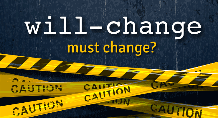 Note: This page was created for GSAP version 2. We have since released GSAP 3 with many improvements. While it is backward compatible with most GSAP 2 features, some parts may need to be updated to work properly. Please see the GSAP 3 release notes for details. Chrome 53 debuted a new "feature" to improve animation performance and graphics fidelity, but it had some nasty side effects that caused quite a few animators to get unpleasant phone calls from angry clients whose ads and web sites suddenly looked blurry and/or stuttery. Every other browser (including previous versions of Chrome) render the same animation beautifully. Chrome's new behavior may also result in WORSE animation performance. A lengthy discussion with the Chrome team revealed some disturbing tradeoffs that animators need to know about, and that could spell trouble with other browsers too unless we band together as a community and make our voices heard. At the heart of the controversy is the will-change CSS property. What is "will-change"? It gives developers a way to say "hey, browser, I'm gonna animate this property, so please do whatever you can to prepare and make it happen smoothly" which often means creating a compositor layer to get GPU-acceleration of transforms and opacity. Think of a compositor layer like a screen-shot of the element that the browser can store on the GPU to move/scale/rotate cheaply instead of re-computing all the pixels on each screen refresh. Read Sara Soueidan's excellent in-depth article here for details. Problem: blurry, stuttering animations What is Chrome 53 doing differently? Chrome is basically saying "In the past, I intelligently managed when and how to rasterize elements, but now that will-change property exists, I'll just make that serve as a blind toggle switch for rasterization instead. If things look blurry, it's not my problem - the developer will need to jump through some hoops (described below) to make things look sharp again." It all boils down to how and when "rasterization" of an element occurs (changing it into pixels stored on the GPU). If rasterization happens when the element is very small, it will be lower resolution. When scaled up, it'll look blurry/pixelated. On the other hand, if you rasterize while it's at its native scale (1) or above, you'll get a much higher-quality image with more pixels. Another key factor is how it is rasterized. Apparently Chrome uses a completely different algorithm for rasterizing an <img> than a <div> with a background-image even though both use identical source files and are sized the same! Here's an example of how they look in Chrome 53: Update: The Chrome team says they've fixed the bug that caused background-image to render differently than <img> (issue 649046) and it should be in the 9/29 release of Chrome Canary. Both factors (the when and the how) are at play in Chrome 53's new behavior (which apparently was a purposeful engineering choice based on will-change). According to this document, all content now gets re-rasterized when its scale changes (which happens up to 60 times per second during animation of scale/scaleX/scaleY properties). That's supposed to keep things sharp, but in this case Chrome's background-image algorithm applies some sort of pixel-snapping which causes that odd vibration during animation. (Update: should be fixed soon). This re-rasterization comes at a cost performance-wise too. Previously, Chrome applied some heuristics to sense when it was appropriate to re-rasterize to avoid blurriness, thus it only kicked in when necessary. But now, you must opt-in to get the layerizing benefits by setting will-change: transform. The Chrome team says this is an "improvement" because it puts the control into the hands of developers, but clearly this shift in behavior comes at quite a price. Overnight, the rug got pulled out from under many animations around the web, hurting performance (due to the constant re-rasterizing by default) and also introducing those visual vibrations when scaling background-image graphics (quite common for sprite sheets). To be clear, this primarily affected scaling animations, not ALL animations on the web. And of course anything where a background-image was used and the element was layerized (making it blurry in Chrome 53). Partial solution: set will-change: transform Complaints rolled in quickly, and the Chrome team suggested that developers go back and edit all their affected animations by adding will-change: transform which would layerize/rasterize those elements (skipping re-rasterizing on every refresh). It's a bit of a nightmare to go back and find all the affected animations and make the necessary edits, but hey, it's just adding one property to the CSS so it shouldn't be too bad, right? Oops, that breaks it in other ways Chrome chose to implement will-change such that it will trigger rasterization at whatever the current scale happens to be, so if you've got an element that starts at scale(0.1) and animates up to scale(1), rasterization happens at scale(0.1), thus it will look terrible (blurry/pixelated) at the end of the animation. Here's an example showing the SAME image animating to identical scales, but flip-flopped starting/ending values: (View the codepen here) Partial solution: toggle will-change back and forth Hold your nose...here comes the hack. In order to trigger re-rasterization of the element to keep it clear, the Chrome team suggested toggling will-change back to auto during the animation, then waiting until a requestAnimationFrame elapses before setting it back to transform...and then doing it again, and again, at whatever frequency the developer wants in order to keep things acceptably sharp. So will-change: auto is being pressed into service to explicitly tell the browser "rasterize me on the next requestAnimationFrame." Yes, you read that correctly: animators must turn **off** the very property whose entire purpose is to be **on** for animation, signaling change. Then toggle it back-and-forth many times during the animation. So we're essentially telling the browser "I'm gonna change this...no I'm not...yes I am...nope..." all while in the process of animating. This doesn't exactly sound consistent with the intent of will-change, nor does it seem performant (Google's document says "Be aware, however, that there is often a large one-time performance cost to adding or removing will-change: transform.") Gotcha: never de-layerize Even if you're willing to follow the advice to set will-change: transform and toggle back-and-forth during the animation to maintain a reasonable level of clarity, there's one last gotcha - if you set it back to will-change: auto at the end of the animation and give it a non-3d transform (to de-layerize it), you'll see a jarring shift in pixels and clarity for anything with a background-image! The Chrome team advises in that case that you make sure it always has a 3d transform thereafter to prevent it from de-layerizing. Following that advice puts you at risk of running out of memory (or hitting performance problems), plus the background-image will always be slightly blurry. Here's what it looks like to toggle between the two modes at the end of the animation: Update: The Chrome team clarified that this was a temporary fix, not a long-term solution. The background-image rendering bug should be resolved soon, and this "never de-layerize" suggestion will no longer apply at that point. The bigger issue, beyond Chrome... The will-change spec doesn't really specify implementation details which means that Chrome's new behavior may be completely unique; Firefox might do something different, and then there's Edge, Safari, Opera, Android, etc. Perhaps Chrome requires that developers toggle back-and-forth to maintain clarity, but what if Firefox interprets that differently, or imposes a big performance penalty when doing the same thing? What if developers must resort to various [potentially conflicting] hacks for each browser, bloating their code and causing all sorts of headaches. We may have to resort to user agent sniffing again (did you just throw up a little in your mouth?). This will-change property that was intended to SOLVE problems for animators may end up doing the opposite. It seems wise for the browsers to step back and let the spec authors fill in the implementation details and gain consensus before moving forward. Another problem: stacking contexts As mentioned in this article, will-change can also affect the stacking context of elements, leading to unintended changes in how things render/stack on your page. So your content may stack differently in browsers that do support will-change than those that don't. More sniffing, yay! To summarize: Before Chrome 53 Just animate stuff. No need to jump through any hoops as a developer to get decent clarity (though the Chrome team points out that there was still some blurriness in certain edge cases that they've heard complaints about). After Chrome 53 Make sure to set will-change: transform if you're animating transforms and want to opt-in to performance optimizations and avoid jittery background-image scaling. But be careful about how it might affect stacking contexts, and keep checking when other browsers decide to implement will-change, as it could change how your content looks. If you're scaling up, make sure you toggle will-change back-and-forth to/from auto during the animation to maintain clarity (but sacrifice performance). Make sure there's a 3D transform applied throughout to prevent de-layerization (which would cause a big performance hit). Don't switch back to a 2D transform at the end (at least for elements with a background-image), or you'll see a jarring pixel shift. (Update: should be fixed soon in Chrome, so this step won't be necessary at some point.) Don't forget to go back and find/fix existing animations that are affected by the new Chrome behavior. Is Chrome going to fix this? As of today, the Chrome team says they've thought a lot about this and feel pretty strongly that the new behavior is an improvement, so there's no plan to change it (that we know of at least). Here are the solutions we proposed (with the answers we got): Instead of putting the burden on developers to manually toggle will-change back-and-forth between transform and auto during the animation, just have the browser natively sense when re-rasterization is prudent and do that automatically which would be much faster than JS anyway. It seems rather trivial for the browser to sense when an element has been scaled greater than a certain delta (like 0.2) and trigger a rasterization. Chrome team's answer (summary): "that's too hard (complex). The browser might get it wrong sometimes, so it's better to have developers do it at the JS level. And JS isn't that much slower than native. It's just a small amount of extra work for animators (or library developers)." The browser could always perform rasterization at native size (scale of 1) or the current scale, whichever is bigger. That way, nobody would run into those nasty blurred images when scaling up from a small value to 1 (pretty common) and there's no need to keep re-rasterizing. Chrome team's answer: "rastering at native size and then scaling that down with bilinear filters in the compositor to something less than 0.5 or so will start to loop noticeably bad." If the goal is to put control into developers' hands, why not expose an API for defining what scale rasterization should occur at, like element.cacheTransform = "scale(1)"? Chrome team's answer: "it may not be so easy to get it right in terms of expressiveness, and requires new APIs...and also to define what raster scale means, which seems quite tricky in general, especially while not over-fitting to current implementation strategies. That might happen later on." The browser should use the same algorithm to rasterize (and scale) anything. The one being used by Chrome for <img> looks great so please use that for background-image too Chrome team's answer (summary): "Acknowledged. We're working on a fix." Instead of turning will-change into a convoluted way to control rasterization in the browser and risk opening a can of worms with other browsers doing things completely differently due to vague specs, roll back the behavior and work with the spec authors to define implementation details and re-approach later when consensus is reached. Chrome team's answer: "the intention of will-change is to give a hint to the browser that the referenced property is going to be animated, and for the browser to take steps to optimize performance for that use case. This is why will-change: transform creates a composited layer: because animating transform afterward will therefore not later have the startup cost and per-frame of creating the composited layer and rasterizing it. Following this logic, further extending the meaning of will-change: transform to not re-raster on scale change is similar, because it will make it faster." Can GSAP fix it for me? Yes and no. We've already experimented with the suggestions that the Chrome team made, but there are a few tricky challenges. First, we're hyper-focused on performance so it's quite painful to have this new Chrome behavior force us to add extra logic that must run on every tick of every tween of any transform-related animation. It probably wouldn't be noticeable unless you're animating hundreds or thousands of elements simultaneously, but we built GSAP to handle crazy amounts of stress because sometimes that's what a project requires, so we're pretty frustrated by Chrome's decision to impose this burden on animators and libraries like GSAP. But yes, we could do the toggling under the hood automatically and accept the performance tradeoff. But another major problem that's totally in the hands of browsers is rendering - we can't fix that jarring pixel shift at the end of the animations of background-image. We can force the 3D transform to remain, but as described above, that leaves things blurry and unnecessarily eats up memory. We work very hard to implement workarounds for browser inconsistencies and bugs like this, but we can't work miracles. We really need Chrome to step up and provide some better solutions. Conclusion There's no doubt that the Chrome team is working hard to move the web forward and deliver the best experience for their users. At GreenSock, Chrome is our primary browser that we use every day, so we're big fans. This article isn't intended to criticize anyone, but rather to bring attention to something that could spell big trouble for animators in the days ahead, beyond the headaches Chrome 53 caused with its new behavior. Hopefully Chrome will roll back the changes and/or implement some of the suggestions above. We'd encourage folks to make their voices heard (on the Chrome thread, below in the comments, with the spec authors, etc.). Perhaps we got something wrong - feel free to correct us or make other suggestions. Ultimately we want to help move animation forward on the web, so please join us.
 -
 Download CustomEase Get CustomEase by creating a FREE GreenSock account which gets you access to our community forums plus you’ll receive our exclusive “GreenSock Insider” email series (you can unsubscribe anytime). Make sure you're logged in, then you’ll get immediately gain access to the download zip containing CustomEase. Note: CustomEase is not in the GitHub repository or CDN; it's only available for download at GreenSock.com. data:image/svg+xml,%3Csvg%20xmlns='http%3A//www.w3.org/2000/svg'%20viewBox='0%200%2084.25%2084.25'%3E%3Cdefs%3E%3Cstyle%3E.cls-1%7Bfill%3A%23FFF;%7D%3C/style%3E%3C/defs%3E%3Cpath%20class='cls-1'%20d='M42.12,0A42.13,42.13,0,1,0,84.25,42.12,42.17,42.17,0,0,0,42.12,0Zm0,77.25A35.13,35.13,0,1,1,77.25,42.12,35.17,35.17,0,0,1,42.12,77.25Z'/%3E%3Cpath%20class='cls-1'%20d='M53.38,41.25l-7.63,8V26.66a3.5,3.5,0,1,0-7,0V49.53l-7.69-7.69a3.5,3.5,0,1,0-4.95,4.95L39.78,60.46h0a5.17,5.17,0,0,0,.51.42l.2.11c.13.07.26.15.4.21l.26.08c.13,0,.26.09.4.12a3.17,3.17,0,0,0,.69.07h0c.12,0,.24,0,.36,0a1.65,1.65,0,0,0,.32,0,2.33,2.33,0,0,0,.25-.07,2.83,2.83,0,0,0,.41-.14l.21-.11a2.16,2.16,0,0,0,.39-.22l.2-.16c.11-.09.22-.18.32-.28l0,0L58.44,46.08a3.5,3.5,0,1,0-5.06-4.83Z'/%3E%3C/svg%3E Download GSAP (ZIP) Demos CustomEase Demos
- 4 comments
-
- 4
-

-

-
- easing
- featured-homepage
- (and 5 more)
-
 As the author of GSAP I'm sometimes asked if the Web Animations API (WAAPI) will be used under the hood eventually. My responses have gotten pretty long so I thought I'd share my findings with everyone here. Hopefully this sheds light on the challenges we face and perhaps it can lead to some changes to WAAPI in the future. WAAPI is a native browser technology that's similar to CSS animations, but for JavaScript. It's much more flexible than CSS animations and it taps into the same mechanisms under the hood so that the browser can maximize performance. Overall support is has gotten pretty good but there are multiple levels to the spec, so some browsers may support only "level 1", for example. The hope is that eventually all major browsers will support WAAPI fully. Progress in that direction has been very, very slow. You could think of WAAPI almost like a browser-level GSAP with a bunch of features stripped out. This has led some to suggest that perhaps GSAP should be built on TOP of WAAPI to reduce file size and maximize performance. Ideally, people could tap into the rich GSAP API with all of its extra features while benefiting from the browser's native underpinnings wherever possible. Sounds great, right? Unfortunately, WAAPI has some critical weak spots that make it virtually impossible for GSAP to leverage it under the hood (at least in any practical manner). I don't mean that as a criticism of WAAPI. In fact, I really wanted to find a way to leverage it inside GSAP, but I'll list a few of the top reasons why it doesn't seem feasible below. To be clear, this is NOT a feature comparison or a bunch of reasons why GSAP is "better" - these are things that make it architecturally impossible (or very cumbersome) to build GSAP on WAAPI. Custom easing WAAPI only supports cubic-bezier() for custom easing, meaning it's limited to one segment with two control points. It can't support eases like Bounce, Elastic, Rough, SlowMo, wiggle, ExpoScaleEase, etc. GSAP must support all of those eases plus any ease imaginable (unlimited segments and control points - see the CustomEase page). This alone is a deal-breaker. Expressive animation hinges on rich easing options. Independent transform components The most commonly animated values are translation (x/y position), rotation, and scale (all transform-related) but you cannot control them independently with CSS or WAAPI. For example, try moving (translate) something and then halfway through start rotating it and stagger a scale toward the end: |-------- translateX() ------------| |------ rotate() ------| |---------- translateY() -----------| |-------------- scale(x,y) --------------| Animators NEED to be able to independently control these values in their animations. Additive animations (composite:"add") probably aren't an adequate solution either. It's unrealistic to expect developers to track all the values manually or assume that stacking them on top of each other will deliver expected results - they should be able to just affect the rotation (or whatever) at any time, even if there was a translate() or scale() applied previously. GSAP could track everything for them, of course, but continuously stacking transforms on top of each other seems very inefficient and I imagine it'd hurt performance (every transform is another matrix concatenation under the hood). There is a new spec being proposed for translate, scale, and rotate CSS properties which would certainly help, but it's not a full solution because you still can't control the x/y components independently, or all of the 3D values like rotationX, rotationY, z, etc. This is an essential feature of GSAP that helped it become so popular. Example See the Pen Independent Transforms Demo by GreenSock (@GreenSock) on CodePen. Custom logic on each tick Certain types of animations require custom logic on each tick (like physics or custom rounding/snapping or morphing). Most GSAP plugins rely on this sort of thing (ModifiersPlugin, for example). I'm pretty sure that's impossible with WAAPI, especially with transforms being spun off to a different thread (any dependencies on JS-based logic would bind it to the main thread). Non-DOM targets As far as I know, WAAPI doesn't let you animate arbitrary properties of generic objects, like {myProperty:0}. This is another fundamental feature of GSAP - people can use it to animate any sort of objects including canvas library objects, generic objects, WebGL values, whatever. Global timing controls I don't think WAAPI lets you set a custom frame rate. Also, GSAP's lag smoothing feature requires the ability to tweak the global time (not timeScale - I mean literally the current time so that all the animations are pushed forward or backward). As far as I know, it's impossible with WAAPI. Synchronization (transforms and non-transforms) As demonstrated in this video, one of the hidden pitfalls of spinning transforms off to another thread is that they can lose synchronization with other main-thread-based animations. As far as I know, that hasn't been solved in all browsers. We can't afford to have things getting out-of-sync. Some have proposed that GSAP could just fall back to using a regular requestAnimationFrame loop to handle things that aren't adequately supported by WAAPI but that puts things at risk of falling out of sync. For example, if transforms are running on a separate thread they might keep moving while other parts of the animation (custom properties that get applied somehow in an onUpdate) slow down or jank. Compatibility GSAP has earned a reputation for "just working" across every browser. In order to deliver on that, we'd have to put extra conditional logic throughout GSAP, providing fallbacks when WAAPI isn't available or doesn't support a feature. That would balloon the file size substantially and slow things down. That's a tough pill to swallow. WAAPI still isn't implemented in several major browsers today. And then there are the browser inconsistencies (like the infamous SVG origin quirks) that will likely pop up over time and then we'd have to unplug those parts from WAAPI and maintain the legacy raw-JS mechanisms internally. Historically, there are plenty of cross-browser bugs in natively-implemented technologies, making it feel risky to build on top of. Performance WAAPI has a performance advantage because it can leverage a separate thread whereas JavaScript always runs on the main thread, right? Well, sort of. The only time a separate thread can be used is if transforms and/or opacity are the only things animating on a particular element (or else you run into synchronization issues). Plus there's overhead involved in managing that thread which can also get bogged down. There are tradeoffs either way. Having access to a different thread is fantastic even if it only applies in certain situations. That's probably the biggest reason I wanted to leverage WAAPI originally, but the limitations and tradeoffs are pretty significant, at least as it pertains to our goals with GSAP. Surprisingly, according to my tests GSAP was often faster than WAAPI. For example, in this speed test WAAPI didn't perform as well as GSAP on most devices I tried. Maybe performance will improve over time, but for now be sure to test to ensure that WAAPI is performing well for your animations. File Size To ensure compatibility, GSAP would need all of its current (non-WAAPI) code in place for fallbacks (most browsers won't fully support WAAPI for years) and then we'd need to layer in all the WAAPI-specific code on top of that like conditional logic checking for compatible eases, sensing when the user is attempting something WAAPI can't support, tracking/stacking additive animations, etc. That means file size would actually be far worse if GSAP were built on WAAPI. Some have suggested creating a different adapter/renderer for each tech, like a WebAnimationsAdapter. That way, we could segregate the logic and folks could just load it if they needed it which is clever but it doesn't really solve the problem. For example, some plugins may affect particular CSS properties or attributes, and at some point conditional logic would have to run to say "oh, if they're using the WebAnimationsAdapter, this part won't work so handle it differently". That conditional logic generally makes the most sense to have in the plugin itself (otherwise the adapter file would fill up with extra logic for every possible plugin, bloating file size unnecessarily and separating plugin logic from the plugin itself). So then if anyone uses that plugin, they'd pay a price for that extra logic that's along for the ride. Weighing the Pros & Cons At the end of the day, the list of "pros" must outweigh the "cons" for this to work, and currently that list is quite lopsided. I'd love to find a way to leverage any of the strengths of WAAPI inside GSAP for sure, but it just doesn't seem feasible or beneficial overall. The main benefit I see in using WAAPI inside GSAP is to get the off-the-main-thread-transforms juice but even that only seems useful in relatively uncommon scenarios, and it comes at a very high price. I'm struggling to find another compelling reason to build on WAAPI; GSAP already does everything WAAPI does plus a lot more. I'm hopeful that some of the WAAPI benefits will someday be possible directly in JS so that GSAP wouldn't have to create a dependency on WAAPI to get those. For example, browsers could expose an API that'd let developers tap into that off-the-main-thread transform performance. Ideally, browsers would also fix that hacky matrix()/matrix3d() string-based API and provide a way to set the numeric matrix values directly - that'd probably deliver a nice speed boost. Please chime in if I'm missing something, though. (Contact us or post in the forums) Why use GSAP even if/when WAAPI gets full browser support? Browser bugs/inconsistencies Lots of extra features like morphing, physics, Bezier tweening, text tweening, etc. Infinite easing options (Bounce, Elastic, Rough, SlowMo, ExpoScaleEase, Wiggle, Custom) Independent transform components (position, scale, rotation, etc.) Animate literally any property of any object (not just DOM) Timeline nesting (workflow) GSDevTools Relative values and overwrite management from() tweens are much easier - you don't need to get the current values yourself Familiar API Why WAAPI might be worth a try If you don’t need broad browser support today or any of GSAP’s unique features, you could save some kb by using WAAPI Solid performance, especially for transforms and opacity Always free Again, the goal of this article is NOT to criticize WAAPI at all. I think it's a great step forward for browsers. I just wanted to explain some of the challenges that prevent us from using it under the hood in GSAP, at least as it stands today. EDIT: Brian Birtles, one of the primary authors of the WAAPI spec, reached out and offered to work through the issues and try to find solutions (some of which may involve editing the spec itself) which is great. Rachel Nabors has also worked to connect people and find solutions. Although it may take years before it's realistic to consider building on WAAPI, it's reassuring to have so much support from leaders in the industry who are working hard to move animation forward on the web. 2020 EDIT: Now Brian Birtles is the only one working on WAAPI and he does so on a volunteer basis, so further development of WAAPI has understandably slowed down in recent times.
 -
 Your animation workflow is about to get a major boost. GSDevTools gives you a visual UI for interacting with and debugging GSAP animations, complete with advanced playback controls, keyboard shortcuts, global synchronization and more. Jump to specific scenes, set in/out points, play in slow motion to reveal intricate details, and even switch to a "minimal" mode on small screens. GSDevTools makes building and reviewing GSAP animations simply delightful. Get Started Load the JavaScript file //be sure to use a path that works in your dev environment <script src="./js/GSDevTools.min.js"></script> Instantiate GSDevTools GSDevTools.create(); That's it! The demo below shows GSDevTools running with its default settings. It automatically gives you control over every animation on the global timeline. Select an animation by id Any GSAP animation (tween or timeline) can be assigned an id (a string) which causes it to show up in the animation menu. That makes it easy to jump to any scene. Notice how the timeline and each tween below have an id assigned: //give the timeline and child tweens their own id. var tl = gsap.timeline({id: "timeline"}) tl.to(".orange", {duration: 1, x: 700, id: "orange"}) .to(".green", {duration: 2, x: 700, ease: "bounce", id: "green"}); //give this tween an id gsap.to(".grey", {duration: 1, x: 700, rotation: 360, delay: 3, id: "grey"}) //instantiate GSDevTools with default settings GSDevTools.create(); Now each id shows up in the animations menu (lower left). Persistence between refreshes For added convenience, when you manually set the in/out points, animation, timeScale, or looping state in the UI, they persist between refreshes! This means you can drag the in/out points to isolate a particular section and then tweak the code, hit refresh, and see the changes immediately within that cropped area. Any values set in the GSDevTools.create({...}) method will override manual selections. Set persist: false to disable persistence. If you encounter persistence contamination (e.g. setting timeScale in one affects another), simply assign a unique id to the GSDevTools instance (the recorded values are segregated by id, session, and domain). Configuration options GSDevTools can be configured extensively. Optionally define any of these properties in the config object: animation [string | animation] - If you define an animation, like animation: myTimeline, animation: myTween or animation: "id", that animation will be initially selected. By default, the global timeline is selected. container [string | element] - Specify the container element for GSDevTools, like: "#devTools" or document.getElementById ("devTools"). css [object | string] - The CSS you want on the outer div, like {width:"50%", bottom:"30px"} or a string of css like "width: 50%; bottom: 30px". It is safe to use GSAP-specific shortcuts like x, yPercent, etc. in the object syntax because it just gets passed to a gsap.set() internally. globalSync [boolean] - By default, animations are kept in context and synchronized with the root timeline (scrubbing one scrubs them all), but you can set globalSync: false to unhook it from the global timeline. Note: only one GSDevTools instance can be globally synchronized on a page (otherwise scrubbing them both to different times would break the time-space continuum). hideGlobalTimeline [boolean] - If true, the Global Timeline will be removed from the animation menu. id [string] - A unique string to identify the GSDevTools instance. The persistent values between refreshes are mapped to this id, so if you ever run into a case where there's cross-contamination of the persistent values (like if you embed multiple codepens on one page and don't want timeScale changes in one to affect the others on refresh), just make sure you give each one a unique id. inTime [number | string] - Position of the in marker (time, in seconds, or label or animation id). You can even use relative values like "myAnimation-=2" to start 2 seconds before the animation with the id of "myAnimation". If you use just a negative relative value like "-=5" , it will be measured from the end of the timeline, making it easy to just watch the final 5 seconds. keyboard [boolean] - If true (the default), keyboard shortcuts will work. Note: only one GSDevTools instance can listen for keyboard shortcuts. paused [boolean] - Initial paused state. loop [boolean] - Initial loop state. minimal [boolean] - If true, the UI will only show minimal controls (scrubber, play/pause, and timeScale). Note: when the screen is less than 600px it automatically switches to minimal mode anyway. outTime [time | label] - Position of the out marker (time, in seconds, or label, or animation id). You can even use relative values like "myAnimation+=2" to end 2 seconds after the animation with the id of "myAnimation" ends. If you use just a positive relative value like "+=5", it will be measured from wherever the inTime is. persist [boolean] - By default, GSDevTools remembers the in/out points, selected animation, timeScale, and looping state between refreshes in the same domain session, but you can disable that behavior by setting persist: false. timeScale [number] - Initial timeScale. visibility [string] - "auto" causes the controls to automatically hide when you roll off of them for about 1 second, and return when you move your mouse over the area again. Default is "visible", or you can set it to "hidden" to hide the controls initially (useful if you don't want the controls to obscure any part of the screen - you can still use the keyboard shortcuts to control playback or tap the "H" key to toggle visibility). Keyboard Controls SPACEBAR: Play/pause UP/DOWN ARROWS: Increase/decrease timeScale LEFT ARROW: Rewind RIGHT ARROW: Jump to end L: Toggle loop I: Set the in point to current position of playhead O: Set the out point to current position of playhead H: Hide/show toggle Tips and tricks Clicking the GreenSock logo (bottom right) gets you right to the GreenSock docs! Double-click on the in/out marker(s) to reset them both immediately. If the playback UI is obscuring part of your animation, just tap the "H" key to hide it (and again to bring it back) - you can still use all the keyboard shortcuts even when it's invisible. Advanced demos We purposefully chose very basic animations for the demos above, but here are a few that illustrate how easy GSDevTools makes it to control and debug even super-complex animation sequences. How do I get it? GSDevTools is available to Club GreenSock members ("Shockingly Green" and above). Just download GSAP with the bonus files zip from your Dashboard. Try GSDevTools for free on CodePen. To learn how to include GSDevTools into your project, see the GSAP install docs. FAQ Why is my global timeline 1000 seconds long? That means you've probably got an infinitely repeating animation somewhere. GSDevTools caps its duration at 1000 seconds. Scrubbing to Infinity is awkward. Does loading GSDevTools impact runtime performance? Since it must monitor and record the root timeline, yes, there is a slight performance hit but probably not noticeable. Keep in mind that usually you'll only load GSDevTools while you're developing/reviewing your animations and then remove it when you're ready to launch, so ultimately it shouldn't be much of a factor anyway. Why isn't GSDevTools in the CDN or GitHub repo? Because it's a membership benefit of Club GreenSock. It's a way for us to give back to those who support our ongoing development efforts. That's why we've been able to continue innovating for over a decade. See https://greensock.com/why-license for details about our philosophy. Does GSDevTools work with other animation libraries? Nope, it depends on some unique capabilities baked into the GSAP architecture. What will I do with all the time this tool saves me? Take up a new hobby, ponder deep philosophical questions, make cookies - it's up to you.
-
- 5
-
-
- javascript
- animation
- (and 8 more)
-
 Note: TweenMax has been deprecated in GSAP 3 in favor of the streamlined gsap object. It has 50+ new features and is almost <strong>half the size!</strong> GSAP 3 is backward compatible with the vast majority of GSAP 2 features including TweenMax. Please see the Migration Guide for details. TweenMax lets you animate literally any property of any object that JavaScript can touch (CSS, SVG, React, Vue, Three.js, canvas, motion paths, generic objects, etc.). Before the release of GSAP 3, TweenMax was the most feature-packed (and popular) animation tool in the GSAP arsenal. However in GSAP 3, you no longer even need to reference TweenMax in your code (although you can because GSAP 3 honors the vast majority of legacy code). We strongly recommend migrating to GSAP 3's streamlined syntax. Quick links Getting started What's so special about GSAP? Documentation: Version 2 | Version 3 Showcase (examples) For convenience and loading efficiency, TweenMax version 2 and earlier included TweenLite, TimelineLite, TimelineMax, CSSPlugin, AttrPlugin, RoundPropsPlugin, BezierPlugin, and EasePack (all in one file). Every bit of that functionality (plus a lot more) is in the GSAP 3 core which is almost half the size. Staggered animations GSAP makes it easy to create staggered animations on multiple objects. The animations can overlap, run in direct sequence or have gaps between their start times. The old TweenMax stagger methods (from version 1 and 2): TweenMax.staggerTo(), TweenMax.staggerFrom() and TweenMax.staggerFromTo() aren't even necessary in GSAP 3 because a "stagger" special property can be added to ANY tween, like in the demo below: Additional Methods (only relevant for version 1 and 2) TweenMax inherits methods from TweenLite and it also has quite a few of its own. ul.chart {width:300px; float:left; margin-right:80px; } ul.chart li:nth-child(1){ font-weight:bold; list-style:none; margin-left:-20px; font-size:20px; margin-bottom:20px; } TweenLite and TweenMax Methods delay() delayedCall() duration() eventCallback from() fromTo() getTweensOf() invalidate() isActive() kill() killDelayedCallsTo() killTweensOf() pause() paused() play() progress() restart() resume() reverse() reversed() seek() set() startTime() time() timeScale() to() totalDuration() totalProgress() totalTime() Methods exclusive to TweenMax getAllTweens() isTweening() killAll() killChildTweensOf() pauseAll() repeat() repeatDelay() resumeAll() staggerFrom() staggerFromTo() staggerTo() updateTo() yoyo() Learn more in the TweenMax version 2 documentation.
 -
 Have you ever wondered why GreenSock doesn't use a more common open source license like MIT? Sometimes our licensing model is misunderstood but hopefully after reading this article you'll see why it is so foundational to the success of our tools and why it ultimately benefits users too. Open source is awesome! If you had to write and maintain your own jQuery or React or GSAP, could you do it? Would it be as refined and reliable? Probably not. How many times have you found a library or chunk of code on github that saved you hours of development time? Open source can be a quick path to great results. It also serves as a jumping-off point for up-and-coming developers to share their innovation, inspiring others to write better code. Open source is easily one of the most influential movements in the entire development community. We're certainly not anti-open-source. Quite the contrary. Open source is *not* always awesome Despite its strengths, there are some dark sides to open source. Many projects are riddled with bugs, poorly documented, and sometimes even dangerous to use. The web is littered with abandoned projects that once seemed promising. It's like a clearance bin you'd find at a discount store; there may be some treasures in there, but you'll have to dig through a lot of undesirables to find the gems. In an industry that's inundated weekly with "hot new" libraries, all just a click away for free, it can be tough to figure out which ones to gamble on. Commitment required(?) Some libraries are one-trick ponies that don't require ongoing commitment. For example, a math library that performs matrix operations or a formatting library. If the author abandons the project, it's no big deal. Other projects, like a full-featured animation library, are much more complex and leverage browser-level optimizations that are moving targets. Vendor-specific bugs need to be worked around or new browser features get introduced that beg to be animated. Plus, animation is the most performance-sensitive aspect of the user experience, so a commitment to ongoing optimization pays dividends. Beyond the code itself, what about community, documentation and examples? These become increasingly important as a library's feature set expands and companies standardize on it, needing to train new staff. Again, some projects have very little need for ongoing support but for GreenSock, it seemed essential. Hampered by success Paradoxically, success is the very thing that kills many open source projects because they don't have a funding mechanism to underwrite all the demands. The project that was once the twinkle in the author's eyes often ends up being a thorn in their side. They can't afford (or don't really want) to keep up with the demands. That's not to say that all open source projects suffer this fate. We have the utmost respect for open source authors, and we don't mean to diminish anyone's hard work or generosity. But there are some common frailties of open source projects in general that GreenSock aims to avoid. Having built and maintained a popular library for over a decade, we've learned that one of the most important factors in keeping a complex project like GSAP vibrant is the licensing model. Our goal was to make GreenSock tools not only accessible (which MIT does a great job of), but also sustainable, business-friendly, consistent, and respectful. We needed a license that would have the best chance of facilitating those goals, as described below: Sustainable Scores of animation libraries have come and gone over the years. We didn't want to be just another flash in the pan that ultimately leaves users feeling abandoned. Trust is paramount for us. We wanted the GreenSock brand to be associated with an exceptionally high level of commitment and reliability. Earning that trust requires a consistent, full-time effort so we considered these funding models: Self-funded - most open source projects are self-funded, meaning that the authors cover all the costs themselves, typically by donating their time and resources. It's noble and perfectly adequate for many projects. An MIT (or similar) license is a great fit because it allows an author to share code with almost zero strings attached. However, the commitment level tends to be unreliable and self-funded projects are rarely sustained long-term. With our particular project and goals, this wasn't a good fit. Corporate sponsorship - sometimes huge companies like Adobe, Microsoft, Facebook, or Google are willing to contribute funds to encourage a project. They usually have a vested interest in its success. For example, Adobe helps fund CreateJS which is a set of libraries that its very own Adobe Animate (formerly Flash) relies on. React is underwritten by Facebook. This can be a great way to offload development costs onto some deep-pocketed corporations, keeping it totally free for end users. The risk, however, is that if the project goals don't line up with the corporation's agenda (which can shift), funding gets yanked or the developers get pressured to go in a direction that may not be good for end users. If the company has a bad year, they may re-allocate resources. The project is ultimately beholden to a few key sponsors with potentially conflicting objectives. This wasn't something we were comfortable with although we acknowledge that it's a great solution for certain projects. Private investors - famo.us is probably the most well-known example of an "open source" project that took on private investors. A few years and $30,000,000+ later, it stopped development of its open source library and laid off a large chunk of its staff, deciding to "pivot" in a more profitable commercial direction. Private investors want a return on their investment (which is completely understandable) but an MIT license can make that very difficult because it leaves the IP (intellectual property) wide open for anyone to steal, including competitors. Similar to corporate sponsorship, projects who get their funding this way are beholden to a few key stakeholders who may have a very different agenda than end users. Again, this wasn't an ideal fit for GreenSock. User-funded - when funding comes directly from end users, it creates a wider base (more stable) and incentivizes the kind of innovation that end users actually care about, otherwise funding naturally dries up. That's a healthy dynamic for aligning agendas. Rather than serving a small set of outside investors looking for a return or a corporation with profit centers to bolster, end users play the central role. The downside, of course, is that certain features or use cases involve a fee. That can be a tough pill to swallow for some, especially when "free" MIT-licensed options abound. And it takes time to build up a wide base of users who literally "buy in". Trust and longevity are key. But a surprising number of users embrace this model because it allows them to "vote" with their dollars and participate in making a product they love continue to thrive. While this model certainly isn't for everyone, it has been a good fit for GreenSock. Accessible Sometimes we hear comments like "you can't use GreenSock in commercial projects without a license." WRONG. [loud buzzer noise]. Our license was designed to make the tools extremely accessible, even permitting usage in one-off commercial projects (where you get paid a one-time fee by a single client). And of course it's free to use in non-commercial projects (see licensing page for details). That way, a certain breed of power-user provides the funding that benefits everyone. An estimated 95%+ of our users never pay us a dime. So while a rare type of commercial project does require a "Business Green" Club GreenSock membership (which covers an unlimited number of projects while active), the vast majority of users never need that special license. This accessibility was a cornerstone of our approach. We didn't want to hide all the tools behind an intimidating paywall or make all commercial uses trigger a fee. Yet it couldn't be as unrestrained as MIT because that would create vulnerabilities for us and our users (as described in this article). Another way we keep the core tools accessible is by freely exposing the raw source code both on github and in our downloads. Users can peek under the hood and see how things work. That makes troubleshooting and learning much easier. We tried to strike a balance of openness and healthy insulation from the frailties of MIT. Business-friendly Most businesses are very concerned about IP infringement, lawsuits, and indemnification. The "no strings attached and no warranties" nature of MIT is both a strength and a weakness. It simplifies sharing, but what if an open source library leverages someone else's IP? What if it uses "copyleft" code that infects anything it touches, requiring that all projects using it be open-sourced as well? That could be a huge problem for businesses with proprietary tools in a competitive market. GreenSock's license doesn't have any attribution requirements, nor does it impose share-alike rules like GNU and Creative Commons. Furthermore, it contains warranties that aren't found in MIT-like licenses, making GreenSock more business-friendly. It survived the software audits and legal review process at reputable companies like Google, Sony, EA, Intel, every major ad network, and many others. This vetting is necessary in the business world where there is so much at stake. The license also allows for code edits to be made for bug fixes. Typically that's not necessary because we handle it as a part of our ongoing support efforts, but businesses appreciate knowing that if we relaxed those efforts, they'd still be able to get their project working if they ran into a bug and needed to squash it themselves. Consistent MIT-licensed projects spread on github where it's trivial to fork them and start making custom flavors. That's ideal for authors whose goal is to start something and then step back to let the community run with it. But that can lead to a lot of confusion as different flavors start popping up with incongruent feature sets and incompatibilities. Focus and direction are easily lost. If there's no driver (or too many drivers), it can be a scary ride for the passengers. We wanted the GreenSock brand to convey a certain level of consistency and reliability. That's part of the reason we don't generally accept pull requests - we keep a tight reign on the codebase so that we are intimately aware of every piece. That allows us to not only support it, but also stand behind our IP warranties. Respectful We believe that if we respect our users, they'll generally reciprocate that respect. Most people want to do the right thing. So we don't inject "phone home" code that reports usage or causes things to suddenly stop working when a membership expires. We don't force business customers register each user or enter serial numbers to activate seats. We don't limit installations or the number of projects that the license covers. We don't burn extra energy policing usage. We've never sued anyone. We funnel our energy into refining the tools, innovating, educating, and supporting our users. We put a lot of effort into creating a positive, respectful culture in the forums which boast over 50,000 members and 80,000 posts. We don't charge a dime for support there, and we don't shamelessly promote Club GreenSock memberships. Again, we trust that if we keep trying to provide value, people will notice and gladly sign up to support the efforts at some point. An unintended benefit of our licensing model has been that it naturally weeds out users who expect everything for free and don't recognize the substantial effort that goes into these projects. We're left with users who tend to be very respectful and trustworthy (exactly who we like to serve). Conclusion GreenSock isn't the typical open source project. Our licensing model reflects that. It offers a blend of sustainability, accessibility, business-friendliness, consistency, and respect that'd be very difficult (or impossible) to accomplish with an MIT-like license. It's not necessarily "better" (open source is fantastic, really) but in our particular case it aligned more closely with the project goals. In fact, many companies have chosen GreenSock because of the license, not in spite of it. They wanted to invest in a platform that had a certain level of commitment behind it that's rare in the open source world. After a decade, the experiment seems to be working and we have our supporters to thank for that. We've been humbled and inspired by Club GreenSock members throughout the years. It's a privilege to create these tools and serve the community. We're grateful for their partnership which makes it all possible.
- 5 comments
-
- 2
-
-

-
- javascript
- article
- (and 8 more)
-
 Note: This page was created for GSAP version 2. We have since released GSAP 3 with many improvements. While it is backward compatible with most GSAP 2 features, some parts may need to be updated to work properly. Please see the GSAP 3 release notes for details. Here are some of the highlights of the GSAP 1.20.0 release... yoyoEase Now you can specify an ease for the yoyo (backwards) portion of a repeating TweenMax animation. Set it to a specific ease like yoyoEase:Power2.easeOut or to flip the existing ease, use the shortcut yoyoEase:true. TweenMax is smart enough to automatically set yoyo:true if you define a yoyoEase, so there's less code for you to write. Score! Animate CSS Variables (custom properties) See the Pen CSS Variables Demo by GreenSock (@GreenSock) on CodePen. Emoji support in TextPlugin 'Nuf said. ...and more There are quite a few little improvements and bug fixes as well, which are listed in the changelog at the github repository. Download GSAP today. Happy tweening!
 -
 Note: This page was created for GSAP version 2. We have since released GSAP 3 with many improvements. While it is backward compatible with most GSAP 2 features, some parts may need to be updated to work properly. Please see the GSAP 3 release notes for details. Club GreenSock members get a fresh batch of superpowers with updates to SplitText and ScrambleText, plus two brand new customizable eases in this 1st-Quarter 2017 update! It's our way of saying "thanks" to those who support our ongoing efforts. Let's dig right into the upgrades... SplitText SplitText now supports nested tags like <span>, <strong>, <em>, <p>, etc. This means you can split text with various styling and even links. To make things even cooler, SplitText now supports emoji characters ! SplitText demo See the Pen BzmGba by GreenSock (@GreenSock) on CodePen. "Simply Green" gets ScrambleText We moved ScrambleText into "Simply Green" membership level to deliver even more value. NEW: CustomWiggle and CustomBounce Add wiggle and bounce effects to your GSAP animations with these brand new, highly customizable eases. Even get squash and stretch! CustomWiggle and CustomBounce are now included for anyone with a "Shocking Green" or "Business Green" membership. To learn more visit greensock.com/wiggle-bounce. Thanks We're incredibly grateful to each and every Club GreenSock member, as we simply couldn't do what we do without your ongoing support. It's a privilege to have such a top-notch community around GSAP. Please feel free to plug in even more by participating in the forums to help others or to get your questions answered. It's a fantastic place to learn and be inspired. Enjoy the fresh updates, and happy tweening! [loginwidget]
 -
 Note: This page was created for GSAP version 2. We have since released GSAP 3 with many improvements. While it is backward compatible with most GSAP 2 features, some parts may need to be updated to work properly. Please see the GSAP 3 release notes for details. Are your animations meant to feel playful? Robotic? Slick? Realistic? If they had a voice, what would they sound like? To become an animation rock star, you must develop a keen sense of easing because that's what determines the style of movement between point A and point B. GreenSock's new CustomEase frees you from the limitations of canned easing options. Create literally any ease imaginable. Zero limitations. CSS animations and WAAPI offer cubic-bezier() which is great but with only two control points it's impossible to create more complex effects like bouncing, elastic, wiggles, rough/jerky eases, etc. Plus you can't make an ease return to its starting values (like a ball jumping into the air and falling back to the ground with a bounce). Features Unlimited anchors and control points. Copy/Paste any SVG <path> (including direct copy/paste from Adobe Illustrator). Use CSS cubic-bezier() values (For example, from cubic-bezier.com). Editor has snapping, undo, sample code and other conveniences. Start with any standard ease and customize it. getSVGData() method turns any ease into SVG <path> data for display at the size you define. Extremely optimized for runtime performance. Free for anyone with a GreenSock account. Reading Ease Curves, Editing, and Using CustomEase Here's an in-depth video tour that'll get you up to speed with exactly how to use CustomEase: Ready to play? Check out the new Ease Visualizer with CustomEase support. Click "Custom" to edit the curve as much as you want: Simple Example See the Pen Video: Single Tween with CustomEase by GreenSock (@GreenSock) on CodePen. We strongly recommend creating your CustomEases initially (rather than in each tween) to maximize performance and readability. You then reference them by ID in your tweening code. When an ease is created, it must parse through the points and do various calculations to prepare for blisteringly fast runtime performance during the animation, so executing those calculations when your page/app loads is typically best. Download CustomEase To get CustomEase, you must have a GreenSock account which is completely free to set up. Plus it gets you access to our community forums (a fantastic place to learn and get your questions answered). The widget below lets you sign up or if you're already logged in, it'll give you immediate access to the download zip that contains CustomEase in the "easing" directory. Note: CustomEase is not in the github repository or CDN; it's only available for download at GreenSock.com. [loginwidget]
 -
 Note: This page was created for GSAP version 2. We have since released GSAP 3 with many improvements. While it is backward compatible with most GSAP 2 features, some parts may need to be updated to work properly. Please see the GSAP 3 release notes for details. GSAP version 1.19.0 introduces some exciting new features for advanced users as well as conveniences for everyone (even the "greenest" novices). The most noteworthy improvements are summarized below: Function-based values Instead of a number (x:100) or string (width:"300px") or relative value (y:"+=50"), you can now define most values as a function that'll get called once for each target the first time the tween renders, and whatever is returned by that function will be used as the value. This can be very useful for randomizing things or applying conditional logic. See it in action in the demos below. See the Pen BzmGba by GreenSock (@GreenSock) on CodePen. ...and more GSAP 1.19.0 is more ES6-friendly (for example, you can npm install gsap and then import {TweenLite, Elastic, TimelineMax} from "gsap" in your project). Plenty of bug fixes too. See the whole list in the github changelog. DOWNLOAD GSAP TODAY Happy tweening!
 -
 Note: This page was created for GSAP version 2. We have since released GSAP 3 with many improvements. While it is backward compatible with most GSAP 2 features, some parts may need to be updated to work properly. Please see the GSAP 3 release notes for details. Since launching MorphSVGPlugin, we've made a bunch of improvements and exposed several new features. Here are the highlights... The challenge Before we dive into solutions, it helps to understand the tasks that MorphSVGPlugin must perform in order to work its magic: Convert the path data string into pure cubic Beziers Map all of the segments between the start and end shapes (match them up), typically based on size and position If there are more segments in one than the other, fabricate new segments and place them appropriately Subdivide any segments with mis-matching point quantities If a shapeIndex number isn't defined, locate the one that delivers the smoothest interpolation (shortest overall distance that points must travel). This involves looping through all the anchor points and comparing distances. Convert all the data back into a string Isolate the points that need to animate/change and organize a data structure to optimize processing during the tween. That may sound like a lot of work (and it is) but MorphSVGPlugin usually rips through it with blazing speed. However, if you've got a particularly complex path, you'll appreciate the recent improvements and the new advanced options: Performance tip #1: define a shapeIndex MorphSVGPlugin's default shapeIndex:"auto" does a bunch of calculations to reorganize the points so that they match up in a natural way but if you define a numeric shapeIndex (like shapeIndex:5) it skips those calculations. Each segment inside a path needs a shapeIndex, so multiple values are passed in an array like shapeIndex:[5,1,-8,2]. But how would you know what numbers to pass in? The findShapeIndex() tool helps for single-segment paths, what about multi-segment paths? It's a pretty complex thing to provide a GUI for. Typically the default "auto" mode works great but the goal here is to avoid the calculations, so there is a new "log" value that will act just like "auto" but it will also console.log() the shapeIndex value(s). That way, you can run the tween in the browser once and look in your console and see the numbers that "auto" mode would produce. Then it's simply a matter of copying and pasting that value into your tween where "log" was previously. For example: TweenMax.to("#id", 1, {morphSVG:{shape:"#otherID", shapeIndex:"log"}}); //logs a value like "shapeIndex:[3]" //now you can grab the value from the console and drop it in... TweenMax.to("#id", 1, {morphSVG:{shape:"#otherID", shapeIndex:[3]}}); Notes shapeIndex:"log" was added in MorphSVGPlugin version 0.8.1. A single segment value can be defined as a number or a single-element array, like shapeIndex:3 or shapeIndex:[3] (both produce identical results) Any segments that don't have a shapeIndex defined will always use "auto" by default. For example, if you morph a 5-segment path and use shapeIndex:2, it will use 2 for the first segment and "auto" for the other four. Performance tip #2: precompile The biggest performance improvement comes from precompiling which involves having MorphSVGPlugin run all of its initial calculations listed above and then spit out an array with the transformed strings, logging them to the console where you can copy and paste them back into your tween. That way, when the tween begins it can just grab all the values directly instead of doing expensive calculations. For example: TweenMax.to("#id", 1, {morphSVG:{shape:"#otherID", precompile:"log"}}); //logs a value like precompile:["M0,0 C100,200 120,500 300,145 34,245 560,46","M0,0 C200,300 100,400 230,400 100,456 400,300"] //now you can grab the value from the console and drop it in... TweenMax.to("#id", 1, {morphSVG:{shape:"#otherID", precompile:["M0,0 C100,200 120,500 300,145 34,245 560,46","M0,0 C200,300 100,400 230,400 100,456 400,300"]}}); As an example, here's a really cool codepen by Dave Rupert before it was precompiled: http://codepen.io/davatron5000/pen/meNOqK/. Notice the very first time you click the toggle button, it may seem to jerk a bit because the entire brain is one path with many segments, and it must get matched up with all the letters and figure out the shapeIndex for each (expensive). By contrast, here's a fork of that pen that has precompile enabled: http://codepen.io/GreenSock/pen/MKevzM. You may noticed that it starts more smoothly. Notes precompile was added in MorphSVGPlugin version 0.8.1. Precompiling only improves the performance of the first (most expensive) render. If your entire morph is janky throughout the tween, it most likely has nothing to do with GSAP; your SVG may be too complex for the browser to render fast enough. In other words, the bottleneck is probably the browser's graphics rendering routines. Unfortunately, there's nothing GSAP can do about that and you'll need to simplify your SVG artwork and/or reduce the size at which it is displayed. The precompiled values are inclusive of shapeIndex adjustments. In other words, shapeIndex gets baked in. In most cases, you probably don't need to precompile; it's intended to be an advanced technique for squeezing every ounce of performance out of a very complex morph. If you alter the original start or end shape/artwork, make sure you precomple again so that the values reflect your changes. Better segment matching In version 0.8.1, there were several improvements made to the algorithm that matches up corresponding segments in the start and end shapes so that things just look more natural. So even without changing any of your code, loading the latest version may instantly make things match up better. map: "size" | "position" | "complexity" If the sub-segments inside your path aren't matching up the way you hoped between the start and end shapes, you can use the map special property to tell MorphSVGPlugin which algorithm to prioritize: "size" (the default) - attempts to match segments based on their overall size. If multiple segments are close in size, it'll use positional data to match them. This mode typically gives the most intuitive morphs. "position" - matches mostly based on position. "complexity" - matches purely based on the quantity of anchor points. This is the fastest algorithm and it can be used to "trick" things to match up by manually adding anchors in your SVG authoring tool so that the pieces that you want matched up contain the same number of anchors (though that's completely optional). TweenMax.to("#id", 1, {morphSVG:{shape:"#otherID", map:"complexity"}}); Notes map is completely optional. Typically the default mode works great. If none of the map modes get the segments to match up the way you want, it's probabaly best to just split your path into multiple paths and morph each one. That way, you get total control. Animate along an SVG path The new MorphSVGPlugin.pathDataToBezier() method converts SVG <path> data into an array of cubic Bezier points that can be fed directly into a BezierPlugin-based tween so that you can essentially use it as a motion guide. Watch the video Demo See the Pen pathDataToBezier() docs official by GreenSock (@GreenSock) on CodePen. Morph back to the original shape anytime If you morph a path into various other shapes, and then you want to morph it back to its original shape, it required saving the original path data as a variable and feeding it back in later. Not anymore. MorphSVGPlugin records the original path data in a "data-original" attribute directly on the element itself, and then if you use that element as the "shape" target, it will automatically grab the data from there. For example: TweenMax.to("#circle", 1, {morphSVG:"#hippo"}); //morphs to hippo TweenMax.to("#circle", 1, {morphSVG:"#camel"}); //morphs to camel TweenMax.to("#circle", 1, {morphSVG:"#circle"}); //morphs back to circle. Conclusion We continue to be amazed by the response to MorphSVGPlugin and the creative ways we see people using it. Hopefully these new features make it even more useful. How do I get MorphSVGPlugin? If you're a "Shockingly Green" or "Business Green" Club GreenSock member, just download the zip from your account dashboard or the download overlay on GSAP-related page on this site. If you haven't signed up for Club GreenSock yet, treat yourself today.
 -
 Note: This page was created for GSAP version 2. We have since released GSAP 3 with many improvements. While it is backward compatible with most GSAP 2 features, some parts may need to be updated to work properly. Please see the GSAP 3 release notes for details. The latest version of GSAP delivers some fun new features that open up entirely new animation possibilities. Check out the videos and demos below that show what's so exciting about 1.18.0. Here's a quick summary: New "cycle" property allows you to add rich variations to staggered animations Relative HSL color tweens (affect just the hue, saturation or lightness) Complex string tweening like "1px 5px rgb(255,0,0)" Numerous improvements and bug fixes (see github) New "cycle" property for staggered animations Have you ever wanted to animate a bunch of elements/targets and alternate between certain values (or even randomize them) in a staggered fashion? The new super-flexible "cycle" property does exactly that. Instead of defining a single value (like x:100, rotation:90), you can define an Array of values to cycle through (like cycle:{x:[100,-100], rotation:[30,60,90]}) or even use function-based values (like cycle:{x:function() { return Math.random() * 200; }}). The amount of functionality you can pack into a single line of code is staggering (pun intended). Demo: array-based and function-based "cycle" values See the Pen Basic staggerTo() using cycle by GreenSock (@GreenSock) on CodePen. Advanced "cycle" effects with SplitText See the Pen SplitText with stagger and cycle by GreenSock (@GreenSock) on CodePen. Caveats The cycle property is available only in the staggerTo(), staggerFrom(), and staggerFromTo() methods in TweenMax, TimelineLite and TimelineMax. When using function-based values the function will be passed an argument which represents the index of the current tween. Inside the function body, the scope (this) refers to the target of the current tween (see source of first demo above). Relative HSL color animation Have you ever wanted to tween a color to something a little darker or lighter without having to guess at cryptic hex values? How about tween a hue to 180 degrees around the color wheel? With relative HSL tweening, it's easy. You can now use familiar relative prefixes ("+=" and "-=") directly inside hsl() strings! //30% darker backgroundColor:"hsl(+=0, +=0%, -=30%)" //to grayscale (0% saturation) backgroundColor:"hsl(+=0, 0%, +=0%)" //opposite color (180 degrees around the other side of the color wheel) backgroundColor:"hsl(+=180, +=0%, +=0%)" Relative HSL demo See the Pen Relative HSL color tweening in GSAP 1.18.0 by GreenSock (@GreenSock) on CodePen. Caveats Be careful about doing relative tweens when they could be interrupted. For example, if you have a mouseover that creates tween to +=30% and then a mouseout that does -=30% and then the user rolls over/out/over/out, you'll get odd results because of the nature of relativity. For bullet-proof rollover effects with relative values check out the demo we used in the video: Hover Demo with Relative HSL Values When you tween to a saturation of 0%, that basically loses any kind of hue data - the underlying color/hue of grayscale is non-existent. So then if you try tweening back to a saturation of 80% or something, it'll be red because that's the default zero position of hue. For example, tween a blue <div> to "hsl(+=0, 0%, +=0%)" and then to "hsl(+=0, 80%, +=0%)", it'll end up red instead of blue. That's not a bug - it's just the nature of colors in the browser (they end up in the rgb color space). Tween complex string-based values Complex string-based values containing multiple numbers can be animated without any extra plugins. For example, a value like "10px 20px 50px" can be animated to "4px 13px 200px". GSAP will find each number in the strings (in order), compare them and animate the ones that changed. CSSPlugin already does this for CSS values and it even converts units, but the base engine (TweenLite) can now do basic string tweening. It will even find rgba(...) values and make sure to round them appropriately during animation. This new feature extends to AttrPlugin too which means it can animate the complex strings inside SVG element attributes like the points in a <polygon> or <polyline> or even <path> data (please carefully read the caveats below). See the Pen Complex string-based tweening: simple shape morph by GreenSock (@GreenSock) on CodePen. Caveats This feature is NOT intended to perform complex shape morphing in SVG. It simply animates the numbers inside the strings (in order). Robust shape morphing requires dynamically parsing path data and injecting extra points in certain cases. This new complex string-based tweening lays the groundwork in the core to do a lot of advanced effects in the future, especially via plugins. If you're animating the "d" attribute of a <path> element or the "points" attribute of a <polygon> or <polyline> element, keep in mind that you MUST make sure the number (and type) of points match between the starting and ending values. And since those are attributes, use the AttrPlugin (which is already inside TweenMax). Community Demos City Construction by Sarah Drasner See the Pen City Construction Site by Sarah Drasner (@sdras) on CodePen. GreenSock Cycle by Petr Tichy See the Pen GreenSock - staggerTo with cycle by GreenSock (@GreenSock) on CodePen. Special Thanks This major update is extra special as it contains features that were largely shaped by feature requests and feedback from our community. We really appreciate the strong community that we have in our forums that not only helps each other, but also helps shape the tools themselves. Extra special thanks to Elliot Geno for suggesting cycle and relative HSL tweening, Diaco for being a testing powerhouse, and everyone who voted on the API changes. Now go download GSAP 1.18.0 and make something beautiful.
 -
 Note: This page was created for GSAP version 2. We have since released GSAP 3 with many improvements. While it is backward compatible with most GSAP 2 features, some parts may need to be updated to work properly. Please see the GSAP 3 release notes for details. Published: 2015-08-07 Google sparked an urgent and rather violent shift away from Flash technology when it announced that Chrome will pause "less important" Flash content starting as early as September 2015. Flash has served as the de facto standard for banner ads for more than a decade. Firefox also blocked Flash after major security issues were discovered and Facebook's security chief called for Adobe to kill Flash once and for all. Amazon says it will no longer accept any Flash ads after September 1. Clearly Flash is on its way out of web browsers. Advertisers can no longer afford its liabilities. Now what? Modern browsers are remarkably capable of handling slick animations natively using HTML, JavaScript, and CSS (collectively referred to as “HTML5” or just “H5”), making them the obvious choice as the tag-team successor to Flash. No more plugins. However, a few barriers are clogging up the transition. Some are technical, some are political, and some have to do with a glaring lack of information. Let's address things head-on, identify some solutions, and get things moving in the right direction. GreenSock has a rich heritage in the banner ad industry, serving as its most popular animation library in both Flash and HTML5. In fact, it’s one of the fastest-growing JavaScript tools on the entire Internet and it was originally born out of banner-specific needs. We obsess about animation in the browser, studying the technical challenges, performance benchmarks, and workflow. Consequently, we’re in a unique position to lend a hand during this transition and perhaps illuminate the path forward. 40 kilobytes? Are you kidding? Years ago, when bandwidth was a tiny fraction of what it is today, the ad industry codified a set of standards for banner ad file sizes. A common limit was 40kb (sometimes even 30kb) including all images, fonts, animations and scripts which Flash compressed into a single amazingly small swf file. Technically each publisher determines its own file size policies, but almost everyone looks to the IAB (Interactive Advertising Bureau) as a standards-setting body, like the W3C for web browsers. The IAB exists to help guide the industry but they don't mandate or enforce anything. When Flash ruled the banner ad landscape, certain file size specs were recommended by the IAB and the system worked well. However, the technology landscape has changed drastically. Bandwidth, page size, and banner budget over the yearsBandwidth (Mbps)Banner budget (kb)Page size (kb)2008200920102011201220132014201540kb33Mbps40kb1,795kb Year Bandwidth (Mbps) Banner budget (kb) Page size (kb) Jan 1, 2008 5.86 40 312 Jan 1, 2009 6.98 40 507 Jan 1, 2010 9.54 40 679 Jan 1, 2011 10.43 40 788 Jan 1, 2012 12.7 40 1081 Jan 1, 2013 15.62 40 1529 Jan 1, 2014 20.83 40 1622 Jan 1, 2015 32.78 40 1795 Page size (kb) Since 2008, average bandwidth has grown by a factor of 5.6 which is remarkably on-pace with the growth of the average web page size (5.7), but the IAB has been cautious about declaring HTML5 specs due to all the complexities involved. They released a set of HTML5 guidelines in 2013, but omitted any file size specs, saying only that HTML5 ads weigh "more" than swf ads. Without specs, many publishers clung to the safe limits of yesteryear. The gatekeepers who impose the 40kb budgets often do not have the authority or wherewithal to allow more than what the latest IAB spec dictates. Consequently, developers are forced to shoehorn HTML5 banners into archaic Flash specs which isn't what the IAB intended. This must change. From our vantage point, fear is driving the industry. Publishers and networks are afraid to raise the file size limits without IAB approval. Some do it anyway, but disagree on exactly how much, leading to wild variations. Developers have no choice but to build for the least common denominator in their ad campaign which is either totally unclear or ends up being the dreaded creativity-crushing 40kb. (UPDATE: The IAB released a draft of its new HTML5 specs.) HTML5 is fundamentally different...embrace that HTML5 banners often weigh 3-5 times as much as a Flash swf but far too many people myopically focus on the aggregate total file size. They miss the unique strengths of HTML5 technology that we should be exploiting - shared resources and browser caching. These have a tremendous impact on loading time and overall performance which is the whole point of the file size limits anyway! Flash compiled all assets into a single swf meaning that if 10 different banners on a site all used a certain library, it got baked into each and every swf. End users paid the file size price 10 times. Multiply that by millions of ads and it gets pretty crazy. In HTML5, however, a library can be dropped onto a CDN (content delivery network) and shared among all banners, thus end users only load it once and it’s completely "free" thereafter...for all ads pointing at that CDN...on all sites. This is a BIG deal. It means that common animation chores like the requestAnimationFrame loop, timing, sequencing, intelligent GPU layerizing, lag smoothing, compatibility workarounds, performance optimization, etc. can be extracted and shared among them all (much like what the Flash Player did for swf files). The unique banner-specific code can be much more concise, reducing overall load times and improving performance. File size limitations should be applied to the banner-specific assets, excluding the shared resources that drive common functionality. Imagine how silly it would have been if the 17MB Flash Player download was included in the aggregate file size for each swf banner. Ad networks and publishers can put a certain subset of tested-and-approved libraries onto their CDNs and exempt them from file size calculations. We're thrilled to see industry leaders like Advertising.com/AOL, Google DoubleClick, Flashtalking, and Sizmek already taking this approach with GSAP. This strategy allows developers to avoid burning hours manually cooking up their own proprietary libraries to fit within the ad specs. Ad networks and publishers win because load times (and costs) are lowered and it's easier to troubleshoot problems when a common toolset is used. They reap the benefits of all the compatibility and performance optimizations in tools like GSAP. End users get ads that perform better, load faster, and look more appealing. Animation technologies and approaches For those tasked with building HTML5 banners, the choices are perplexing. Is it best to use a visual IDE like Adobe Edge Animate, Google Web Designer, or Tumult Hype? Even Flash is capable of outputting HTML5 content. These tools can make building ads easier (especially for designers who don’t want to write code), but a common complaint is that the resulting output is bloated and slow, making them ill-suited for banner ads. Some networks explicitly state that they won't accept ads built with these tools. We'd love to see the visual tools mature and export concise, performant, ad-friendly code because plenty of designers aren't comfortable hand-coding banners yet. Ideally, they'd tap into GSAP under the hood so that designers and developers could collaborate on the same files without worrying about runtime redundancies. There are also network-specific banner-building tools but their proprietary nature makes them impractical for many campaigns. If an agency uses one network’s proprietary tool and then their client asks to run the ad on another network too, it must be rebuilt. Learning how to use each network's proprietary tool can be cumbersome. Hand-coded animations are usually much lighter-weight, performant, and universally accepted, but building them requires a particular skill set. And which underlying technologies should be used? CSS animations? jQuery? GSAP? CreateJS? Once again, answers vary wildly among ad networks and publishers. The goal of this article isn't to provide an in-depth review or comparison of the various tools. Each has its own strengths and weaknesses, but let's briefly touch on some of the major runtime animation technologies: CSS transitions and CSS animations - these are supported in all modern browsers, but not IE9 or earlier. They're cheap from a file size standpoint and they perform well. For simple animations like button rollovers, they're great. However, file size rises quickly and things get cumbersome when you attempt even moderately complex animations. Simply put, they will take longer to build, they won't work in some older browsers, there are bugs (particularly when animating SVG elements), and certain tasks are outright impossible. Additional reading: https://css-tricks.com/myth-busting-css-animations-vs-javascript/ and http://greensock.com/transitions/ and https://css-tricks.com/svg-animation-on-css-transforms/ jQuery - it was never intended to be a robust animation tool, so jQuery suffers from poor performance and workflow issues. Most ad networks strongly advise against using it. GSAP is up to 20x faster. Additional reading: http://greensock.com/jquery/ CreateJS - Adobe Flash can optionally export to this canvas-based library. You can't just publish existing Flash banners to CreateJS (you must do some conversion work and leverage JavaScript instead of ActionScript) but for designers who are already used to the Flash interface, this can be a boon. One down side to canvas-based libraries is that you lose accessibility (the browser sees it as essentially a blob of pixels), but that's probably not a top priority for banners. File size can also become a concern (possibly mitigated by CDN standardization). You can use GSAP to animate CreateJS content. Additional reading: http://createjs.com Zepto - like a lightweight version of jQuery that uses CSS transitions under the hood for animations. Zepto is better than jQuery for banners, but it suffers from similar workflow issues as well as the inconsistencies/bugs inherent in CSS transitions/animations (like with SVG transforms). Active development seems to have stalled. Additional reading: http://zeptojs.com Web Animations - a new spec being worked on that has a lot of promise, but it just isn't a realistic contender at this point because it is in flux and several browser vendors remain noncommittal about ever supporting it. The polyfill has performance problems. Additional reading: http://w3c.github.io/web-animations GSAP - Widely recognized as the performance leader, GSAP solves all kinds of real-world animation problems from browser inconsistencies to workflow headaches (far too many to go into here). The Flash banner ad community is full of designers and developers who use GSAP daily, making it much easier to transition to HTML5; no new syntax to learn. Ongoing development and support have a solid track record for over 7 years. Additional reading: http://greensock.com/why-gsap/ Recommendations Based on our experience and the results from our survey, we suggest the following: Standardize a few JavaScript libraries Ideally, the IAB would equip the community with a short list of recommended libraries that get CDN-ified and exempted from file size calculations. Historically, the IAB has been extremely reluctant to officially endorse any third party tools. That's understandable - it could be seen as playing favorites or unfairly excluding someone's favorite library. However, without specific recommendations, the HTML5 landscape is so fractured and complex that it will result in a free-for-all (which is basically what it is now). The IAB can set the tone and move the focus away from aggregate total file sizes and into the modern era that leverages shared resources and browser caching to deliver excellent performance. It is imperative that this list of "recommended" libraries be very short, otherwise the caching impact will be diluted. The IAB can run their own independent tests and look at performance, features, compatibility, support, workflow benefits, and overall industry demand to determine which libraries get recommended. Of course we feel strongly that GSAP belongs on that list because: It is the top performer. It has widespread industry acceptance, both in Flash and HTML5. It's recommended by Google, used by the biggest brands in the world, etc. It is framework-agnostic, super flexible and robust, able to animate anything. It is professionally supported, yet free to use in banner ads. Modernize file size specs Given the 5.6x growth factor of bandwidth and page size since 2008, it seems entirely reasonable to adjust the old 40kb limit to 200kb (5x) for the modern HTML5 era. This is entirely consistent with some in-depth testing that has been done recently aimed at identifying the file size threshold at which real-world users perceive a dip in performance. The results showed that the threshold was upwards of 250kb. Combined file size isn't the only issue that contributes to slow load times; the number of server requests can have a significant impact. A single 300kb file can often load faster than 200kb split among 20 files. HTML5 banners can't realistically mash everything into one file, though. Doing so would kill the benefits of caching and resource sharing. So a reasonable compromise seems to be a 10-file maximum. Sprite sheets can be used to combine images. Given all the factors, we'd recommend the following for standard (non-rich media) ads: 200kb combined total (gzipped) Maximum of 10 files. Any additional must be loaded "politely" (after the parent page finishes loading) Shared CDN resources like GSAP don't count toward these totals. Some have suggested slicing the 200kb standard limit into two parts - a 50kb initial load, and then the rest "politely" loads. However, we advise against this for standard (non-rich media) ads because it unnecessarily complicates the design and production process as well as QA and enforcement. Rich media ads will likely require more files and kb than the limits mentioned above, and those should be polite-loaded. By "rich media", we mean ads that contain video or expand or perform API calls (like feeding the viewer's zip code to a backend script), etc. Update documentation and guidelines It is surprisingly difficult to get answers to some of the most basic questions when preparing a banner ad campaign for even the biggest networks and publishers. What are the file size limits? Which libraries can be used? Do CDN resources count against the total file size? Is there a network-specific CDN link for common libraries? Online docs either have outdated information or none at all related to HTML5. Drop support for IE8 Legacy IE support is not just painful for developers, it's exceedingly expensive for advertisers. Certain effects are outright impossible, so creatives must learn about the IE8 pitfalls and adjust their designs. Developers are forced to rebuild entire portions, implement workarounds and perform extra testing, all to accommodate a tiny fraction of the web audience who probably don't represent the demographic that advertisers are targeting anyway. This was never an issue for Flash, but it's a HUGE issue for HTML5 because it relies on native browser technologies that are absent from older browsers like IE8. Our recommendation is to draw a line in the sand and drop support for IE8 for sure, and potentially even IE9. Consider SVG instead of iframes Displaying ads inside an iframe is nice for security, but it forces ads into a strict rectangular space (ruling out fancy overlays with transparency/mask effects that show the main web page behind) and there's a performance price too. SVG is widely supported and it has some excellent transparency/masking capabilities, plus it can serve as a single container for an entire ad (see Chris Gannon's blog post and video)! Further testing needs to be done to better understand the performance and security implications, but it certainly seems like a worthwhile contender. Create a gallery of sample banners and templates Rather than pouring over specs and instructions and then building something from scratch, most developers prefer to analyze banners that already conform to the standards and use one as a template for their own project. Each network has different API's and ways you must track clicks, etc., so it would be lovely if each one provided a gallery of demos at each standard size. Codepen.io is a great place to host a collection because it's so easy to see (and edit) the HTML, CSS, and JS as well as the result all in one place. Developers can simply click the "fork" button and start producing their own version of that banner immediately in the browser. Codepen even integrates nicely with crossbrowsertesting.com for easy QA. Adjust client expectations As the industry transitions from Flash to HTML5, clients must be made aware of the design, budget, and schedule implications. HTML5 banners take more time to produce and test, therefore they will be more expensive. Plus there are certain effects that were easy in Flash but are virtually impossible in HTML5, so creative expectations need to be adjusted as well. Common GreenSock Questions With the broader discussion out of the way, let's narrow our focus to GreenSock for a moment and address some of the most frequently asked questions: Which networks support GSAP? All networks that we're aware of allow GSAP, and most even exempt its file size from the ads and host it on their CDNs. Google DoubleClick recommends GSAP for complex animations. Here's a breakdown of how some of the major players stack up: Allows GSAP Excludes GSAP from file size calculation* Hosts GSAP on CDN Advertising.com/AOL YES YES YES Google DoubleClick YES YES YES Flashtalking YES YES YES Sizmek YES YES YES Flite YES YES YES Cofactor YES YES YES AdWords YES YES YES *Unless publisher objects which is uncommon TweenMax is too big! Where's TweenNano? Let's face it: TweenMax (the most robust tool in the GSAP suite) is overkill for many banners that are only doing simple fades and movement. Wouldn't it be smart for GreenSock to create a super-small animation engine that's targeted at banners and only has the basic features? In the Flash days, we did exactly that and called it "TweenNano". It weighed about 2kb. On the surface, it sounds like a great idea but there are several reasons we avoided TweenNano in the HTML5 toolset: Caching - this is the biggest factor; loading the JavaScript file is a one-time hit and then the browser caches it, mitigating the entire loading issue on every page thereafter. Realistically, TweenNano must include a subset of TweenLite and CSSPlugin features and weigh at least 8kb; how much longer would it take for the average user to load an extra 25kb for TweenMax? It's not even noticeable (less than one second). So it doesn't seem like a worthwhile tradeoff to rip out all those features just to gain a fraction of a second only the first time it loads, especially for banners where caching and resource sharing could be used so effectively. If networks toss TweenMax.min.js on their CDNs, it effectively becomes "free" (zero load time) very quickly, giving them instant access to all the timeline tools plus a bunch of advanced plugins. Thus it seems smarter to press the full-featured, super-fast TweenMax engine into service rather than a sliced-down TweenNano with limited effects. Performance - GSAP has been engineered with a huge priority on performance which sometimes comes with a file size tradeoff. We could accomplish the same tasks with less code in places, but runtime performance would suffer. We feel strongly that when it comes to animation, it's wiser to pay a small up-front kb tax (only a fraction of a second in most cases) in order to get maximum runtime performance. Animations must look smooth and conserve battery power. Think of it this way: would you rather buy a computer that boots up 2 seconds faster or one that's 30% faster all the time (after it boots)? Flexibility/Creativity - what if you want to animate a non-essential CSS property like boxShadow or slide along a curve or scrub through a timeline? Even if there's just one part of your banner that needs a more advanced feature, it presents a dilemma. Creativity is hampered. Again, the fraction of a second one-time cost difference for TweenMax seems well worth it for the added flexibility and peace of mind. API confusion - years ago, Adobe created a lightweight version of the Flash Player dubbed "Flash Lite" with similar aspirations (bake only the essentials into a lighter weight flavor), but it was a complete failure. One of the problems was that developers couldn't remember which features were available in the regular Flash Player versus Flash Lite. Likewise, TweenNano's feature disparity would create some confusion/frustration. What about creating a tool that lets users select only the features they need, and then it spits out a customized stripped-down version of TweenMax? Again, this sounds appealing, but it would likely lead to worse load times because instead of having one common TweenMax that gets shared and cached, every banner would have its own different (and partially redundant) flavor to load. Ultimately, we're committed to delivering the tools that are needed most, so if the broader industry decides not to leverage shared resources and publishers insist on sticking to all-inclusive aggregate file size totals, we're open to creating TweenNano. Luckily, it looks like there's excellent momentum behind TweenMax getting CDN-ified and exempted from file size limits. In our opinion, that's definitely the smartest approach. What's so special about GSAP? It's beyond the scope of this article to explain all the benefits of using GSAP; see http://greensock.com/why-gsap/ for a summary. If you're still wondering what the big deal is, we'd encourage you to find someone who is proficient with it and ask about their experience. Usually people who take the time to learn it have a "light bulb" moment pretty quickly and never want to go back to using other libraries or CSS. It's difficult to explain to the uninitiated - lists of features don't really do it justice. It's not merely about performance (although that's a biggie) - it's about feeling empowered to animate almost anything you can imagine with minimal code. Do I need a commercial license to use GSAP in banner ads? GreenSock's standard "no charge" license covers usage in banner ads even if you get paid a one-time fee to produce the banners. We fully encourage the use of GSAP in banner ads and beyond. You may want to check out Club GreenSock for some bonus plugins that allow you to easily achieve advanced effects. Is anyone building a GUI for GSAP? A visual tool for building GSAP-based animations is a popular request, and we have been approached by several large and small companies about the possibilities, but there's nothing rock solid to report yet. We hope that companies like Adobe and Google will offer export options from their tools that leverage GSAP as the runtime engine and produce well-formatted, concise code. There's a pretty neat tool called Animachine that's in alpha and can be installed as a Chrome extension. It shows promise, but isn’t entirely stable at this point. There are also several online GSAP-based banner builders: http://html5maker.com/, https://tweenui.com/, and http://www.loxiastudio.com. Where can I get GSAP training? You can have GreenSock come directly to your organization and sit with your team to get them up to speed quickly. We can even convert one of your Flash banners and then teach you how we did it which is an excellent way to learn banner-specific tricks. The Q&A sessions are invaluable. We have limited slots available, though, so contact us as soon as possible to get your event scheduled. There are plenty of other learning resources available: GreenSock's getting started video/article GreenSock's learning resources New GreenSock eBook (published by Noble Desktop) Lynda.com course ihatetomatoes.net course (intermediate/advanced) Noble Desktop class in NYC 02Geek course Egghead.io The GreenSock forums are a fantastic place to not only ask your question(s), but also poke around and see what others are saying. It's one of the best places to learn even if you never ask a question. There are plenty of demos on codepen.io as well. For inspiration, we'd suggest following these people: Chris Gannon Sarah Drasner Petr Tichy Sara Soueidan Diaco.ml Blake Bowen Ico Dimchev UPDATE: The IAB released a draft of its new HTML5 specs and is soliciting public feedback before finalizing the document. The outstanding news is that they agreed with our assessment regarding a 200kb limit for standard ads. The IAB is expected to release an update to its HTML5 Best Practices guide soon which will likely contain a short list of JavaScript libraries that are recommended for exemption from file size calculations. We're confident GSAP will be on that list. #network-support { border-spacing: 1px; border-collapse: separate; background-color: #ccc; width: 830px; line-height: 1.1em; } #network-support thead td { background-color: #333; color: white; } #network-support td { text-align: center; vertical-align: bottom; font-family: Asap, Arial, sans-serif; padding: 10px 14px; background-color: white; } #network-support .network { text-align: left; font-weight: bold; } #network-support .yes { background-image: url(/wp-content/themes/greensock/images/licencing-check.png); } #network-support .yes, #network-support .no { background-color: white; background-repeat: no-repeat; vertical-align: middle; background-position: center center; background-size: 35px 35px; color: transparent; } .disclaimer { font-size: 11px; color: #777; padding: 2px; }
 -
 When it comes to animation, SVG and GSAP go together like peanut butter and jelly. Chocolate and strawberries. Bacon and...anything. SVG offers the sweet taste of tiny file size plus excellent browser support and the ability to scale graphics infinitely without degradation. They're perfect for building a rich, responsive UI (which includes animation, of course). However, just because every major browser offers excellent support for displaying SVG graphics doesn't mean that animating them is easy or consistent. Each browser has its own quirks and implementations of the SVG spec, causing quite a few challenges for animators. For example, some browsers don't support CSS animations on SVG elements. Some don't recognize CSS transforms (rotation, scale, etc.), and implementation of transform-origin is a mess. Don't worry, GSAP smooths out the rough spots and harmonizes behavior across browsers for you. There are quite a few unique features that GSAP offers specifically for SVG animators. Below we cover some of the things that GSAP does for you and then we have a list of other things to watch out for. This page is intended to be a go-to resource for anyone animating SVG with GSAP. Outline Challenges that GSAP solves for you Scale, rotate, skew, and move using 2D transforms Set the transformOrigin (the point around which rotation and scaling occur) Set transformOrigin without unsightly jumps Transform SVG elements around any point in the SVG canvas Animate SVG attributes like cx, cy, radius, width, etc. Use percentage-based x/y transforms Drag SVG elements (with accurate bounds and hit-testing) Move anything (DOM, SVG) along a path including autorotation, offset, looping, and more Animate SVG strokes Morph SVG paths with differing numbers of points Tips to Avoid Common Gotchas Limitations of SVG Browser support Inspiration Awesome SVG Resources Get Started Quickly with GSAP Challenges that GSAP solves for you GSAP does the best that it can to normalize browser issues and provide useful tools to make animate SVG as easy as it can be. Here are some of the challenges that using GSAP to animate SVG solves for you: Scale, rotate, skew, and move using 2D transforms When using GSAP, 2D transforms on SVG content work exactly like they do on any other DOM element. gsap.to("#gear", {duration: 1, x: 100, y: 100, scale: 0.5, rotation: 180, skewX: 45}); Since IE and Opera don't honor CSS transforms at all, GSAP applies these values via the SVG transform attribute like: <g id="gear" transform="matrix(0.5, 0, 0, 0.5, 100, 0)">...</g> When it comes to animating or even setting 2D transforms in IE, CSS simply is not an option. #gear { /* won't work in IE */ transform: translateX(100px) scale(0.5); } Very few JavaScript libraries take this into account, but GSAP handles this for you behind the scenes so you can get amazing results in IE with no extra hassles. Set the transformOrigin (the point around which rotation and scaling occur) Another unique GSAP feature: use the same syntax you would with normal DOM elements and get the same behavior. For example, to rotate an SVG <rect> that is 100px tall by 100px wide around its center you can do any of the following: gsap.to("rect", {duration: 1, rotation: 360, transformOrigin: "50% 50%"}); //percents gsap.to("rect", {duration: 1, rotation: 360, transformOrigin: "center center"}); //keywords gsap.to("rect", {duration: 1, rotation: 360, transformOrigin: "50px 50px"}); //pixels The demo below shows complete parity between DOM and SVG when setting transformOrigin to various values. We encourage you to test it in all major browsers and devices. With MorphSVG, you can Morph <path> data even if the number (and type) of points is completely different between the start and end shapes! Most other SVG shape morphing tools require that the number of points matches. Morph a <polyline> or <polygon> to a different set of points Convert and replace non-path SVG elements (like <circle>, <rect>, <ellipse>, <polygon>, <polyline>, and <line>) into identical <path>s using MorphSVGPlugin.convertToPath(). Optionally define a "shapeIndex" that controls how the points get mapped. This affects what the in-between state looks like during animation. Simply feed in selector text or an element (instead of passing in raw path data) and the plugin will grab the data it needs from there, making workflow easier. MorphSVGPlugin is a bonus plugin for Club GreenSock members (Shockingly Green and Business Green). Tips to Avoid Common Gotchas There are some things that GSAP can't solve for you. But hopefully this part of the article can help prepare you to avoid them ahead of time! Here are some things to keep in mind when creating and animating SVGs. Vector editor/SVG creation tips: When creating an SVG in Illustrator or Inkscape, create a rectangle the same size as your artboard for when you copy elements out of your vector editor and paste them into a code editor (how-to here). How to quickly reverse the direction of a path in Illustrator (Note: If the Path Direction buttons are not visible in the attributes panel, click the upper right menu of that panel and choose 'Show All'): Open path: Select the pen tool and click on the first point of your path and it will reverse the points. Closed path: Right click the path and make it a compound path, choose menu-window-attributes and then use the Reverse Path Direction buttons. If you're morphing between elements it might be useful to add extra points yourself to simpler shapes where necessary so that MorphSVG doesn't have to guess at where to add points. You can think of masks as clip-paths that allow for alpha as well. When using masks, it's often important to specify which units to use. Use a tool like SVGOMG (or this simpler tool) to minify your SVGs before using them in your projects. Code/animation-related tips: Always set transforms of elements with GSAP (not just CSS). There are quite a few browser bugs related to getting transform values of elements which GSAP can't fix or work around so you should always set the transform of elements with GSAP if you're going to animate that element with GSAP. Always use relative values when animating an SVG element. Using something like y: "+=100" allows you to change the SVG points while keeping the same animation effect as hard coding those values. You can fix some rendering issues (especially in Chrome) by adding a very slight rotation to your tween(s) like rotation: 0.01. If you're having performance issues with your issue, usually the issue is that you have too many elements or are using filters/masks too much. For more information, see this post focused on performance with SVGs. You might like injecting SVGs into your HTML instead of keeping it there directly. You can do this by using a tool like Gulp. You can easily convert between coordinate systems by using MotionPathPlugin's helper functions like .convertCoordinates(). Technique tips/resources: You can animate the viewBox attribute (demo)! You can animate (draw) a dashed line by following the technique outlined in this post. You can animate (draw) lines with varied widths by following the technique outlined in this post. You can animate (draw) handwriting effects by following the technique outlined in this post. You can create dynamic SVG elements! You can animate (draw) a "3D" SVG path. You can fake nested SVG elements (which will be available in SVG 2) by positioning the inner SVG with GSAP and scaling it (demo). You can fake 3D transforms (which will be available in SVG 2) in some cases by either Faking the transform that you need. For example sometimes rotationYs can be replaced by a scaleX instead. Applying the transform to a container instead. If you can limit the elements within the SVG to just the ones you want to transform, this is a great approach. For example, applying a rotationY to the <svg> or <div> containing a <path> instead of applying it to the <path> itself. Limitations of SVG The current SVG spec does not account for 3D transforms. Browser support is varied. Best to test thoroughly and have fallbacks in place. Most browsers don't GPU-accelerate SVG elements. GSAP can't change that. Browser support All SVG features in this article will work in IE9+ and all other major desktop and mobile browsers unless otherwise noted. If you find any cross-browser inconsistencies please don't hesitate to let us know in our support forums. Inspiration The Chris Gannon GSAP Animation collection is great for seeing more SVG animations made with GSAP. Be sure to also check out Chris Gannon's full portfolio on CodePen and follow him on Twitter for a steady influx of inspiration. Awesome SVG Resources SVG Tutorials - MotionTricks The SVG Animation Masterclass - Cassie Evans Understanding SVG Coordinate Systems and Transformations - Sara Soueidan Improving SVG Runtime Performance - Taylor Hunt SVG tips - Louis Hoebregts A Compendium of SVG Information - Chris Coyier Making SVGs Responsive with CSS - Sara Soueidan viewBox newsletter (SVG focus) - Cassie Evans and Louis Hoebregts Get Started Quickly with GSAP Below are a few resources that will get you up and running in no time: Getting Started Guide with Video Sequence Animations like a Pro (video) GSAP Documentation
 -
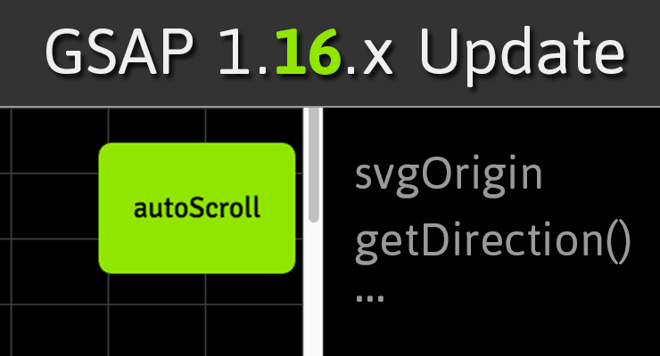 Note: This page was created for GSAP version 2. We have since released GSAP 3 with many improvements. While it is backward compatible with most GSAP 2 features, some parts may need to be updated to work properly. Please see the GSAP 3 release notes for details. We're constantly improving GSAP to solve the problems you face as a developer/designer. In the recent release of GSAP 1.16.0 and 1.16.1, Draggable got some big upgrades and SVG support has never been better across the whole platform. Here's a summary of what's most exciting in 1.16.x: Draggable gets "autoScroll" What happens if you're dragging an element inside a scrollable container (or page) and you reach the edge? Wouldn't it be nice if it automatically scrolled in that direction for you? Wouldn't it be even cooler if it applied variable-speed scrolling based on how close your mouse/touch is to the edge, and it handle MULTIPLE containers? Wish granted. Video tour Interactive demo See the Pen Draggable autoScroll by GreenSock (@GreenSock) on CodePen. Draggable's new getDirection() method Sometimes it's useful to know which direction an element is dragged (left | right | up | down | left-up | left-down | right-up | right-down), or maybe you'd like to know which direction it is compared to another element. That's precisely what getDirection() is for. Video tour Interactive demo See the Pen Draggable getDirection() by GreenSock (@GreenSock) on CodePen. Easier SVG animation with svgOrigin For SVG elements, CSSPlugin recognizes a new svgOrigin special property that works exactly like transformOrigin but it uses the SVG's global coordinate space instead of the element's local coordinate space. This can be very useful if, for example, you want to make a bunch of SVG elements rotate around a common point. So you can do TweenLite.to(svgElement, 1, {rotation:270, svgOrigin:"250 100"}) if you'd like to rotate svgElement as though its origin is at x:250, y:100 in the SVG canvas's global coordinates. It also records the value in a data-svg-origin attribute so that it can be parsed back in. So for SVG elements, you can choose whichever one fits your project better: transformOrigin or svgOrigin. Sara Soueidan used this feature in her excellent Circulus tool demo. Interactive demo See the Pen GSAP svgOrigin by GreenSock (@GreenSock) on CodePen. For more information about how GSAP has solved cross-browser SVG challenges, see https://css-tricks.com/svg-animation-on-css-transforms/ and for performance data, see https://css-tricks.com/weighing-svg-animation-techniques-benchmarks/. More Draggable improvements Draggable exposes a lockedAxis property so that you can find out whether it's "x" or "y" (assuming you set lockAxis:true in the config object). New onLockAxis callback that fires whenever the axis gets locked. Several performance optimizations were made to Draggable, particularly for transforms and scrolling. Draggable allows you to native touch-scroll in the opposite direction as Draggables that are limited to one axis. For example, a Draggable of type:"x" or "left" permit native touch-scrolling in the vertical direction, and type:"y" or "top" permit native horizontal touch-scrolling. SVG support is better than ever. It plots the rotational origin accurately, for example. Touch support has been improved as well. Bug fixes See the github changelogs for 1.16.0 and 1.16.1 for a complete list. Conclusion If you're already using GSAP and/or Draggable, we definitely recommend grabbing the latest version. If you haven't tried GSAP yet, what are you waiting for? Head over to the Getting Started article/video now and you'll be having fun in no time. Helpful links Getting Started with GSAP Draggable demo and main page Draggable docs GSAP docs Got questions? Visit the forums
 -
 Note: This page was created for GSAP version 2. We have since released GSAP 3 with many improvements. While it is backward compatible with most GSAP 2 features, some parts may need to be updated to work properly. Please see the GSAP 3 release notes for details. The following is a guest post by Chris Gannon. Chris is the leading authority on using GSAP with Edge Animate. A veteran of the Flash world, Chris has been applying his animation and design skills to many cutting-edge HTML5 projects. We asked Chris to explain to our audience some of the techniques that he uses in his client work and top-selling components on CodeCanyon.net. The concepts he describes have many practical applications and can serve to radically transform how you approach complex projects. Be sure to explore the demos and study the source code. This is not intended to be a step-by-step tutorial. .wide .content p { font-size:20px; } I love 3D stuff and I'm always trying out interesting ways to add depth to my projects. In this article I'll talk about how the CubeDial below was made, the concepts surrounding its underlying mechanism and how some of the solutions I employ overcome some common issues. Ok, so let's get going. Explore the CubeDial demo In the demo below, spin the dial. Notice that spinning the dial spins the cube. You can also swipe the cube and the dial will spin. Both the cube and the dial spin using momentum-based physics. If you are really clever, you may notice that the cube isn't really a cube, as it has 6 front-facing sides. See the Pen Gannon - Cube / Dial by GreenSock (@GreenSock) on CodePen. What's it using under the hood? The core functionality is handled by the GreenSock Animation Platform (GSAP). I always load TweenMax because it includes all the things I need in one script load: TweenLite, CSSPlugin, EasePack, timeline sequencing tools, etc. I use TweenMax all over the place not only to immediately set CSS properties (using TweenMax.set() but also to delay the setting of them, to tween them, and to trigger events not only when they start or stop but crucially whilst they're animating too. Next up is Draggable - a very useful and flexible utility that I use in practically all of my projects now as most UIs need something dragged or moved. Finally we add in ThrowPropsPlugin (and couple it up to Draggable) for that flick/throw/physics/inertia that we have all become so used to on our mobile devices. So the three main GreenSock tools I will be using are: Draggable, TweenMax and ThrowPropsPlugin. The Cube's Structure A lot of you reading this will be visually led developers so below is a diagram of what's going on with the cube (ok it's a hexahedron I think as it has 6 sides). Each face of the 3D object is a <div> with a background image. Each <div> has its Z transformOrigin point set a fair bit away from the actual face (behind it) so that when its rotationY is animated it pivots left to right in perspective. This diagram illustrates the 6 faces - their transformOrigin X and Y are simply set to the middle of the faces (50% 50%) but the crucial part is the transformOrigin Z position which is -200px. In the actual code I dynamically work out what that distance should be based on the number of faces but to keep the diagram simple, I use -200px. The dotted center is that value (-200px) and once that's set each face will appear to swing around a point 200px behind itself when you tween its rotationY. By spinning each face around the same point, we achieve the illusion of the entire cube spinning around its center. To programmatically figure out the rotational offset of each face I use this equation: rotationY: (360/numFaces) * i; What wizardry is used to make a 6-sided object look like a cube? There's a simple answer to this and to demonstrate what's going on I have coded it so that all the faces become slightly transparent when you drag the cube. Try dragging and then holding it halfway through a drag - you'll see the other faces are distorted behind (see sceenshot on left). That's because the transformPerspective on each face is set fairly low (meaning exaggerated) in order to 'bend' the other faces behind. I've also added a slider to help illustrate this in the demo at the top of the page. As you drag the slider, the faces' transformPerspective is set higher and higher to the point where if the slider is fully to the right the perspective is so flat that the cube looks more like an infinite slide show. Try dragging it halfway then spinning the dial or the cube. Creating the dial In simple terms, the dial is just a png with some divs with some numbers in them. I do a little loop based on the number of sides in the cube to generate those divs and position them over the dial image. To make the dial "spin-able" literally takes one line of code using GSAP's Draggable. myDialDraggable = Draggable.create(dial, { type:'rotation', throwProps:true // for momentum-based animation }) That's really all you need to spin something. Amazing. However, the dial I use for this project is a little more advanced. I've isolated some of the dial's code in the demo below. Take note of how the numbers stay vertically oriented as the dial spins. Spin the dial See the Pen Gannon - Dial Only by GreenSock (@GreenSock) on CodePen. Using this method keeps everything in sync and it allows for multiple UI inputs - the null object is always controlled by user interaction and its X position is used to determine the rotation value of the dial (if the cube is dragged) and rotationY value(s) of the faces (if the dial is dragged). You can also use it to work out which face is at the front and because Draggable has the brilliant snap function you can ensure that when you release your drag/throw on either the 3D element or the dial it will always animate the null (and consequently all dependent objects) to a position where a face is flat on. Once it's come to rest you can also fire an onComplete event and have something happen - you might want the active/front face to load an iframe or animate its content. Or maybe you'd like a sound to play or you might want to perform a calculation based on the X position of null. Examples of using onComplete to trigger an animation when the spin is complete can be seen in demos for EdgeRotater and EdgeDial. Interacting with the 3D cube Unlike the simplified 2D demo above, grabbing and throwing the cube is a little more involved. The secret here is that you aren't directly touching the cube at all. In fact it would be literally impossible to effectively drag the cube by a face as the face would eventually disappear in to the distance of 3D space and overlap with other faces. It would be extremely difficult to assess which face receives the touch / mouse input for dragging. To solve this issue a Draggable instance is created that has the null object as its target and uses the <div> that contains the faces of the cube as its trigger. In simple terms this means that any time you click and drag on the div containing the cube it controls the x position of the null object, which in turn sets the rotation of each face of the cube and the rotation of the dial. Its sort of like interacting with a touch screen. There is a piece of glass between you and the UI elements you tap. Where you tap on the screen dictates which UI elements respond to your input. In the CubeDial, the div that contains the cube is like the glass screen of your phone. As you move your finger over the container, the app tracks your motion and applies the new values to the null object. Wrap up Ok that's enough of the complexities - it's hopefully not that complicated when you play around with it and adjust some values and see how things react. And if you're not already familiar with this kind of mechanism, once you've got your head around it you'll probably find you use it everywhere as it can be applied in pretty much all of your interactive projects. So that's all for now - I hope you found some (if not all) of this article interesting and/or informative. Admittedly it introduces the concept of null objects using a fairly complex example but it really doesn't have to be complex (or 3D). The 2D null object demo above might be a great place to start if all of this is pretty new to you as it uses a null object at its most basic level. Dive into the entire source code of the CubeDial Demo. My first draft of this article was peppered with gushing compliments regarding GSAP and I was told to tone it down a bit and maybe leave them until the end. So here it is (it's toned down a bit because I'm quite an excitable person!). GSAP rocks my world and the world of all my clients. If you aren't using it yet you are potentially missing out on one of the best (if not the best) animation platforms for JavaScript/CSS3. Its flexibility, ease of use and performance is light years ahead of anything else and if you're not using it and are curious then I heartily recommend you dive in and see for yourself. Jack has created amazing tools for designers and developers like us and Carl does an extraordinary job of explaining how they work in a simple, relevant and, most importantly, usable way. Happy tweening!
 -
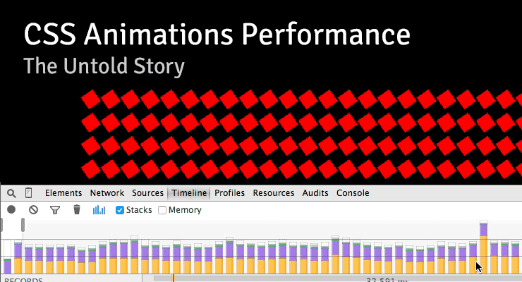 Note: This page was created for GSAP version 2. We have since released GSAP 3 with many improvements. While it is backward compatible with most GSAP 2 features, some parts may need to be updated to work properly. Please see the GSAP 3 release notes for details. There are some interesting (and surprising) performance implications of using CSS animations that aren't widely known. I stumbled across a few of them while running tests for a customer in the advertising industry who is pushing to have GSAP adopted as the standard, so I recorded a screencast explaining what I found. I figured it was worth sharing: Summary Timeline recordings in Chrome Dev Tools don't show the overhead involved with CSS animation of transforms, so people often misinterpret the [lack of] data. Recordings look "clean" with CSS and "dirty" with JS which leads to faulty conclusions about performance. CSS animations of transforms used twice as much CPU compared to JS according to Chrome's task manager. CSS animations caused the main thread to bog down more than using JavaScript animations. User interaction is typically handled on the main thread, making things feel sluggish to the user. It is especially costly if you animate transforms along with almost any other property at the same time. Webkit browsers have synchronization problems. JavaScript was faster than CSS animations on every device that I ran this test on – the only exception was animating transforms in Webkit browsers (and then there's that heavy cost on the main thread and sync problems). In order to independently control the timing/easing of transform components (rotation, scale, skew, position) in CSS, you must create a DOM node for each which negatively impacts performance. With JavaScript, no such workarounds are necessary. (see note below) I love Dev Tools - I'm not knocking it at all. These things are just tough to measure. Do your own tests! Don't put too much faith in Dev Tools or my tests. Use your eyes because ultimately perception is what matters to end users. Smooth movement and responsive UI are both important. Links Raw Codepen test Google's Paul Lewis addresses CSS vs. JS Animations A great article about hardware accelerated CSS by Ariya Hidayat Why GSAP? - a practical developer's guide UPDATE: After recording the video, I did some more tests that showed that one of the biggest contributors to the slowdowns in the pure CSS version was the fact that multiple elements had to be nested in order to accomplish the independent transform component controls. In other words, staggering the start/end times (or easing) of rotation, scale, and position is practically impossible in pure CSS unless you nest things like that, but there's a relatively significant performance tradeoff. When nesting could be avoided, pure CSS animation of only transforms did appear smoother on webkit browsers under heavy pressure and it was basically indistinguishable from optimized JS animations under all other levels of pressure.
 -
 Note: This page was created for GSAP version 2. We have since released GSAP 3 with many improvements. While it is backward compatible with most GSAP 2 features, some parts may need to be updated to work properly. Please see the GSAP 3 release notes for details. We're excited to announce enhanced SVG support baked right into GSAP's CSSPlugin. Now you can animate the rotation, scale, skew, position (and even change the transform origin) of SVG elements just like normal DOM elements. The chart below illustrates a number of cross-browser bugs related to CSS transforms on SVG elements. Four modern browsers interpret the same basic animation code in drastically different ways. Browser comparison (without GSAP) See the Pen GIFS: SVG + CSS Transform Problems by GreenSock (@GreenSock) on CodePen. Be sure to test the demo above in IE, Opera, FireFox, Safari and Chrome to see equal results. Find out how it all works In order to help a wider audience understand how to get around the obstacles of working with SVG, Jack wrote an article packed with tons of info, animation demos and a video showing all the juicy details on www.css-tricks.com. We're honored that Chris Coyier allowed us to share these enhancements and time-saving techniques with the wider developer community on his highly-respected blog. Get all the juicy details in: SVG Animation and CSS Transforms: A Complicated Love Story. The techniques discussed will surely transform your SVG animation workflow
 -
![More information about "CSS Animations: Workflow Issues Exposed [Includes Videos]"](https://gsap.com/community/uploads/monthly_2014_01/535684648_201401blog-CSSWorkflow.jpg.1f90c672fe87c2148eb04653fef395b2.jpg) Note: This page was created for GSAP version 2. We have since released GSAP 3 with many improvements. While it is backward compatible with most GSAP 2 features, some parts may need to be updated to work properly. Please see the GSAP 3 release notes for details. A post by Carl Schooff, GreenSock's "Geek Ambassador" Hot on the heels of the CSS Myth-Busting article, I'm going to take a deeper look into CSS Animations and how they fit (or don't fit) into a modern animator's workflow. This isn't about simple fades or basic transitions (CSS is great for those); Developers who use animation to tell a story or deliver rich interactivity require a very different workflow than those who are simply doing UI transitions. I'm going to show you exactly where some of the pain points are for a typical project and how they can bring your workflow to a grinding halt. Even relatively simple animations like the one below can become surprisingly cumbersome with CSS. Example of a Simple, "Story-Telling" Animation See the Pen GSAP: Full Version Complete by GreenSock (@GreenSock) on CodePen. Seriously, You guys are beating up on CSS Animations again? Really, I'm not trying to be negative for the sake of being negative. It's just that so many developers are looking for animation tools that accommodate their real-world projects and the industry seems to scream "use CSS!" even though the API doesn't adequately serve the workflow of modern animators who are building immersive experiences or animations that "tell a story". Too many people are being led down a path that results in utter frustration, or at least a lot of wasted time. And no, CSS Animations aren't "evil". In fact, sometimes they're perfectly appropriate (see the CSS Myth-Busting article for details). There are CSS fans who craft animations and proudly shout "Pure CSS! No JS!" as if the grueling effort necessary is a badge of honor. The accomplishment is indeed admirable, and we tip our hats to them. But WOW it's a lot of work and doesn't exactly lend itself to experimentation or easy edits. Quite simply, we aim to change the tide with tools like GSAP. The majority of the GSAP API has been shaped by feedback from real developers in the trenches over the course of many years. The process of animation should be fun and inspiring. Challenge! Still not convinced that GSAP is better suited for professional animators? I'm very interested to see how this animation can be built more effectively. Are you in the CSS-Purist camp? Do you prefer to trigger animations with JavaScript setTimeouts? Maybe you have another library that blows GSAP away. Dig in and build the animation I've been using with your own choice of tools. Below are some resources that should make it easy to get started. When you're done, just drop us a line in the comments or in the forums. Full storyboard showing css values for each key frame: http://codepen.io/GreenSock/pen/DzHBs Starter Pen: http://codepen.io/GreenSock/pen/EsAvF Recommended reading: Myth Busting: CSS Animations vs JavaScript (css-tricks.com guest post) Main GSAP page Jump Start: GSAP JS Cage matches: CSS3 transitions vs GSAP | jQuery vs GSAP 3D Transforms & More CSS3 Goodies Arrive in GSAP JS
Note: This page was created for GSAP version 2. We have since released GSAP 3 with many improvements. While it is backward compatible with most GSAP 2 features, some parts may need to be updated to work properly. Please see the GSAP 3 release notes for details. A post by Carl Schooff, GreenSock's "Geek Ambassador" Hot on the heels of the CSS Myth-Busting article, I'm going to take a deeper look into CSS Animations and how they fit (or don't fit) into a modern animator's workflow. This isn't about simple fades or basic transitions (CSS is great for those); Developers who use animation to tell a story or deliver rich interactivity require a very different workflow than those who are simply doing UI transitions. I'm going to show you exactly where some of the pain points are for a typical project and how they can bring your workflow to a grinding halt. Even relatively simple animations like the one below can become surprisingly cumbersome with CSS. Example of a Simple, "Story-Telling" Animation See the Pen GSAP: Full Version Complete by GreenSock (@GreenSock) on CodePen. Seriously, You guys are beating up on CSS Animations again? Really, I'm not trying to be negative for the sake of being negative. It's just that so many developers are looking for animation tools that accommodate their real-world projects and the industry seems to scream "use CSS!" even though the API doesn't adequately serve the workflow of modern animators who are building immersive experiences or animations that "tell a story". Too many people are being led down a path that results in utter frustration, or at least a lot of wasted time. And no, CSS Animations aren't "evil". In fact, sometimes they're perfectly appropriate (see the CSS Myth-Busting article for details). There are CSS fans who craft animations and proudly shout "Pure CSS! No JS!" as if the grueling effort necessary is a badge of honor. The accomplishment is indeed admirable, and we tip our hats to them. But WOW it's a lot of work and doesn't exactly lend itself to experimentation or easy edits. Quite simply, we aim to change the tide with tools like GSAP. The majority of the GSAP API has been shaped by feedback from real developers in the trenches over the course of many years. The process of animation should be fun and inspiring. Challenge! Still not convinced that GSAP is better suited for professional animators? I'm very interested to see how this animation can be built more effectively. Are you in the CSS-Purist camp? Do you prefer to trigger animations with JavaScript setTimeouts? Maybe you have another library that blows GSAP away. Dig in and build the animation I've been using with your own choice of tools. Below are some resources that should make it easy to get started. When you're done, just drop us a line in the comments or in the forums. Full storyboard showing css values for each key frame: http://codepen.io/GreenSock/pen/DzHBs Starter Pen: http://codepen.io/GreenSock/pen/EsAvF Recommended reading: Myth Busting: CSS Animations vs JavaScript (css-tricks.com guest post) Main GSAP page Jump Start: GSAP JS Cage matches: CSS3 transitions vs GSAP | jQuery vs GSAP 3D Transforms & More CSS3 Goodies Arrive in GSAP JS -
 Note: This page was created for GSAP version 2. We have since released GSAP 3 with many improvements. While it is backward compatible with most GSAP 2 features, some parts may need to be updated to work properly. Please see the GSAP 3 release notes for details. With the release of iOS 7, I was anticipating some big leaps forward in browser performance. What I found was quite surprising. Is anyone else experiencing the same thing? Here's a quick [and very casual] video showing what I discovered: A lot of people in the industry talk about the benefits of using CSS transitions because they're so much faster, especially with transforms (scale/translate/rotate) on mobile devices. What happened? Why is Zepto (which uses CSS transitions) so much slower? GSAP's performance remains solid in iOS 7 (far better than jQuery and other libraries), but CSS transitions fall flat on their face (at least with transforms). Can anyone shed some light on what's happening? Are you seeing the same results in iOS 7? Also, is anyone else seeing worse performance when altering the scrollTop or scrollLeft of DOM elements? Useful links Speed test Draggable Demo CSS Transitions/Animations vs. GSAP Cage Match jQuery vs. GSAP Cage Match Why GSAP? A practical guide for developers UPDATE: Apple reached out to us and acknowledged the apparent bug and said they're working on a fix. (Thanks Apple)
 -
 Note: This page was created for GSAP version 2. We have since released GSAP 3 with many improvements. While it is backward compatible with most GSAP 2 features, some parts may need to be updated to work properly. Please see the GSAP 3 release notes for details. Making a DOM element draggable isn't terribly difficult - there are jQuery plugins and even some native HTML5 capabilities in newer browsers. But generic dragging is kinda boring. What about smooth, natural momentum-based continuation after the user releases the mouse (or touch on mobile devices)? What about imposing bounds and edge resistance and silky-smooth redirection to certain landing values that you provide? Or flick/drag scrolling with bounce-back that doesn't look awkward? Or instead of dragging to change the position of an element, what if you want to spin it? Maybe you even want to track the momentum and let it come to rest naturally or rig it to glide to a stop at a certain value, Wheel-of-Fortune style? Yeah, that's a lot more complex. In fact, it can be a real drag to build (sorry, the pun was irresistible). Draggable makes it remarkably simple. More importantly, it delivers a very fluid user experience on both mobile devices and desktop browsers. Instead of explaining what makes Draggable so special, we built an interactive demo that showcases some of its talents. There are even code samples that update as you change the options. Go play around and have some fun. View Demo
 -

 Note: This page was created for GSAP version 2. We have since released GSAP 3 with many improvements. While it is backward compatible with most GSAP 2 features, some parts may need to be updated to work properly. Please see the GSAP 3 release notes for details. This video walks you through some common problems that professional animators face every day and shows you how GSAP’s TimelineLite tackles these challenges with ease. Although GSAP is very powerful and flexible, the API is beginner-friendly. In no time you will be creating TimelineLite animations that can bend and adapt to the needs of the most demanding clients and art directors. Watch the video and ask yourself, "Can my current animation toolset do this?" Enjoy. Video Highlights Tweens in a TimelineLite naturally play one-after-the-other (the default insertion point is at the end of the timeline). No need to specify or update the delay of each tween every time the slightest timing changes are made. Tweens in a TimelineLite don't need to play in direct sequence; you can overlap them or easily add gaps. Multiple tweens can all start at the same time or slightly staggered. Easily to rearrange the order in which tweens play. Jump to any point of the timeline to finesse a particular animation. No need to watch the whole animation each time. Add labels anywhere in the timeline to mark where other tweens should be added, or use them for navigation. Control the speed of the timeline with timeScale(). Full control over every aspect of playback: play, pause, reverse, resume, jump to any label or time, and much more. Unlike jQuery.animate() or other JS libraries that allow you to chain together multiple animations on a particular object, GSAP’s TimelineLite lets you sequence multiple tweens on multiple objects. It's a radically different and more practical approach that allows for precise synchronization and flexibility. If you are still considering CSS3 animations or transitions for robust animation after watching this video, please watch it again Check out this Pen! If you are wondering what "autoAlpha" refers to in the code above, its a convenience feature of CSSPlugin that intelligently handles "opacity" and "visibility" combined. Recommended reading: Main GSAP JS page Jump Start: GSAP JS Speed comparison Cage matches: CSS3 transitions vs GSAP | jQuery vs GSAP jQuery.animate() with GSAP: get the jquery.gsap.js plugin! 3D Transforms & More CSS3 Goodies Arrive in GSAP JS
 -
Note: This page was created for GSAP version 2. We have since released GSAP 3 with many improvements. While it is backward compatible with most GSAP 2 features, some parts may need to be updated to work properly. Please see the GSAP 3 release notes for details. New DirectionalRotationPlugin Have you ever tweened rotation to a particular value but wished that you could control which direction it traveled (clockwise or counter-clockwise)? For example, if the current rotation is 170 and you tween to -170, normally that would travel counter-clockwise -340 degrees but what if you prefer rotating 20 degrees clockwise instead? Or maybe you just want it to go in the shortest direction to that new position (20 degrees in this case). This is all possible now with the DirectionalRotationPlugin. Previously, shortRotation was available in CSSPlugin, but there were three shortcomings (pardon the pun): It always went in the shortest direction - it wasn't possible to define a particular direction (clockwise or counter-clockwise). It required using a different property name ("shortRotation" or "shortRotationX" or "shortRotationY") instead of the regular property name ("rotation" or "rotationX" or "rotationY"). It only worked on DOM elements. What if you have a generic object or an EaselJS Shape (or whatever)? The new DirectionalRotationPlugin solves all of these issues. First of all, its functionality is baked into CSSPlugin, so you don't even need to load the DirectionalRotationPlugin if you're only animating DOM elements. The plugin is also included in TweenMax, so there's no need to load a separate plugin there either. Use the new syntax to get the desired behavior - add one of the following suffixes to the value: "_cw" for clockwise, "_ccw" for counter-clockwise, and "_short" to go whichever direction is shortest. Here are some examples: //tweens to the 270 position in a counter-clockwise direction (notice the value is in quotes) TweenMax.to(element, 1, {rotation:"270_ccw"}); //tweens to the -45 position in a clockwise direction TweenMax.to(element, 1, {rotation:"-45_cw"}); //tweens 1.5 radians more than the current rotationX value, and travels in the shortest direction TweenMax.to(element, 1, {rotationX:"+=1.5rad_short"}); If you're tweening a more generic object (anything that's not a DOM element), you can use the DirectionalRotationPlugin. If you pass in a simple value, it will assume you're attempting to tween the target's "rotation" property but you can tween ANY rotational properties of any name by passing in an object with the appropriate properties. Here are some examples: //start with a generic object with various rotation values var obj = {rotation:45, rotationX:0, rotationY:110}; //tweens rotation to 270 in a clockwise direction TweenLite.to(obj, 1, {directionalRotation:"270_cw"}); //tweens rotationX to -45 in a counter-clockwise direction and rotationY to 200 in a clockwise direction: TweenLite.to(obj, 1, {directionalRotation:{rotationX:"-45_ccw", rotationY:"200_cw"}}); As of 1.9.0, shortRotation is deprecated in favor of this new (more flexible and concise) syntax. New AttrPlugin This plugin allows you to tween any numeric attribute of a DOM element. For example, let's say your DOM element looks like this: <rect id="rect" fill="none" x="0" y="0" width="500" height="400"></rect> You could tween the "x", "y", "width", or "height" attributes using AttrPlugin like this: //tuck any attributes you want to tween into an attr:{} object TweenMax.to("#rect", 1, {attr:{x:100, y:50, width:100, height:100}, ease:Linear.easeNone}); You can tween an unlimited number of attributes simultaneously. Just use the associated property name inside the attr:{} object. The AttrPlugin is included inside the TweenMax JS file, so you don't need to load the plugin separately if you're using TweenMax. New TextPlugin This plugin allows you to tween the text content of a DOM element, replacing it one character at a time (or one word at a time if you set the delimiter to " " (a space) or you can even use a custom delimiter). So when the tween is finished, the DOM element's text has been completely replaced. This also means that if you rewind/restart the tween, the text will be reverted to what it was originally. Here is a simple example of replacing the text in yourElement: //replaces yourElement's text with "This is the new text" over the course of 2 seconds TweenMax.to(yourElement, 2, {text:"This is the new text", ease:Linear.easeNone}); If you'd like to use a different delimiter so that instead of replacing character-by-character, it gets replaced word-by-word, just pass an object with configuration properties like this: //replaces word-by-word because the delimiter is " " (a space) TweenMax.to(yourElement, 2, {text:{value:"This is the new text", delimiter:" "}, ease:Linear.easeNone}); Sometimes it's useful to have the new text differentiated visually from the old text, so TextPlugin allows you to assign a css class to the new and/or old content, like this: //wraps the old text in <span class="class1"></span> and the new text in a <span class="class2"></span> TweenLite.to(yourElement, 2, {text:{value:"This is the new text", newClass:"class2", oldClass:"class1"}, ease:Power2.easeIn}); As indicated, defining a newClass and/or oldClass will result in wrapping a <span> tag around the associated text. The TextPlugin is NOT included inside TweenMax, so you'll need to load it separately. Other updates and enhancements in 1.9.0: Added support for hsl() and hsla() colors in CSSPlugin and ColorPropsPlugin Implemented a new (more concise and clear) way to register plugins. Old plugins will still work fine, but most of the new ones in 1.9.0 use the new style of registering which won't work with old versions of TweenLite/TweenMax. Please just make sure all your files are updated. Fixed issue that caused className to be ignored by the autoCSS feature that creates the css:{} wrapper internally. Fixed issue that could cause em not to be translated to px accurately, causing a jump when the start and end units for the tween don't match (like px to em or visa-versa) Fixed backfaceVisibility so that it is properly prefixed when necessary Now setting "float" on a DOM element will work across browsers including Firefox and IE. Worked around issue that caused x/y/z transforms not to work properly if they exceeded 21,474 (or -21,474). Fixed issue that caused values not to be interpreted correctly if a negative number had a relative prefix, like "+=-50px" or "-=-50px" Fixed issue in EaselPlugin that prevented ColorMatrixFilter tweens from working correctly when the starting matrix wasn't an identity matrix Now fromTo() and staggerFromTo() methods have immediateRender set to true by default, just like from() and staggerFrom() always did. This seems like the preferred behavior for most developers, but you can certainly set immediateRender:false on any tween if you prefer that behavior. Now fromTo() and staggerFromTo() tweens that have immediateRender:false will record their pre-tween values (before even implementing the "from" part of the tween) so that if their parent timeline rewinds past the beginning of the tween, it restores values to their originals. Get it now Download the latest version of GSAP using the fancy new download screen, and notice that everything is also available as CDN links as well. The docs have been updated to reflect all these changes. Questions? Swing by the forums to get your questions answered.
-
 Note: This page was created for GSAP version 2. We have since released GSAP 3 with many improvements. While it is backward compatible with most GSAP 2 features, some parts may need to be updated to work properly. Please see the GSAP 3 release notes for details. Update: don't miss our guest post on css-tricks.com, Myth Busting: CSS Animations vs. JavaScript which provides some additional data, visual examples, and a speed test focused on this topic. Ever since CSS3 "transitions" and "animations" were introduced, they have been widely lauded as the future of animation on the web. It often seems like all the "cool kids" are talking about them. Should you jump on the bandwagon? Is JavaScript animation headed for extinction? How does the new GreenSock Animation Platform (GSAP) fare when it steps into the ring and faces off against the hyped-up tag-team of CSS3 transitions & animations? Does GSAP have the chops to hold its own? Let's find out. Ready...FIGHT! Performance One of the most common arguments in favor of CSS3 animations has been that they're hardware accelerated, thus outperform any JavaScript-based equivalent. The theory is that if you define your transitions/animations directly in css, the browser can worry about all the calculations behind the scenes and tap into hardware and native code to execute them. Sounds awesome. Unfortunately it's not quite that clean. Only certain properties are hardware-accelerated (like 3D transforms and opacity - mostly ones that don't affect document flow) and different browsers handle things differently. Plus every comparison we saw on the web pitted CSS3 transitions against jQuery, but GSAP is up to 20 times faster than jQuery. In our real-world tests, we saw drastic differences in performance among the various browsers and when tested head-to-head against GSAP, CSS3 animations were usually slower! Weird. As expected, however, 3D transforms were indeed faster under heavy stress although in most situations you'd never notice a difference. GSAP is extremely optimized. UPDATE (2015-01-05): There are some interesting (and surprising) performance implications of using CSS animations that aren't widely known. Here's a screencast that shows how Dev Tools doesn't report the overhead involved with CSS animations, some synchronization problems, and how they can drag down the main thread performance more than JS. To see a simple comparison for yourself, select the "Zepto" engine in the speed comparison because it uses CSS3 transitions for its animations, and then compare it to GSAP. Beware that the fps (frames per second) counter in the lower right corner isn't always accurate in some browsers (like recent versions of Safari) when using CSS3 transitions because requestAnimationFrame events [incorrectly] get dispatched even when the screen is clearly not being updated. So the animation may actually be running at a very jerky 10fps, yet 50+ requestAnimationFrame cycles are being triggered by the browser! This exposes another flaw in CSS3 transitions - there's no way to know when updates truly occur. There's only a "complete" event fired at the end of the transition/animation. If anyone knows how to get a more accurate fps counter in Safari while using CSS3 transitions, please let us know. Another performance issue to note in the speed comparison is the clumping that occurs with many engines (including Zepto) under heavy stress, where the stars begin pulsing out in rings instead of a nicely dispersed field. Even though GSAP was faster than CSS3 transitions in the majority of our real-world tests, it's still true that 3D transforms and opacity tweens are faster with CSS3 transitions and it's possible that browsers will be able to further tap into hardware acceleration in the future, so we'll call this round a tie. Feel free to build your own tests to see how things compare in your workflow. Performance winner: TIE Controls This is one of the major weak spots for CSS transitions (its "glass jaw" of sorts). Let's say you invest the time in writing a bunch of css for a whiz-bang animation and then you need to control the whole thing - good luck with that. It is virtually impossible. GSAP's object oriented architecture allows you to pause, resume, reverse, restart, or seek to any spot in any tween. Even adjust timeScale on the fly for slow motion or fastforward effects. Place tweens in a timeline with precise scheduling (including overlaps or gaps) and then control the whole thing just like it's a single tween. All of the easing and effects remain perfectly intact as you reverse, adjust timeScale, etc. (with CSS transitions, easing flip-flops upon reverse). You can even kill individual portions of a tween anytime (like if a tween is controlling both "top" and "left" properties, you can kill "left" while "top" continues). Put labels in a timeline to mark important spots and seek() to them anytime. Imagine trying to build the example below using CSS transitions. It would be virtually impossible. With GSAP, it's easy. In fact, all of the animation is done with 2 lines of code. Drag the scrubber, click the buttons below, and see how easy it is to control the sequenced animation. Controls winner: GSAP Tweenable Properties Both competitors can animate transforms (2D and 3D), colors, borderRadius, boxShadow, and pretty much every important property, but there's one key shortcoming of CSS - you cannot animate individual transforms distinctly! For example, try rotating an object and then halfway through that animation, start scaling it with a different ease and finish at a different time. Since all transforms (scaleX, scaleY, rotation, rotationX, rotationY, skewX, skewY, x, y, and z) are all mashed into one "transform" property, it's virtually impossible to handle them distinctly. GSAP not only works around this limitation, but it also allows you to do advanced things like animate along Bezier paths or do momentum-based motion (with ThrowPropsPlugin) or relative tweens or animate the scroll position or do directional rotation or physics-based motion, etc. Plus GSAP can animate any numeric property of any object, not just DOM elements. Do you really want to use one toolset (CSS) for animating DOM elements and then have to switch to a completely different toolset and syntax when you do canvas-based animation? GSAP handles both consistently. CSS transitions and animations just can't compete here. Tweenable properties winner: GSAP Workflow When you're creating fun and interesting animations, workflow is critical. You need to be able to quickly build sequences, stagger start times, overlap tweens, experiment with eases, leverage various callbacks and labels, and create concise code. It would be great to modularize your code by creating functions that each spit back an animation object (tween or timeline) which can be inserted into another timeline at a precise time. You need a flexible, powerful system that lets you experiment without wasting hours. GSAP wipes the floor with CSS transitions in this round. Anyone who has attempted an ambitious project with CSS3 transitions/animations will attest to the fact that they tend to get very cumbersome and verbose. Experimenting with timing and fine-tuning details can get extremely tedious especially when dealing with all the browser prefixes. GSAP CSS3 transitions = supported = unsupported Flexible object-oriented architecture that allows animations to be nested inside other animations as deeply as you want Supported Unsupported Concise code that doesn't require vendor prefixes Supported Unsupported Create sequences (even with overlapping animations) that auto-adjust as you insert/remove/change intermediate pieces of animation (makes experimenting MUCH easier) Supported Unsupported Accommodate virtually any ease including Bounce, Elastic, SlowMo, RoughEase, SteppedEase, etc. Supported Unsupported Animate things into place (backwards) with convenience methods like from() and staggerFrom() Supported Unsupported Callbacks for when an animation starts, updates, completes, repeats, and finishes reversing, plus optionally pass any number of parameters to those callbacks Supported Unsupported Place labels at specific times in a sequence so that you can seek() there (and/or insert animations there) Supported Unsupported Animate any numeric property of any JavaScript object, not just DOM elements (great for canvas-based animation). Supported Unsupported Workflow winner: GSAP Compatibility CSS transitions simply don't work in older browsers, even Internet Explorer 9. GSAP works in all browsers (although some particular features may be disabled, like 3D transforms in IE8). Once again, this round was no contest. GSAP can even do 2D transforms like rotation, scaleX, scaleY, x, y, skewX, and skewY all the way back to IE6 including transformOrigin functionality! Plus it works around scores of other browser issues so that you can focus on the important stuff. Safari's 3D transformOrigin bug? No problem. Firefox's flashing 3D elements bug? No worries. Inconsistency in IE's backgroundPosition values? GSAP has you covered. Vendor prefixes? Nah, GSAP adds 'em for you when necessary. Compatibility winner: GSAP Popularity CSS3 transitions have been talked about (and used) for years all over the web whereas GSAP is relatively new. It can't match CSS3 transitions' popularity. As clients start pushing for more aggressive animations and HTML5 games proliferate and operating systems become very JavaScript-friendly, the balance may very well shift quickly. For now, though, this round goes squarely to CSS transitions. Popularity winner: CSS3 transitions Conflict management What happens if a particular set of properties (like "left" and "top") are animating and then you need to redirect one of those to a different value (like "left" to 100px instead of 300px) using a different ease and duration? With CSS transitions, it's a very complex process. With GSAP, it's simple and automatic. In fact, there are several overwrite modes you can choose from. Conflict management winner: GSAP Support There are numerous places on the web where you can ask the community your CSS transitions-related questions, but GSAP has dedicated support forums where there's rarely a question that remains unanswered for more than 24 hours. GreenSock's forums are manned by paid staff (including the author of the platform), so you're quite likely to get solid answers there. Add to that the fact that GreenSock has a track record of being much more agile in terms of squashing bugs and releasing updates than browsers do for CSS3 transitions, so GSAP gets the upper hand here. Support winner: GSAP Expandability GSAP employs a plugin architecture, making it relatively easy to add features and custom animation properties but CSS transitions have no such equivalent. You're stuck with what the browsers decide to offer. In addition to CSSPlugin, GSAP already has plugins like ScrollToPlugin for scrolling to specific window or div scroll positions, BezierPlugin for animating along Bezier curves, ThrowPropsPlugin for momentum-based motion, and RaphaelPlugin, EaselPlugin, and KineticPlugin for those libraries (Raphael, EaselJS, and KineticJS). Plus there are physics-based plugins like Phyics2DPlugin and PhysicsPropsPlugin as well as a fun ScrambleTextPlugin for Club GreenSock members. More plugins are on their way, and you can create your own too. Expandability winner: GSAP Learning resources Again, the popularity of CSS3 transitions trumps anything GSAP could throw at it right now. There are lots of tutorials, videos, and articles about CSS3 transitions whereas GSAP is new to the game. GreenSock is being aggressive about putting together solid resources (like the Jump Start tour) and the community is crankin' out some great articles and videos too, but CSS3 transitions score the win in this round. Learning resources winner: CSS3 TRANSITIONS Price & license Both CSS3 transitions and GSAP are completely free for almost every type of usage. GSAP allows you to edit the raw source code to fix bugs (if that's something you need to do), but there's no way to edit the source code that drives CSS3 transitions. Then again, there's no special license required to use them either. If you plan to use GSAP in a product/app/site/game for which a fee is collected from multiple customers, you need the commercial license that comes with "Business Green" Club GreenSock memberships (one-off commercial projects don't require the special license). It's actually a more business-friendly license in many ways than a typical open source license that offers no warranties or backing of any kind or imposes code sharing or credit requirements. GreenSock's licensing model provides a small funding mechanism that benefits the entire user base because it empowers continued innovation and support, keeping it free for the vast majority of users. See the licensing page for details. Although there are some clear benefits of GreenSock's model, we'll give this round to CSS3 transitions because using them is technically "free" in more scenarios than GSAP. Price & license winner: CSS3 TRANSITIONS File size This is a tricky round indeed because GSAP requires inclusion of at least 1 JavaScript file whereas CSS3 transitions leverage native code in the browser, but the code you'd have to write to accomplish the same thing in CSS3 animations or transitions is often far more verbose, offsetting the kb savings. For example, let's take a relatively simple sequenced animation (see codepen or jsfiddle? GSAP code: var tl = new TimelineLite(); tl.staggerFrom('.box', 0.5, {opacity:0, scale:0, rotation:-180}, 0.3) .staggerTo('.box', 0.3, {scale:0.8}, 0.3, 0.7); This type of thing is impossible with CSS3 transitions, but it can be done with CSS3 animations as long as we give each element its own class name or ID. Let's take a look at the CSS code (see codepen or jsfiddle? Equivalent CSS3 Animation: .animated { -webkit-animation-fill-mode: both; -moz-animation-fill-mode: both; animation-fill-mode: both; -webkit-animation-duration: 1s; -moz-animation-duration: 1s; animation-duration: 1s; } @-webkit-keyframes introAnimation { 0% { -webkit-transform: scale(0) rotate(-180deg) ; opacity: 0; } 50% { -webkit-transform: scale(1) rotate(0deg) ; opacity: 1; } 70% { -webkit-transform: scale(1) rotate(0deg); } 100% { -webkit-transform: scale(0.8) rotate(0deg); } } @-moz-keyframes introAnimation { 0% { -moz-transform: scale(0) rotate(-180deg); opacity: 0; } 50% { -moz-transform: scale(1) rotate(0deg); opacity: 1; } 70%{ -moz-transform: scale(1) rotate(0deg); } 100% { -moz-transform: scale(0.8) rotate(0deg); } } @keyframes introAnimation { 00% { transform: scale(0) rotate(-180deg); opacity: 0; } 50% { transform: scale(1) rotate(0deg); opacity: 1; } 70%{ transform: scale(1) rotate(0deg); } 100% { transform: scale(0.8) rotate(0deg); } } .introAnimation { -webkit-backface-visibility: visible !important; -webkit-animation-name: introAnimation; -moz-backface-visibility: visible !important; -moz-animation-name: introAnimation; backface-visibility: visible !important; animation-name: introAnimation; } .two { -webkit-animation-delay: 0.3s; -moz-animation-delay: 0.3s; animation-delay: 0.3s; } .three { -webkit-animation-delay: 0.6s; -moz-animation-delay: 0.6s; animation-delay: 0.6s; } .four { -webkit-animation-delay: 0.9s; -moz-animation-delay: 0.9s; animation-delay: 0.9s; } .five { -webkit-animation-delay: 1.2s; -moz-animation-delay: 1.2s; animation-delay: 1.2s; } .six { -webkit-animation-delay: 1.5s; -moz-animation-delay: 1.5s; animation-delay: 1.5s; } .seven { -webkit-animation-delay: 1.8s; -moz-animation-delay: 1.8s; animation-delay: 1.8s; } .eight { -webkit-animation-delay: 2.1s; -moz-animation-delay: 2.1s; animation-delay: 2.1s; } .nine { -webkit-animation-delay: 2.4s; -moz-animation-delay: 2.4s; animation-delay: 2.4s; } As you can see, the CSS3 code is more than 10 times longer! And what if you want to have the entire sequence repeat 3 times? Good luck with that in CSS - you can set an animation-iteration-count but it only applies to each individual element, so it doesn't give us the effect we're after. And what if you want to experiment with the easing or offsets/delays or rotational values? It is quite cumbersome to say the least, even if you use sass or something like that. With GSAP, it's simple. If you only need very simple animations/transitions, CSS3 would deliver smaller file sizes, but once you start getting more aggressive and expressive with your animations, the scales shift quickly and GSAP becomes more economical. The other thing to keep in mind is that GSAP's JS file(s) are typically cached by the browser, so the savings page-to-page is much larger since the code you write on each page is far more concise. In other words, think of how much js/css the browser must actually request from the server over the course of your users' multi-page visit to your site. File size winner: TIE Flexibility Let's face it: basic tweening is pretty straightforward for any system, but it's really the details and advanced features that make a robust platform shine. GSAP crushes CSS3 transitions and animations when it comes to delivering a refined, professional-grade tool set that's truly flexible. Here are just a few of the conveniences baked into GSAP: Tween any numeric property of any object. Optionally round values to the nearest integer to make sure they're always landing on whole pixels/values. Animate along Bezier curves, even rotating along with the path or plotting a smoothly curved Bezier through a set of points you provide (including 3D!). GSAP's Bezier system is super flexible in that it's not just for x/y/z coordinates - it can handle ANY set of properties. Plus it will automatically adjust the movement so that it's correctly proportioned the entire way, avoiding a common problem that plagues Bezier animation systems. You can define Bezier data as Cubic or Quadratic or raw anchor points. Animate any color property of any JavaScript object (not just DOM elements). Define colors in any of the common formats like #F00 or #FF0000 or rgb(255,0,0) or rgba(255,0,0,1) or hsl(30, 50%, 80%) or hsla(30, 50%, 80%, 0.5) or "red". Set a custom fps (frames per second) for the entire engine (the default is 60fps). All tweens are perfectly synchronized (unlike many other tweening engines). Use the modern requestAnimationFrame API to drive refreshes or a standard setTimeout (the default is requestAnimationFrame with a fallback to setTimeout) Tons of easing options including proprietary SlowMo, RoughEase, and SteppedEase along with all the industry standards Animate css style sheet rules themselves with CSSRulePlugin Animate the rotation of an object in a specific direction (clockwise, counter-clockwise, or whichever is shortest) by appending "_cw", "_ccw", and "_short" to the value. You can tween getter/setter methods, not just properties. For example, myObject.getProp() and myObject.setProp() can be tweened like TweenLite.to(myObject, 1, {setProp:10}); and it will automatically recognize that it's a method and call getProp() to get the current value when the tween starts. Same for jQuery-style getters/setters that use a shared method like myObject.prop(). You can even tween another tween or timeline! For example, TweenLite.to(otherTween, 1, {timeScale:0.5}) would animate otherTween.timeScale to 0.5 over the course of 1 second. You can even scrub the virtual playhead of one tween/timeine with another tween by animating its "time". Flexibility winner: GSAP Conclusion Despite the hype surrounding CSS3 transitions and animations, they just aren't well-suited for professional-grade animation tasks. They did manage to win a few rounds in this match but ultimately GSAP man-handled them, sending them running from the ring like scared sissies. Of course we're slightly biased, but check out the facts for yourself. Kick the tires. Audition GSAP on your next project. See how it feels once you get past the initial learning curve. If you only need simple fades or very basic animation in modern browsers, CSS3 transitions are probably just fine. However, what happens when your client wants to do something more expressive? What if browser compatibility becomes an issue? Why not build on a solid foundation to begin with so that you don't find yourself having to rewrite all your animation code? If you want professional-grade scripted animation, look no further. To get started fast, check out our Jump Start tour. Recommended reading: Main GSAP JS page Why GSAP? A practical guide for developers Jump Start: GSAP JS jQuery vs GSAP: cage match 3D Transforms & More CSS3 Goodies Arrive in GSAP JS Speed comparison Explanation of CSS3 transitions, transforms and animations P.S. A rant about where animation logic belongs: We can't put this post to bed without mentioning a beef we've got with the whole concept of putting all your animation logic in css. Ever since the <blink> tag, there has been this tendency for browser vendors to offer developers these nifty "conveniences" that end up encouraging them to mix markup and/or style rules with behavioral logic. Is that really a good idea? One of the wonderful things about the modern web is that we've got this lovely separation between markup, presentation/styling, and behavioral logic (at least that's the goal). Should we be blurring the line like this? Isn't JavaScript the logic layer that should be handling state changes, application logic, reaction to user interaction (which often includes animation), etc.? Some may claim "But putting animation in css is great because that way if the user has JavaScript disabled, the animations still work!" Do you really think users of the modern web can turn off JavaScript and expect to browse the web with great results? Is that who you're targeting for a rich experience? And if they turned off JavaScript, might they have done so specifically to avoid annoying animations? Is it really helping to shift animation logic into css where they can't turn it off? In the web of yesteryear, animations were quite simplistic; fade this, slide that. Done. Anything more aggressive was relegated to a plugin like Flash which afforded incredible richness and complexity in terms of animation. But today, clients want that sort of expressiveness directly in the browser. It needs to work on mobile devices. It's no longer about simple fade-ins or sliding an image across the screen. CSS3 transitions fit the old mentality well, but not the new one. CSS3 animations technically provide more flexibility but they fall miserably short and they still force behavioral logic into the style layer. And to use them effectively, we still need JavaScript to at least swap classes and trigger things. From a development and debugging standpoint, when I apply a class to an element how would I know if that will trigger an animation or transition or neither? Should I have to keep bouncing back and forth between css and JS to manage behavioral logic related to animations? Maybe we're just ill-informed and there are some fantastic reasons for putting behavioral logic like animation into the css layer, but one thing seems pretty clear: the current way that developers have to build all but the simplest css animation leaves a LOT to be desired. The API is terribly limiting and clunky. Let's move the web forward. Let's make animation fun and flexible. Let's keep behavioral logic and style rules distinct. Let's leverage the incredible flexibility of JavaScript. If we've misrepresented anything here or if you want to weigh in with your opinion about where behavioral logic like animation belongs, feel free to post your comment below. If you're someone who has attempted an aggressive animation task with CSS3 transitions/animations as well as GSAP, we'd love to hear how you felt they compared.
