Search the Community
Showing results for tags 'css'.
-
How can I animate height from 0 to auto using the Tweenmax Timeline? I do a lot of research and see some solutions with CSS. But I have already something dynamic with Gsap where I need to animate height from 0px to auto on clicking the item. I didn't find any solution to gsap documentation and any example where I can achieve it. Here is my code to animate on GSAP. import { TimelineMax, Power4, Expo, TweenMax } from 'gsap/all'; const loginSection = document.querySelector('.login-form'); const loginForm = document.querySelector('.login-form form'); const tl = new TimelineMax({ paused: true }) TweenMax.set(loginSection, { height: 0 }) tl.addLabel('start') .set(loginForm, { opacity: 0, x: 50 }) .to(loginSection, 0.7, { height: 'auto', ease: Power4.easeOut }, 'start') .to(loginForm, 0.7, { opacity: 1, x: 0, ease: Power4.easeOut }, 'start+=0.4') when I click on the element rather than it expanding it renders immediately without any animation. But when I use px instead of auto it's working. But it's not my goal. Your suggestion or solution appreciated.
-
hi guys, i want to achieve https://dexternavy.com like hover effect. i have tried it using this cdn 'https://cdnjs.cloudflare.com/ajax/libs/gsap/1.18.0/TweenLite.min.js' but it not work as i thought and i am stuck here. Any help would be greatly appreciated.
-
Hi, I creating a website and i using TweenMax. I've created line animation like this; Its connected with scroll. Animation is like that; First left long line going down then bottom line goes to right then right line starts from bottom to top finally top line start from right and goes to left and animation is ends. At the end we had this image. But there is something it will drive me crazy. At the start of animation lines goes normal (fast). But when its ending its very slow down like smoothing. Example at the start of animation i scrolling 1 click, lines with changes between 0 - 30px but the end of animation i scroll 1 click again and lins with changing between 0 - 10px. Why it like that? I want line is always change same pixel when i scroll same long. In other words i want to close this smoothing.
-
Hello Guys, I've been looking around the internet and this forum for some time and I could not find a fix whatsoever. I am currently working on my finals project and I've come across this white-space problem which seems to only occur on mobile devices. (In my case: iPhone 11) I included a codepen (https://codepen.io/benvi/pen/KKwbzON) on which you can see the problem yourself. On a PC or Laptop, there will be no whitespace on the right side, however if you inspect this codepen on your mobile device you will notice while the animation hasn't finished playing, you can scroll all the way to the right like 1000px or something and as soon as all the elements that came in animated are finished with their animation, the whitespace somehow magically disappears and you can no longer swipe to the right. I am not quite sure how this affects a mobile device but not a pc or laptop. I am fairly new to GSAP and I am sorry if this has already been answered somewhere. Could you possibly teach me to properly position elements off the screen (to animate them in later) without causing excessive amounts of whitespace? Thank you guys!
- 4 replies
-
- white space
- mobile
-
(and 2 more)
Tagged with:
-
Image is getting called multiple times in network section of dev tools. when i am using BezierPlugin GSAP 2.1.2 and assigning image as css background issue.zip
- 10 replies
-
- javascript
- gsap 2
-
(and 3 more)
Tagged with:
-
Hey all, This is my first time posting here, so let me know if i've given too much / too little detail! I'm having an issue with some css on safari, essentially I have a series of elements, positioned along the Z-axis with transform: translateZ, in order to achieve a parallax effect, however, I would also like to apply a mix blend mode to some of the elements on the page. This works fine on Chrome and FireFox, and displays as expected, however it completely breaks the site on Safari with the content appearing extremely zoomed in, i'm not sure what to try to rectify the issue, i've tried attaching prefixes to everything however this doesn't seem to make any difference, I have attached an image bellow of what the page looks like when viewed in Safari. Any help would be really appreciated thanks!
-
Hello, I have a problem not related to GSAP, I don't find any solution, I asked on 3 forums (+stackoverflow) and didn't find any answer. I already used GSAP on my webpage for a small animation and I was wondering if it could help me with this problem or if it would be overkill to use GSAP (performance/ressources). I tried to document my problem on stackoverflow (if someone want to read more details) : https://stackoverflow.com/questions/57784926/why-using-opacity-or-an-absolute-position-ruin-my-transform-rotatey180deg I made a card that can rotate on Y when it's mouse hovered (everything with CSS). the problem is that when I use css to change the opacity (svg flag) or the position of an element (text in my situation) on the back of the card, the rotate animation is buggy and got a delay of +/-1sec to display the back of the card. /!\ the bug occur only once, the first time the rotateY is used; to do it again, you need to reload the page (F5). The bug only apear in Chrome (work perfectly on firefox). If I use GSAP to do the rotation instead of css, should it fix the problem or is the problem from chrome and would still be here with GSAP ? (what would be more logic using GSAP for the rotation on Y or for opacity/text position?) I made a codepen with the problem : https://codepen.io/Demky/pen/pozWZKM -> if you remove the css classes .bottom-right and .changeOpacity there is no more delay. As I said on stackoverflow, if you use the template from w3school and just add an opacity to an element from the back of their card (exemple .flip-card-back), it does the same delay problem so I don't think the error is from my code : https://www.w3schools.com/howto/tryit.asp?filename=tryhow_css_flip_card What would you do in my situation ? I can't believe it's impossible to customise the back of a card that rotate ? I don't really know if I can post my question here but I don't know where to search a solution Let me know if something isn't clear. ---------------------- Edit : looking to test it with gsap to see if it work; found this thread, will try it soon ;
-
Hello There , Swedish London based Rich Media Banner Developer & Designer, with over a decade of experience of building banners for a wide range of clients. Canvas or no canvas? No problem. Greensock or Pixie? Can do. Story-boarding needed? Yes. Video? You bet! Interactive Javascript or image slider? Consider it done! Can work over Zeplin or WeTransfer, whatever you prefer. A codepen sample of my work: https://codepen.io/ThomasJames/pen/RXQrzp Some of the companies I worked with: WWF, Wunderman Ogilvy Gamesys, TBWA\Copenhagen, MRM Meteorite, McCann, The Two Marias, NKD Learning, DOOH, York Press, TAG Worldwide Ad banner platforms I work with: Google Studio, Google Campaign Manager, Flashtalking, Celtra, Sizmek, Adform, Admeto, +Yours (Send me the specs!) Contact me at hello@thomasthorstensson.co.uk for more samples of recent work and a discussion of what you need done!
-
- 1
-

-
- javascript
- pixie
- (and 11 more)
-
Hello folks, For a school project I am creating an analog clock and animating it using GSAP. For now, I've got it moving in the way I want, but part of the functionality of a clock is that it actually shows the current time. So my hence my question, how do I get the arms to show the current hours, minutes and seconds?
-
So for a school product I really want to recreate something like this, but the example here is using jQuery. One of the conditions of the challenge was to use the GSAP libraries, so jQuery is not allowed. Is there an easy way to make this kind of clock using GSAP? Is there fast way to replace jQuery with GSAP withing my js files? I'm a beginner so all the tips are welcome!
-
Hello, I am having a problem in creating a hover dropdown using GSAP animations to stagger in links after the container fades and drops in. After the user hovers off, it does another timeline in reverse. However, if a user were to go back and forth too quickly there are partial or full loops of the animations over and over depending on the swipes across the trigger. I am wondering if there is a way GSAP knows and animations are playing and will not allow another set to run if another is playing. Something along the lines of if tl starts and the user hovers off then it finish before starting timeLine's animation...? Thanks in Advance!
- 2 replies
-
- jquery
- .mouseleave
-
(and 4 more)
Tagged with:
-
i want to set random backgroundcolor of the animate elements, but still not works, in the following code,i tried to test several properties "left"、"top" and "skewY" "backgroundColor",why "left" "top" is regular working, if set "backgroundColor" value to colors arrary ,it can regular working , but set to an anonymous funtion will not work. the "skewY" is same issue, it confused me , the anonymous funtion return a colors arrary too, why not work. var colors = ["#164","#350","#350","#088","#254","#401","#306","#209","#005","#987","#614","#767","#406","#909","#201","#405","#806","#558"]; var tween = new TimelineLite(); var obj = $(".dot-test"); tween.add(TweenMax.staggerFrom(obj, 2, { cycle: { skewY: ["42deg", "242deg", "12deg", "92deg", "256deg", "310deg", "48deg", "122deg", "162deg", "142deg", "77deg"], // backgroundColor : colors, backgroundColor:function(){ var m = new Array(); for (var i = 0; i < 80; i++) { m.push("#"+ Math.floor((Math.random() * 10))+ Math.floor((Math.random() * 10))+Math.floor((Math.random() * 10))); // to construct a color arrary. } console.info(m); return m; }, left: function () { var m = []; for (var i = 0; i < 80; i++) { m.push(Math.random() * 10000 * (Math.random() > 0.5 ? -1 : 1)); } return m; }, top: function () { var m = []; for (var i = 0; i < 80; i++) { m.push(Math.random() * 5000 * (Math.random() > 0.5 ? -1 : 1)); } return m; }, autoAlpha: [0], }, yoyo: true, ease: Power4.easeOut },0.1)); thanks for come in to see my iusse.
-
Hi First what I want to do. I have a slider with 4 pages and depending on the page I'm on, when hovering over a pre-specified element I want some text to display. This text is otherwise (when not hovering over the element) hidden. I've been thinking about ideas how to do it and thought about something and I'm wondernig whether it's possible. I give my "dots" (as seen below) <div style="text-align:center"> <span class="dot"></span> <span class="dot"></span> <span class="dot"></span> <span class="dot"></span> </div> a css active state and then display the appropriate text depending on which "dot" is active? If that wouldn't be possible, how else could I achieve this? So far I only was able to display the text, which is otherwise hidden, when hovering over the pre-specified element. All help is appreciated! Thanks in advance!
- 3 replies
-
- javascript
- greensock
-
(and 8 more)
Tagged with:
-
Hi! I'm a little stuck on a little issue ? I am trying to make a simple responsive variable in a tween. At different screen sizes, the box needs to move up by varying amounts ( does not work with yPercent ) It was suggested somewhere on this forum that className would work for this, but the css values seem to 'cache' to whatever rules applied at the screen size on page load. i.e. On the codepen the red box should move to the top of the grey bar, and < 1000px turn black, > 1000px turn green. It does this if you run the pen at either size, but if you resize live the initial css value is always used. Is there an easy way around this? Or a simpler method? I also tried using modifier plugin, as suggested elsewhere, but had similar results ( I couldn't find the modifiers plugin js link to make another codepen, commented out in my demo ) I'm guessing some sort of destroy / rebuild the timeline on resize would do the trick, but would be nice if I didn't have to do that? ( maybe not relevant but I am attaching it to a scrollmagic scene, which triggers the shrink / expand nav logo on scroll ) Cheers Greensock you're awesome!
- 2 replies
-
- responsive
- classname
-
(and 1 more)
Tagged with:
-
Hi! Let's say I want to animate an SVG circle element. I can move it around by tweening its center (cx, cy), or its (x, y) coordinates. Is there a difference between these choices, e.g., in performance? I've read that tweening x and y is just sugar for doing a css translation, which is supposed to be GPU accelerated. (Indeed, a "translate" attribute gets added to the circle node.) On the other hand, tweening cx and cy makes it easy to work in absolute coordinates, whereas the coordinate system for x and y is relative to the element being animated (right?)... Matt
-
Hi, I'm trying to animate the stdDeviation attribute of a svg filter, it's actually working when I inspect the element, it's updating the attribute, but the rendering is either very bad and slow (firefox) or not rendering at all (chrome). Are the browsers struggling to render properly an animated svg filter? the SVG filter (if stdDeviation="0 20" it works fine but if I animate the values it render very pourly) : <svg xmlns="http://www.w3.org/2000/svg" version="1.1" viewPort="0 0 500 300"> <filter id="blur" x="-50%" y="-50%" width="200%" height="200%"> <feGaussianBlur id="test" in="SourceGraphic" stdDeviation="0 0" /> </filter> </svg> the CSS : p { width: 50%; margin: 0 auto 50px auto; font-size: 35px; font-weight: bold; color: white; filter: url("#blur"); } and JS : let currentPixel = window.pageYOffset; const looper = function(){ const newPixel = window.pageYOffset; const diff = newPixel - currentPixel; const speed = diff * .1; const blur = speed < 0 ? speed * -1 : speed; //console.log(speed); //TweenMax.to($('.item-content'), .5, {skewY: speed + 'deg'}); TweenMax.to("#test", 0, {attr:{stdDeviation:"0 " + blur}}); //TweenMax.to("#test", 0, {attr:{stdDeviation:"0 " + blur * 2}}); currentPixel = newPixel; requestAnimationFrame(looper); } looper() Once again, GSAP seems to do the job properly, but the rendering on the screen is terrible. I might miss something very basic. If anyone has an idea,... Thank you
-
Hi, I was looking for animation on scrolling and i came across this So I played with it a little. I used scrollmagic to pin the layout during the duratoin of the box animation. So now i want to create similar animation timelines, with few changes. How do i put an individual timeline into a function and call it on scroll. Ive tried this syntax, but it doesnt seem to work : jQuery('.Screen').each(function () { var currentScreen = this; new ScrollMagic.Scene({ triggerElement: currentScreen, duration: 2000, offset: iScreenSize_H }) .on('start', function () { console.log(this.triggerElement().id); }).addTo(controller); }); Thank you .
-
Hi, Anybody can help me achieve the slider effect this firm is using? antoni.de I am new to using greensock. Thank you in advance! GH
-
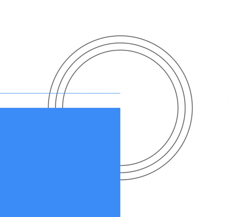
I'm laying out ideas on how to approach an animation that will happen in multiple places across an entire site. While I know I could use DrawSVG...the way I developed these circles for each section was specifically for ease of control of the various sizes across sections, viewports, etc...so I opted for a circle created with straight CSS rather than SVG. Can you do a similar draw effect with the circles on CSS properties, without having to use SVG and DrawSVG?
-
Hi guys, Sorry if this is not right question in this forum, but I hope you can help me. I need to achieve such nice gradient glow as in picture. I made this in photoshop and I tried to do same with CSS but I cant make it. With CSS you still can see edges of circle, I want it to fade 100%, like in picture. Also in picture center of the circle is more bright mine is all same. It is possible to make exactly same glow as in this picture? Or this is max what I can achieve with CSS? So maybe I can achieve this with GSAP? Thanks, Mantvydas
- 2 replies
-
- radient gradient
- css
-
(and 2 more)
Tagged with:
-
I am trying to reveal the black background only after the two red and blue canvases have completed the animation. But as you can see there is "leak" and the black ground is visible during the rotation. Also I'm learning to control overflow and have found this link https://stackoverflow.com/questions/8837050/allow-specific-tag-to-override-overflowhidden , but theres something I'm doing wrong . Please Help.
-
Hi, Id like to know if there is a GSAP function that can create the effect of a mouse following the cursor


