Search the Community
Showing results for tags 'workflow'.
Found 16 results
-
 https://css-tricks.com/tips-for-writing-animation-code-efficiently/
- 1 comment
-
- 3
-

-

-
- workflow
- javascript
- (and 1 more)
-
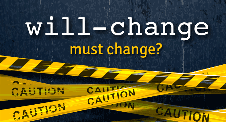 Note: This page was created for GSAP version 2. We have since released GSAP 3 with many improvements. While it is backward compatible with most GSAP 2 features, some parts may need to be updated to work properly. Please see the GSAP 3 release notes for details. Chrome 53 debuted a new "feature" to improve animation performance and graphics fidelity, but it had some nasty side effects that caused quite a few animators to get unpleasant phone calls from angry clients whose ads and web sites suddenly looked blurry and/or stuttery. Every other browser (including previous versions of Chrome) render the same animation beautifully. Chrome's new behavior may also result in WORSE animation performance. A lengthy discussion with the Chrome team revealed some disturbing tradeoffs that animators need to know about, and that could spell trouble with other browsers too unless we band together as a community and make our voices heard. At the heart of the controversy is the will-change CSS property. What is "will-change"? It gives developers a way to say "hey, browser, I'm gonna animate this property, so please do whatever you can to prepare and make it happen smoothly" which often means creating a compositor layer to get GPU-acceleration of transforms and opacity. Think of a compositor layer like a screen-shot of the element that the browser can store on the GPU to move/scale/rotate cheaply instead of re-computing all the pixels on each screen refresh. Read Sara Soueidan's excellent in-depth article here for details. Problem: blurry, stuttering animations What is Chrome 53 doing differently? Chrome is basically saying "In the past, I intelligently managed when and how to rasterize elements, but now that will-change property exists, I'll just make that serve as a blind toggle switch for rasterization instead. If things look blurry, it's not my problem - the developer will need to jump through some hoops (described below) to make things look sharp again." It all boils down to how and when "rasterization" of an element occurs (changing it into pixels stored on the GPU). If rasterization happens when the element is very small, it will be lower resolution. When scaled up, it'll look blurry/pixelated. On the other hand, if you rasterize while it's at its native scale (1) or above, you'll get a much higher-quality image with more pixels. Another key factor is how it is rasterized. Apparently Chrome uses a completely different algorithm for rasterizing an <img> than a <div> with a background-image even though both use identical source files and are sized the same! Here's an example of how they look in Chrome 53: Update: The Chrome team says they've fixed the bug that caused background-image to render differently than <img> (issue 649046) and it should be in the 9/29 release of Chrome Canary. Both factors (the when and the how) are at play in Chrome 53's new behavior (which apparently was a purposeful engineering choice based on will-change). According to this document, all content now gets re-rasterized when its scale changes (which happens up to 60 times per second during animation of scale/scaleX/scaleY properties). That's supposed to keep things sharp, but in this case Chrome's background-image algorithm applies some sort of pixel-snapping which causes that odd vibration during animation. (Update: should be fixed soon). This re-rasterization comes at a cost performance-wise too. Previously, Chrome applied some heuristics to sense when it was appropriate to re-rasterize to avoid blurriness, thus it only kicked in when necessary. But now, you must opt-in to get the layerizing benefits by setting will-change: transform. The Chrome team says this is an "improvement" because it puts the control into the hands of developers, but clearly this shift in behavior comes at quite a price. Overnight, the rug got pulled out from under many animations around the web, hurting performance (due to the constant re-rasterizing by default) and also introducing those visual vibrations when scaling background-image graphics (quite common for sprite sheets). To be clear, this primarily affected scaling animations, not ALL animations on the web. And of course anything where a background-image was used and the element was layerized (making it blurry in Chrome 53). Partial solution: set will-change: transform Complaints rolled in quickly, and the Chrome team suggested that developers go back and edit all their affected animations by adding will-change: transform which would layerize/rasterize those elements (skipping re-rasterizing on every refresh). It's a bit of a nightmare to go back and find all the affected animations and make the necessary edits, but hey, it's just adding one property to the CSS so it shouldn't be too bad, right? Oops, that breaks it in other ways Chrome chose to implement will-change such that it will trigger rasterization at whatever the current scale happens to be, so if you've got an element that starts at scale(0.1) and animates up to scale(1), rasterization happens at scale(0.1), thus it will look terrible (blurry/pixelated) at the end of the animation. Here's an example showing the SAME image animating to identical scales, but flip-flopped starting/ending values: (View the codepen here) Partial solution: toggle will-change back and forth Hold your nose...here comes the hack. In order to trigger re-rasterization of the element to keep it clear, the Chrome team suggested toggling will-change back to auto during the animation, then waiting until a requestAnimationFrame elapses before setting it back to transform...and then doing it again, and again, at whatever frequency the developer wants in order to keep things acceptably sharp. So will-change: auto is being pressed into service to explicitly tell the browser "rasterize me on the next requestAnimationFrame." Yes, you read that correctly: animators must turn **off** the very property whose entire purpose is to be **on** for animation, signaling change. Then toggle it back-and-forth many times during the animation. So we're essentially telling the browser "I'm gonna change this...no I'm not...yes I am...nope..." all while in the process of animating. This doesn't exactly sound consistent with the intent of will-change, nor does it seem performant (Google's document says "Be aware, however, that there is often a large one-time performance cost to adding or removing will-change: transform.") Gotcha: never de-layerize Even if you're willing to follow the advice to set will-change: transform and toggle back-and-forth during the animation to maintain a reasonable level of clarity, there's one last gotcha - if you set it back to will-change: auto at the end of the animation and give it a non-3d transform (to de-layerize it), you'll see a jarring shift in pixels and clarity for anything with a background-image! The Chrome team advises in that case that you make sure it always has a 3d transform thereafter to prevent it from de-layerizing. Following that advice puts you at risk of running out of memory (or hitting performance problems), plus the background-image will always be slightly blurry. Here's what it looks like to toggle between the two modes at the end of the animation: Update: The Chrome team clarified that this was a temporary fix, not a long-term solution. The background-image rendering bug should be resolved soon, and this "never de-layerize" suggestion will no longer apply at that point. The bigger issue, beyond Chrome... The will-change spec doesn't really specify implementation details which means that Chrome's new behavior may be completely unique; Firefox might do something different, and then there's Edge, Safari, Opera, Android, etc. Perhaps Chrome requires that developers toggle back-and-forth to maintain clarity, but what if Firefox interprets that differently, or imposes a big performance penalty when doing the same thing? What if developers must resort to various [potentially conflicting] hacks for each browser, bloating their code and causing all sorts of headaches. We may have to resort to user agent sniffing again (did you just throw up a little in your mouth?). This will-change property that was intended to SOLVE problems for animators may end up doing the opposite. It seems wise for the browsers to step back and let the spec authors fill in the implementation details and gain consensus before moving forward. Another problem: stacking contexts As mentioned in this article, will-change can also affect the stacking context of elements, leading to unintended changes in how things render/stack on your page. So your content may stack differently in browsers that do support will-change than those that don't. More sniffing, yay! To summarize: Before Chrome 53 Just animate stuff. No need to jump through any hoops as a developer to get decent clarity (though the Chrome team points out that there was still some blurriness in certain edge cases that they've heard complaints about). After Chrome 53 Make sure to set will-change: transform if you're animating transforms and want to opt-in to performance optimizations and avoid jittery background-image scaling. But be careful about how it might affect stacking contexts, and keep checking when other browsers decide to implement will-change, as it could change how your content looks. If you're scaling up, make sure you toggle will-change back-and-forth to/from auto during the animation to maintain clarity (but sacrifice performance). Make sure there's a 3D transform applied throughout to prevent de-layerization (which would cause a big performance hit). Don't switch back to a 2D transform at the end (at least for elements with a background-image), or you'll see a jarring pixel shift. (Update: should be fixed soon in Chrome, so this step won't be necessary at some point.) Don't forget to go back and find/fix existing animations that are affected by the new Chrome behavior. Is Chrome going to fix this? As of today, the Chrome team says they've thought a lot about this and feel pretty strongly that the new behavior is an improvement, so there's no plan to change it (that we know of at least). Here are the solutions we proposed (with the answers we got): Instead of putting the burden on developers to manually toggle will-change back-and-forth between transform and auto during the animation, just have the browser natively sense when re-rasterization is prudent and do that automatically which would be much faster than JS anyway. It seems rather trivial for the browser to sense when an element has been scaled greater than a certain delta (like 0.2) and trigger a rasterization. Chrome team's answer (summary): "that's too hard (complex). The browser might get it wrong sometimes, so it's better to have developers do it at the JS level. And JS isn't that much slower than native. It's just a small amount of extra work for animators (or library developers)." The browser could always perform rasterization at native size (scale of 1) or the current scale, whichever is bigger. That way, nobody would run into those nasty blurred images when scaling up from a small value to 1 (pretty common) and there's no need to keep re-rasterizing. Chrome team's answer: "rastering at native size and then scaling that down with bilinear filters in the compositor to something less than 0.5 or so will start to loop noticeably bad." If the goal is to put control into developers' hands, why not expose an API for defining what scale rasterization should occur at, like element.cacheTransform = "scale(1)"? Chrome team's answer: "it may not be so easy to get it right in terms of expressiveness, and requires new APIs...and also to define what raster scale means, which seems quite tricky in general, especially while not over-fitting to current implementation strategies. That might happen later on." The browser should use the same algorithm to rasterize (and scale) anything. The one being used by Chrome for <img> looks great so please use that for background-image too Chrome team's answer (summary): "Acknowledged. We're working on a fix." Instead of turning will-change into a convoluted way to control rasterization in the browser and risk opening a can of worms with other browsers doing things completely differently due to vague specs, roll back the behavior and work with the spec authors to define implementation details and re-approach later when consensus is reached. Chrome team's answer: "the intention of will-change is to give a hint to the browser that the referenced property is going to be animated, and for the browser to take steps to optimize performance for that use case. This is why will-change: transform creates a composited layer: because animating transform afterward will therefore not later have the startup cost and per-frame of creating the composited layer and rasterizing it. Following this logic, further extending the meaning of will-change: transform to not re-raster on scale change is similar, because it will make it faster." Can GSAP fix it for me? Yes and no. We've already experimented with the suggestions that the Chrome team made, but there are a few tricky challenges. First, we're hyper-focused on performance so it's quite painful to have this new Chrome behavior force us to add extra logic that must run on every tick of every tween of any transform-related animation. It probably wouldn't be noticeable unless you're animating hundreds or thousands of elements simultaneously, but we built GSAP to handle crazy amounts of stress because sometimes that's what a project requires, so we're pretty frustrated by Chrome's decision to impose this burden on animators and libraries like GSAP. But yes, we could do the toggling under the hood automatically and accept the performance tradeoff. But another major problem that's totally in the hands of browsers is rendering - we can't fix that jarring pixel shift at the end of the animations of background-image. We can force the 3D transform to remain, but as described above, that leaves things blurry and unnecessarily eats up memory. We work very hard to implement workarounds for browser inconsistencies and bugs like this, but we can't work miracles. We really need Chrome to step up and provide some better solutions. Conclusion There's no doubt that the Chrome team is working hard to move the web forward and deliver the best experience for their users. At GreenSock, Chrome is our primary browser that we use every day, so we're big fans. This article isn't intended to criticize anyone, but rather to bring attention to something that could spell big trouble for animators in the days ahead, beyond the headaches Chrome 53 caused with its new behavior. Hopefully Chrome will roll back the changes and/or implement some of the suggestions above. We'd encourage folks to make their voices heard (on the Chrome thread, below in the comments, with the spec authors, etc.). Perhaps we got something wrong - feel free to correct us or make other suggestions. Ultimately we want to help move animation forward on the web, so please join us.
 -
So as I am getting refamiliarized with GSAP I was wondering what IDE y'all are using? I am right now I am back and forth between ATOM and Codepen. In Codepen I am finding it a hassle when I am uploading assets I have to "reconnect" them in my code but it offers color coding and seems to have some auto complete features. While in ATOM I can't seem to find a package that supports GSAP. So I was wondering what y'alls workflow looks like. You don't have to get into the weeds if you don't want. Just looking for some options. TIA, Diza
-
 As the author of GSAP I'm sometimes asked if the Web Animations API (WAAPI) will be used under the hood eventually. My responses have gotten pretty long so I thought I'd share my findings with everyone here. Hopefully this sheds light on the challenges we face and perhaps it can lead to some changes to WAAPI in the future. WAAPI is a native browser technology that's similar to CSS animations, but for JavaScript. It's much more flexible than CSS animations and it taps into the same mechanisms under the hood so that the browser can maximize performance. Overall support is has gotten pretty good but there are multiple levels to the spec, so some browsers may support only "level 1", for example. The hope is that eventually all major browsers will support WAAPI fully. Progress in that direction has been very, very slow. You could think of WAAPI almost like a browser-level GSAP with a bunch of features stripped out. This has led some to suggest that perhaps GSAP should be built on TOP of WAAPI to reduce file size and maximize performance. Ideally, people could tap into the rich GSAP API with all of its extra features while benefiting from the browser's native underpinnings wherever possible. Sounds great, right? Unfortunately, WAAPI has some critical weak spots that make it virtually impossible for GSAP to leverage it under the hood (at least in any practical manner). I don't mean that as a criticism of WAAPI. In fact, I really wanted to find a way to leverage it inside GSAP, but I'll list a few of the top reasons why it doesn't seem feasible below. To be clear, this is NOT a feature comparison or a bunch of reasons why GSAP is "better" - these are things that make it architecturally impossible (or very cumbersome) to build GSAP on WAAPI. Custom easing WAAPI only supports cubic-bezier() for custom easing, meaning it's limited to one segment with two control points. It can't support eases like Bounce, Elastic, Rough, SlowMo, wiggle, ExpoScaleEase, etc. GSAP must support all of those eases plus any ease imaginable (unlimited segments and control points - see the CustomEase page). This alone is a deal-breaker. Expressive animation hinges on rich easing options. Independent transform components The most commonly animated values are translation (x/y position), rotation, and scale (all transform-related) but you cannot control them independently with CSS or WAAPI. For example, try moving (translate) something and then halfway through start rotating it and stagger a scale toward the end: |-------- translateX() ------------| |------ rotate() ------| |---------- translateY() -----------| |-------------- scale(x,y) --------------| Animators NEED to be able to independently control these values in their animations. Additive animations (composite:"add") probably aren't an adequate solution either. It's unrealistic to expect developers to track all the values manually or assume that stacking them on top of each other will deliver expected results - they should be able to just affect the rotation (or whatever) at any time, even if there was a translate() or scale() applied previously. GSAP could track everything for them, of course, but continuously stacking transforms on top of each other seems very inefficient and I imagine it'd hurt performance (every transform is another matrix concatenation under the hood). There is a new spec being proposed for translate, scale, and rotate CSS properties which would certainly help, but it's not a full solution because you still can't control the x/y components independently, or all of the 3D values like rotationX, rotationY, z, etc. This is an essential feature of GSAP that helped it become so popular. Example See the Pen Independent Transforms Demo by GreenSock (@GreenSock) on CodePen. Custom logic on each tick Certain types of animations require custom logic on each tick (like physics or custom rounding/snapping or morphing). Most GSAP plugins rely on this sort of thing (ModifiersPlugin, for example). I'm pretty sure that's impossible with WAAPI, especially with transforms being spun off to a different thread (any dependencies on JS-based logic would bind it to the main thread). Non-DOM targets As far as I know, WAAPI doesn't let you animate arbitrary properties of generic objects, like {myProperty:0}. This is another fundamental feature of GSAP - people can use it to animate any sort of objects including canvas library objects, generic objects, WebGL values, whatever. Global timing controls I don't think WAAPI lets you set a custom frame rate. Also, GSAP's lag smoothing feature requires the ability to tweak the global time (not timeScale - I mean literally the current time so that all the animations are pushed forward or backward). As far as I know, it's impossible with WAAPI. Synchronization (transforms and non-transforms) As demonstrated in this video, one of the hidden pitfalls of spinning transforms off to another thread is that they can lose synchronization with other main-thread-based animations. As far as I know, that hasn't been solved in all browsers. We can't afford to have things getting out-of-sync. Some have proposed that GSAP could just fall back to using a regular requestAnimationFrame loop to handle things that aren't adequately supported by WAAPI but that puts things at risk of falling out of sync. For example, if transforms are running on a separate thread they might keep moving while other parts of the animation (custom properties that get applied somehow in an onUpdate) slow down or jank. Compatibility GSAP has earned a reputation for "just working" across every browser. In order to deliver on that, we'd have to put extra conditional logic throughout GSAP, providing fallbacks when WAAPI isn't available or doesn't support a feature. That would balloon the file size substantially and slow things down. That's a tough pill to swallow. WAAPI still isn't implemented in several major browsers today. And then there are the browser inconsistencies (like the infamous SVG origin quirks) that will likely pop up over time and then we'd have to unplug those parts from WAAPI and maintain the legacy raw-JS mechanisms internally. Historically, there are plenty of cross-browser bugs in natively-implemented technologies, making it feel risky to build on top of. Performance WAAPI has a performance advantage because it can leverage a separate thread whereas JavaScript always runs on the main thread, right? Well, sort of. The only time a separate thread can be used is if transforms and/or opacity are the only things animating on a particular element (or else you run into synchronization issues). Plus there's overhead involved in managing that thread which can also get bogged down. There are tradeoffs either way. Having access to a different thread is fantastic even if it only applies in certain situations. That's probably the biggest reason I wanted to leverage WAAPI originally, but the limitations and tradeoffs are pretty significant, at least as it pertains to our goals with GSAP. Surprisingly, according to my tests GSAP was often faster than WAAPI. For example, in this speed test WAAPI didn't perform as well as GSAP on most devices I tried. Maybe performance will improve over time, but for now be sure to test to ensure that WAAPI is performing well for your animations. File Size To ensure compatibility, GSAP would need all of its current (non-WAAPI) code in place for fallbacks (most browsers won't fully support WAAPI for years) and then we'd need to layer in all the WAAPI-specific code on top of that like conditional logic checking for compatible eases, sensing when the user is attempting something WAAPI can't support, tracking/stacking additive animations, etc. That means file size would actually be far worse if GSAP were built on WAAPI. Some have suggested creating a different adapter/renderer for each tech, like a WebAnimationsAdapter. That way, we could segregate the logic and folks could just load it if they needed it which is clever but it doesn't really solve the problem. For example, some plugins may affect particular CSS properties or attributes, and at some point conditional logic would have to run to say "oh, if they're using the WebAnimationsAdapter, this part won't work so handle it differently". That conditional logic generally makes the most sense to have in the plugin itself (otherwise the adapter file would fill up with extra logic for every possible plugin, bloating file size unnecessarily and separating plugin logic from the plugin itself). So then if anyone uses that plugin, they'd pay a price for that extra logic that's along for the ride. Weighing the Pros & Cons At the end of the day, the list of "pros" must outweigh the "cons" for this to work, and currently that list is quite lopsided. I'd love to find a way to leverage any of the strengths of WAAPI inside GSAP for sure, but it just doesn't seem feasible or beneficial overall. The main benefit I see in using WAAPI inside GSAP is to get the off-the-main-thread-transforms juice but even that only seems useful in relatively uncommon scenarios, and it comes at a very high price. I'm struggling to find another compelling reason to build on WAAPI; GSAP already does everything WAAPI does plus a lot more. I'm hopeful that some of the WAAPI benefits will someday be possible directly in JS so that GSAP wouldn't have to create a dependency on WAAPI to get those. For example, browsers could expose an API that'd let developers tap into that off-the-main-thread transform performance. Ideally, browsers would also fix that hacky matrix()/matrix3d() string-based API and provide a way to set the numeric matrix values directly - that'd probably deliver a nice speed boost. Please chime in if I'm missing something, though. (Contact us or post in the forums) Why use GSAP even if/when WAAPI gets full browser support? Browser bugs/inconsistencies Lots of extra features like morphing, physics, Bezier tweening, text tweening, etc. Infinite easing options (Bounce, Elastic, Rough, SlowMo, ExpoScaleEase, Wiggle, Custom) Independent transform components (position, scale, rotation, etc.) Animate literally any property of any object (not just DOM) Timeline nesting (workflow) GSDevTools Relative values and overwrite management from() tweens are much easier - you don't need to get the current values yourself Familiar API Why WAAPI might be worth a try If you don’t need broad browser support today or any of GSAP’s unique features, you could save some kb by using WAAPI Solid performance, especially for transforms and opacity Always free Again, the goal of this article is NOT to criticize WAAPI at all. I think it's a great step forward for browsers. I just wanted to explain some of the challenges that prevent us from using it under the hood in GSAP, at least as it stands today. EDIT: Brian Birtles, one of the primary authors of the WAAPI spec, reached out and offered to work through the issues and try to find solutions (some of which may involve editing the spec itself) which is great. Rachel Nabors has also worked to connect people and find solutions. Although it may take years before it's realistic to consider building on WAAPI, it's reassuring to have so much support from leaders in the industry who are working hard to move animation forward on the web. 2020 EDIT: Now Brian Birtles is the only one working on WAAPI and he does so on a volunteer basis, so further development of WAAPI has understandably slowed down in recent times.
 -
 Feature lists don't always tell the story in a way that's relevant to you as the developer/designer in the trenches, trying to get real work done for real clients. You hear about theoretical benefits of CSS animations or some fancy new library that claims to solve various challenges, but then you discover things fall apart when you actually try to use it or the API is exceedingly cumbersome. You need things to just work. .expander { cursor: pointer; font-weight: 400; position: relative; } section .card{ padding-bottom: 6px; margin-bottom: 10px; padding-left: 35px; padding-top: 6px; box-shadow: none; } .expandable-list { padding-left: 0; } .expandable-content { padding: 0; height: 0; overflow: hidden; } .expander-button { position: absolute; border-radius: 50%; background-color: #BBB; width: 15px; height: 15px; display: inline-block; vertical-align: middle; border: 1px solid #FFF; margin-top: 8px; /* vertically center with heading top: 50%; margin-top: -9px; */ left: -8px; margin-left: -18px; font-size: 0px; } .expander-plus, .expander-minus { position: absolute; background-color: #FFF; display: block; } .expander-plus { width: 1px; height: 7px; left: 6px; top: 3px; } .expander-minus { width: 7px; height: 1px; top: 6px; left: 3px; } .project-post p { font-family: "Lucida Grande", "Lucida Sans Unicode", Helvetica, Arial, Verdana, sans-serif; } .project-post h2 { padding-top: 16px; margin-bottom: 10px; } .expPoint, .project-post .expList li { font-size: 1.1em; list-style: none; line-height: normal; margin: 0px 0px 0px 8px; padding: 6px 4px 4px 20px; position:relative; border: 1px solid rgba(204,204,204,0); } .expPoint, .expContent { font-family: "Lucida Grande", "Lucida Sans Unicode", Helvetica, Arial, Verdana, sans-serif; } .expPoint:hover, .project-post .expList li:hover { background-color:white; border: 1px solid rgb(216,216,216); } .expContent { height: 0px; overflow: hidden; color: #656565; font-size: 0.9em; line-height: 150%; font-weight: normal; margin: 5px 0px 0px 0px; padding-top: 0px; } .toggle { width:6px; height:8px; position:absolute; background-image:url(/_img/toggle_arrow.gif); background-repeat: no-repeat; left: 9px; top: 12px; } .expMore { color: #71b200; text-decoration: underline; font-size:0.8em; } #featureAnimation, #featureBox { background-color:#000; border: 1px solid #333; height: 220px; overflow:hidden; line-height: normal; font-size: 80%; } #featureAnimation { position:relative; visibility:hidden; } #featureBox { position:absolute; } #featureAnimation, #featureBox, #whyGSAP, .featureTextGreen, .featureTextWhite { width: 838px; } #whyGSAP, .featureTextGreen, .featureTextWhite { text-align: center; } #whyGSAP, .featureTextGreen, .featureTextWhite { font-size:50px; position:absolute; font-family: "Lucida Grande", "Lucida Sans Unicode", Helvetica, Arial, Verdana, sans-serif; top:0; } .featureTextGreen { color:#91e600; font-weight: bold; } .featureTextWhite { color:white; font-weight:normal; } .star { position: absolute; width: 16px; height: 16px; display: none; } #browserIcons { top:64px; left: 100px; width: 92px; height: 92px; position: absolute; text-align:left; } #browserIcons img { position:absolute; } .featureTextMinor { color:#CCCCCC; font-weight:normal; font-size:20px; position:absolute; font-family: "Lucida Grande", "Lucida Sans Unicode", Helvetica, Arial, Verdana, sans-serif; visibility:hidden; } .dot { position:absolute; background-color: #91e600; } #ctrl_slider { position:absolute; width: 725px; height:10px; left:18px; top:196px; background: rgba(80,80,80,0.3); border:1px solid rgba(102,102,102,0.5); visibility:hidden; } Why GSAP? Performance Compatibility Other tools fall down in older browsers, but GSAP is remarkably compatible. Scale, rotate & move independently (impossible with CSS animations/transitions) XNJYHQLJYQEW CSS, canvas libraries, colors, beziers, etc. Total control pause(), play(), reverse(), or timeScale() any tween or sequence. GSAP The standard for HTML5 animation replay
- 1 comment
-
- 5
-
-
- workflow
- compatibility
- (and 7 more)
-
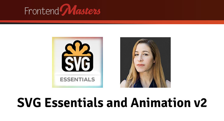 Note: This page was created for GSAP version 2. We have since released GSAP 3 with many improvements. While it is backward compatible with most GSAP 2 features, some parts may need to be updated to work properly. Please see the GSAP 3 release notes for details. Learn to build and optimize SVG – the scalable graphics format for the web that can achieve impressively small filesizes for fast-loading websites. In this course, you'll learn to create immersive graphics and make them alive with animations! https://frontendmasters.com/courses/svg-essentials-animation/
 -
 Note: This page was created for GSAP version 2. We have since released GSAP 3 with many improvements. While it is backward compatible with most GSAP 2 features, some parts may need to be updated to work properly. Please see the GSAP 3 release notes for details. This course from Egghead.io will walk you through the features of Greensock, including how to: animate an element, manually control an animation, and animate between CSS classes. https://egghead.io/courses/create-amazing-animations-with-greensock
 -
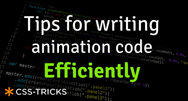
 Note: This page was created for GSAP version 2. We have since released GSAP 3 with many improvements. While it is backward compatible with most GSAP 2 features, some parts may need to be updated to work properly. Please see the GSAP 3 release notes for details. If you've ever coded an animation that's longer than 10 seconds with dozens or even hundreds of choreographed elements, you know how challenging it can be to avoid the dreaded "wall of code". Worse yet, editing an animation that was built by someone else (or even yourself 2 months ago) can be nightmarish. Our article on CSS-Tricks, Writing Smarter Animation Code, will show you how to keep your code manageable and speed up your workflow. Here's just a taste of what's covered: Benefits of timelines Nesting timelines Creating functions that return timelines Using GSDevTools to super-charge your workflow This article contains what we consider to be two of our most important videos. Definitely watch them both. We're confident these tips will truly revolutionize how you approach your complex animations. Read Writing Smarter Animation Code.
-
- 1
-
-
- functions that return timelines
- nested timelines
- (and 4 more)
-
 When it comes to animation, SVG and GSAP go together like peanut butter and jelly. Chocolate and strawberries. Bacon and...anything. SVG offers the sweet taste of tiny file size plus excellent browser support and the ability to scale graphics infinitely without degradation. They're perfect for building a rich, responsive UI (which includes animation, of course). However, just because every major browser offers excellent support for displaying SVG graphics doesn't mean that animating them is easy or consistent. Each browser has its own quirks and implementations of the SVG spec, causing quite a few challenges for animators. For example, some browsers don't support CSS animations on SVG elements. Some don't recognize CSS transforms (rotation, scale, etc.), and implementation of transform-origin is a mess. Don't worry, GSAP smooths out the rough spots and harmonizes behavior across browsers for you. There are quite a few unique features that GSAP offers specifically for SVG animators. Below we cover some of the things that GSAP does for you and then we have a list of other things to watch out for. This page is intended to be a go-to resource for anyone animating SVG with GSAP. Outline Challenges that GSAP solves for you Scale, rotate, skew, and move using 2D transforms Set the transformOrigin (the point around which rotation and scaling occur) Set transformOrigin without unsightly jumps Transform SVG elements around any point in the SVG canvas Animate SVG attributes like cx, cy, radius, width, etc. Use percentage-based x/y transforms Drag SVG elements (with accurate bounds and hit-testing) Move anything (DOM, SVG) along a path including autorotation, offset, looping, and more Animate SVG strokes Morph SVG paths with differing numbers of points Tips to Avoid Common Gotchas Limitations of SVG Browser support Inspiration Awesome SVG Resources Get Started Quickly with GSAP Challenges that GSAP solves for you GSAP does the best that it can to normalize browser issues and provide useful tools to make animate SVG as easy as it can be. Here are some of the challenges that using GSAP to animate SVG solves for you: Scale, rotate, skew, and move using 2D transforms When using GSAP, 2D transforms on SVG content work exactly like they do on any other DOM element. gsap.to("#gear", {duration: 1, x: 100, y: 100, scale: 0.5, rotation: 180, skewX: 45}); Since IE and Opera don't honor CSS transforms at all, GSAP applies these values via the SVG transform attribute like: <g id="gear" transform="matrix(0.5, 0, 0, 0.5, 100, 0)">...</g> When it comes to animating or even setting 2D transforms in IE, CSS simply is not an option. #gear { /* won't work in IE */ transform: translateX(100px) scale(0.5); } Very few JavaScript libraries take this into account, but GSAP handles this for you behind the scenes so you can get amazing results in IE with no extra hassles. Set the transformOrigin (the point around which rotation and scaling occur) Another unique GSAP feature: use the same syntax you would with normal DOM elements and get the same behavior. For example, to rotate an SVG <rect> that is 100px tall by 100px wide around its center you can do any of the following: gsap.to("rect", {duration: 1, rotation: 360, transformOrigin: "50% 50%"}); //percents gsap.to("rect", {duration: 1, rotation: 360, transformOrigin: "center center"}); //keywords gsap.to("rect", {duration: 1, rotation: 360, transformOrigin: "50px 50px"}); //pixels The demo below shows complete parity between DOM and SVG when setting transformOrigin to various values. We encourage you to test it in all major browsers and devices. With MorphSVG, you can Morph <path> data even if the number (and type) of points is completely different between the start and end shapes! Most other SVG shape morphing tools require that the number of points matches. Morph a <polyline> or <polygon> to a different set of points Convert and replace non-path SVG elements (like <circle>, <rect>, <ellipse>, <polygon>, <polyline>, and <line>) into identical <path>s using MorphSVGPlugin.convertToPath(). Optionally define a "shapeIndex" that controls how the points get mapped. This affects what the in-between state looks like during animation. Simply feed in selector text or an element (instead of passing in raw path data) and the plugin will grab the data it needs from there, making workflow easier. MorphSVGPlugin is a bonus plugin for Club GreenSock members (Shockingly Green and Business Green). Tips to Avoid Common Gotchas There are some things that GSAP can't solve for you. But hopefully this part of the article can help prepare you to avoid them ahead of time! Here are some things to keep in mind when creating and animating SVGs. Vector editor/SVG creation tips: When creating an SVG in Illustrator or Inkscape, create a rectangle the same size as your artboard for when you copy elements out of your vector editor and paste them into a code editor (how-to here). How to quickly reverse the direction of a path in Illustrator (Note: If the Path Direction buttons are not visible in the attributes panel, click the upper right menu of that panel and choose 'Show All'): Open path: Select the pen tool and click on the first point of your path and it will reverse the points. Closed path: Right click the path and make it a compound path, choose menu-window-attributes and then use the Reverse Path Direction buttons. If you're morphing between elements it might be useful to add extra points yourself to simpler shapes where necessary so that MorphSVG doesn't have to guess at where to add points. You can think of masks as clip-paths that allow for alpha as well. When using masks, it's often important to specify which units to use. Use a tool like SVGOMG (or this simpler tool) to minify your SVGs before using them in your projects. Code/animation-related tips: Always set transforms of elements with GSAP (not just CSS). There are quite a few browser bugs related to getting transform values of elements which GSAP can't fix or work around so you should always set the transform of elements with GSAP if you're going to animate that element with GSAP. Always use relative values when animating an SVG element. Using something like y: "+=100" allows you to change the SVG points while keeping the same animation effect as hard coding those values. You can fix some rendering issues (especially in Chrome) by adding a very slight rotation to your tween(s) like rotation: 0.01. If you're having performance issues with your issue, usually the issue is that you have too many elements or are using filters/masks too much. For more information, see this post focused on performance with SVGs. You might like injecting SVGs into your HTML instead of keeping it there directly. You can do this by using a tool like Gulp. You can easily convert between coordinate systems by using MotionPathPlugin's helper functions like .convertCoordinates(). Technique tips/resources: You can animate the viewBox attribute (demo)! You can animate (draw) a dashed line by following the technique outlined in this post. You can animate (draw) lines with varied widths by following the technique outlined in this post. You can animate (draw) handwriting effects by following the technique outlined in this post. You can create dynamic SVG elements! You can animate (draw) a "3D" SVG path. You can fake nested SVG elements (which will be available in SVG 2) by positioning the inner SVG with GSAP and scaling it (demo). You can fake 3D transforms (which will be available in SVG 2) in some cases by either Faking the transform that you need. For example sometimes rotationYs can be replaced by a scaleX instead. Applying the transform to a container instead. If you can limit the elements within the SVG to just the ones you want to transform, this is a great approach. For example, applying a rotationY to the <svg> or <div> containing a <path> instead of applying it to the <path> itself. Limitations of SVG The current SVG spec does not account for 3D transforms. Browser support is varied. Best to test thoroughly and have fallbacks in place. Most browsers don't GPU-accelerate SVG elements. GSAP can't change that. Browser support All SVG features in this article will work in IE9+ and all other major desktop and mobile browsers unless otherwise noted. If you find any cross-browser inconsistencies please don't hesitate to let us know in our support forums. Inspiration The Chris Gannon GSAP Animation collection is great for seeing more SVG animations made with GSAP. Be sure to also check out Chris Gannon's full portfolio on CodePen and follow him on Twitter for a steady influx of inspiration. Awesome SVG Resources SVG Tutorials - MotionTricks The SVG Animation Masterclass - Cassie Evans Understanding SVG Coordinate Systems and Transformations - Sara Soueidan Improving SVG Runtime Performance - Taylor Hunt SVG tips - Louis Hoebregts A Compendium of SVG Information - Chris Coyier Making SVGs Responsive with CSS - Sara Soueidan viewBox newsletter (SVG focus) - Cassie Evans and Louis Hoebregts Get Started Quickly with GSAP Below are a few resources that will get you up and running in no time: Getting Started Guide with Video Sequence Animations like a Pro (video) GSAP Documentation
 -
![More information about "CSS Animations: Workflow Issues Exposed [Includes Videos]"](https://gsap.com/community/uploads/monthly_2014_01/535684648_201401blog-CSSWorkflow.jpg.1f90c672fe87c2148eb04653fef395b2.jpg) Note: This page was created for GSAP version 2. We have since released GSAP 3 with many improvements. While it is backward compatible with most GSAP 2 features, some parts may need to be updated to work properly. Please see the GSAP 3 release notes for details. A post by Carl Schooff, GreenSock's "Geek Ambassador" Hot on the heels of the CSS Myth-Busting article, I'm going to take a deeper look into CSS Animations and how they fit (or don't fit) into a modern animator's workflow. This isn't about simple fades or basic transitions (CSS is great for those); Developers who use animation to tell a story or deliver rich interactivity require a very different workflow than those who are simply doing UI transitions. I'm going to show you exactly where some of the pain points are for a typical project and how they can bring your workflow to a grinding halt. Even relatively simple animations like the one below can become surprisingly cumbersome with CSS. Example of a Simple, "Story-Telling" Animation See the Pen GSAP: Full Version Complete by GreenSock (@GreenSock) on CodePen. Seriously, You guys are beating up on CSS Animations again? Really, I'm not trying to be negative for the sake of being negative. It's just that so many developers are looking for animation tools that accommodate their real-world projects and the industry seems to scream "use CSS!" even though the API doesn't adequately serve the workflow of modern animators who are building immersive experiences or animations that "tell a story". Too many people are being led down a path that results in utter frustration, or at least a lot of wasted time. And no, CSS Animations aren't "evil". In fact, sometimes they're perfectly appropriate (see the CSS Myth-Busting article for details). There are CSS fans who craft animations and proudly shout "Pure CSS! No JS!" as if the grueling effort necessary is a badge of honor. The accomplishment is indeed admirable, and we tip our hats to them. But WOW it's a lot of work and doesn't exactly lend itself to experimentation or easy edits. Quite simply, we aim to change the tide with tools like GSAP. The majority of the GSAP API has been shaped by feedback from real developers in the trenches over the course of many years. The process of animation should be fun and inspiring. Challenge! Still not convinced that GSAP is better suited for professional animators? I'm very interested to see how this animation can be built more effectively. Are you in the CSS-Purist camp? Do you prefer to trigger animations with JavaScript setTimeouts? Maybe you have another library that blows GSAP away. Dig in and build the animation I've been using with your own choice of tools. Below are some resources that should make it easy to get started. When you're done, just drop us a line in the comments or in the forums. Full storyboard showing css values for each key frame: http://codepen.io/GreenSock/pen/DzHBs Starter Pen: http://codepen.io/GreenSock/pen/EsAvF Recommended reading: Myth Busting: CSS Animations vs JavaScript (css-tricks.com guest post) Main GSAP page Jump Start: GSAP JS Cage matches: CSS3 transitions vs GSAP | jQuery vs GSAP 3D Transforms & More CSS3 Goodies Arrive in GSAP JS
Note: This page was created for GSAP version 2. We have since released GSAP 3 with many improvements. While it is backward compatible with most GSAP 2 features, some parts may need to be updated to work properly. Please see the GSAP 3 release notes for details. A post by Carl Schooff, GreenSock's "Geek Ambassador" Hot on the heels of the CSS Myth-Busting article, I'm going to take a deeper look into CSS Animations and how they fit (or don't fit) into a modern animator's workflow. This isn't about simple fades or basic transitions (CSS is great for those); Developers who use animation to tell a story or deliver rich interactivity require a very different workflow than those who are simply doing UI transitions. I'm going to show you exactly where some of the pain points are for a typical project and how they can bring your workflow to a grinding halt. Even relatively simple animations like the one below can become surprisingly cumbersome with CSS. Example of a Simple, "Story-Telling" Animation See the Pen GSAP: Full Version Complete by GreenSock (@GreenSock) on CodePen. Seriously, You guys are beating up on CSS Animations again? Really, I'm not trying to be negative for the sake of being negative. It's just that so many developers are looking for animation tools that accommodate their real-world projects and the industry seems to scream "use CSS!" even though the API doesn't adequately serve the workflow of modern animators who are building immersive experiences or animations that "tell a story". Too many people are being led down a path that results in utter frustration, or at least a lot of wasted time. And no, CSS Animations aren't "evil". In fact, sometimes they're perfectly appropriate (see the CSS Myth-Busting article for details). There are CSS fans who craft animations and proudly shout "Pure CSS! No JS!" as if the grueling effort necessary is a badge of honor. The accomplishment is indeed admirable, and we tip our hats to them. But WOW it's a lot of work and doesn't exactly lend itself to experimentation or easy edits. Quite simply, we aim to change the tide with tools like GSAP. The majority of the GSAP API has been shaped by feedback from real developers in the trenches over the course of many years. The process of animation should be fun and inspiring. Challenge! Still not convinced that GSAP is better suited for professional animators? I'm very interested to see how this animation can be built more effectively. Are you in the CSS-Purist camp? Do you prefer to trigger animations with JavaScript setTimeouts? Maybe you have another library that blows GSAP away. Dig in and build the animation I've been using with your own choice of tools. Below are some resources that should make it easy to get started. When you're done, just drop us a line in the comments or in the forums. Full storyboard showing css values for each key frame: http://codepen.io/GreenSock/pen/DzHBs Starter Pen: http://codepen.io/GreenSock/pen/EsAvF Recommended reading: Myth Busting: CSS Animations vs JavaScript (css-tricks.com guest post) Main GSAP page Jump Start: GSAP JS Cage matches: CSS3 transitions vs GSAP | jQuery vs GSAP 3D Transforms & More CSS3 Goodies Arrive in GSAP JS -
 Note: This page was created for GSAP version 2. We have since released GSAP 3 with many improvements. While it is backward compatible with most GSAP 2 features, some parts may need to be updated to work properly. Please see the GSAP 3 release notes for details. Update: don't miss our guest post on css-tricks.com, Myth Busting: CSS Animations vs. JavaScript which provides some additional data, visual examples, and a speed test focused on this topic. Ever since CSS3 "transitions" and "animations" were introduced, they have been widely lauded as the future of animation on the web. It often seems like all the "cool kids" are talking about them. Should you jump on the bandwagon? Is JavaScript animation headed for extinction? How does the new GreenSock Animation Platform (GSAP) fare when it steps into the ring and faces off against the hyped-up tag-team of CSS3 transitions & animations? Does GSAP have the chops to hold its own? Let's find out. Ready...FIGHT! Performance One of the most common arguments in favor of CSS3 animations has been that they're hardware accelerated, thus outperform any JavaScript-based equivalent. The theory is that if you define your transitions/animations directly in css, the browser can worry about all the calculations behind the scenes and tap into hardware and native code to execute them. Sounds awesome. Unfortunately it's not quite that clean. Only certain properties are hardware-accelerated (like 3D transforms and opacity - mostly ones that don't affect document flow) and different browsers handle things differently. Plus every comparison we saw on the web pitted CSS3 transitions against jQuery, but GSAP is up to 20 times faster than jQuery. In our real-world tests, we saw drastic differences in performance among the various browsers and when tested head-to-head against GSAP, CSS3 animations were usually slower! Weird. As expected, however, 3D transforms were indeed faster under heavy stress although in most situations you'd never notice a difference. GSAP is extremely optimized. UPDATE (2015-01-05): There are some interesting (and surprising) performance implications of using CSS animations that aren't widely known. Here's a screencast that shows how Dev Tools doesn't report the overhead involved with CSS animations, some synchronization problems, and how they can drag down the main thread performance more than JS. To see a simple comparison for yourself, select the "Zepto" engine in the speed comparison because it uses CSS3 transitions for its animations, and then compare it to GSAP. Beware that the fps (frames per second) counter in the lower right corner isn't always accurate in some browsers (like recent versions of Safari) when using CSS3 transitions because requestAnimationFrame events [incorrectly] get dispatched even when the screen is clearly not being updated. So the animation may actually be running at a very jerky 10fps, yet 50+ requestAnimationFrame cycles are being triggered by the browser! This exposes another flaw in CSS3 transitions - there's no way to know when updates truly occur. There's only a "complete" event fired at the end of the transition/animation. If anyone knows how to get a more accurate fps counter in Safari while using CSS3 transitions, please let us know. Another performance issue to note in the speed comparison is the clumping that occurs with many engines (including Zepto) under heavy stress, where the stars begin pulsing out in rings instead of a nicely dispersed field. Even though GSAP was faster than CSS3 transitions in the majority of our real-world tests, it's still true that 3D transforms and opacity tweens are faster with CSS3 transitions and it's possible that browsers will be able to further tap into hardware acceleration in the future, so we'll call this round a tie. Feel free to build your own tests to see how things compare in your workflow. Performance winner: TIE Controls This is one of the major weak spots for CSS transitions (its "glass jaw" of sorts). Let's say you invest the time in writing a bunch of css for a whiz-bang animation and then you need to control the whole thing - good luck with that. It is virtually impossible. GSAP's object oriented architecture allows you to pause, resume, reverse, restart, or seek to any spot in any tween. Even adjust timeScale on the fly for slow motion or fastforward effects. Place tweens in a timeline with precise scheduling (including overlaps or gaps) and then control the whole thing just like it's a single tween. All of the easing and effects remain perfectly intact as you reverse, adjust timeScale, etc. (with CSS transitions, easing flip-flops upon reverse). You can even kill individual portions of a tween anytime (like if a tween is controlling both "top" and "left" properties, you can kill "left" while "top" continues). Put labels in a timeline to mark important spots and seek() to them anytime. Imagine trying to build the example below using CSS transitions. It would be virtually impossible. With GSAP, it's easy. In fact, all of the animation is done with 2 lines of code. Drag the scrubber, click the buttons below, and see how easy it is to control the sequenced animation. Controls winner: GSAP Tweenable Properties Both competitors can animate transforms (2D and 3D), colors, borderRadius, boxShadow, and pretty much every important property, but there's one key shortcoming of CSS - you cannot animate individual transforms distinctly! For example, try rotating an object and then halfway through that animation, start scaling it with a different ease and finish at a different time. Since all transforms (scaleX, scaleY, rotation, rotationX, rotationY, skewX, skewY, x, y, and z) are all mashed into one "transform" property, it's virtually impossible to handle them distinctly. GSAP not only works around this limitation, but it also allows you to do advanced things like animate along Bezier paths or do momentum-based motion (with ThrowPropsPlugin) or relative tweens or animate the scroll position or do directional rotation or physics-based motion, etc. Plus GSAP can animate any numeric property of any object, not just DOM elements. Do you really want to use one toolset (CSS) for animating DOM elements and then have to switch to a completely different toolset and syntax when you do canvas-based animation? GSAP handles both consistently. CSS transitions and animations just can't compete here. Tweenable properties winner: GSAP Workflow When you're creating fun and interesting animations, workflow is critical. You need to be able to quickly build sequences, stagger start times, overlap tweens, experiment with eases, leverage various callbacks and labels, and create concise code. It would be great to modularize your code by creating functions that each spit back an animation object (tween or timeline) which can be inserted into another timeline at a precise time. You need a flexible, powerful system that lets you experiment without wasting hours. GSAP wipes the floor with CSS transitions in this round. Anyone who has attempted an ambitious project with CSS3 transitions/animations will attest to the fact that they tend to get very cumbersome and verbose. Experimenting with timing and fine-tuning details can get extremely tedious especially when dealing with all the browser prefixes. GSAP CSS3 transitions = supported = unsupported Flexible object-oriented architecture that allows animations to be nested inside other animations as deeply as you want Supported Unsupported Concise code that doesn't require vendor prefixes Supported Unsupported Create sequences (even with overlapping animations) that auto-adjust as you insert/remove/change intermediate pieces of animation (makes experimenting MUCH easier) Supported Unsupported Accommodate virtually any ease including Bounce, Elastic, SlowMo, RoughEase, SteppedEase, etc. Supported Unsupported Animate things into place (backwards) with convenience methods like from() and staggerFrom() Supported Unsupported Callbacks for when an animation starts, updates, completes, repeats, and finishes reversing, plus optionally pass any number of parameters to those callbacks Supported Unsupported Place labels at specific times in a sequence so that you can seek() there (and/or insert animations there) Supported Unsupported Animate any numeric property of any JavaScript object, not just DOM elements (great for canvas-based animation). Supported Unsupported Workflow winner: GSAP Compatibility CSS transitions simply don't work in older browsers, even Internet Explorer 9. GSAP works in all browsers (although some particular features may be disabled, like 3D transforms in IE8). Once again, this round was no contest. GSAP can even do 2D transforms like rotation, scaleX, scaleY, x, y, skewX, and skewY all the way back to IE6 including transformOrigin functionality! Plus it works around scores of other browser issues so that you can focus on the important stuff. Safari's 3D transformOrigin bug? No problem. Firefox's flashing 3D elements bug? No worries. Inconsistency in IE's backgroundPosition values? GSAP has you covered. Vendor prefixes? Nah, GSAP adds 'em for you when necessary. Compatibility winner: GSAP Popularity CSS3 transitions have been talked about (and used) for years all over the web whereas GSAP is relatively new. It can't match CSS3 transitions' popularity. As clients start pushing for more aggressive animations and HTML5 games proliferate and operating systems become very JavaScript-friendly, the balance may very well shift quickly. For now, though, this round goes squarely to CSS transitions. Popularity winner: CSS3 transitions Conflict management What happens if a particular set of properties (like "left" and "top") are animating and then you need to redirect one of those to a different value (like "left" to 100px instead of 300px) using a different ease and duration? With CSS transitions, it's a very complex process. With GSAP, it's simple and automatic. In fact, there are several overwrite modes you can choose from. Conflict management winner: GSAP Support There are numerous places on the web where you can ask the community your CSS transitions-related questions, but GSAP has dedicated support forums where there's rarely a question that remains unanswered for more than 24 hours. GreenSock's forums are manned by paid staff (including the author of the platform), so you're quite likely to get solid answers there. Add to that the fact that GreenSock has a track record of being much more agile in terms of squashing bugs and releasing updates than browsers do for CSS3 transitions, so GSAP gets the upper hand here. Support winner: GSAP Expandability GSAP employs a plugin architecture, making it relatively easy to add features and custom animation properties but CSS transitions have no such equivalent. You're stuck with what the browsers decide to offer. In addition to CSSPlugin, GSAP already has plugins like ScrollToPlugin for scrolling to specific window or div scroll positions, BezierPlugin for animating along Bezier curves, ThrowPropsPlugin for momentum-based motion, and RaphaelPlugin, EaselPlugin, and KineticPlugin for those libraries (Raphael, EaselJS, and KineticJS). Plus there are physics-based plugins like Phyics2DPlugin and PhysicsPropsPlugin as well as a fun ScrambleTextPlugin for Club GreenSock members. More plugins are on their way, and you can create your own too. Expandability winner: GSAP Learning resources Again, the popularity of CSS3 transitions trumps anything GSAP could throw at it right now. There are lots of tutorials, videos, and articles about CSS3 transitions whereas GSAP is new to the game. GreenSock is being aggressive about putting together solid resources (like the Jump Start tour) and the community is crankin' out some great articles and videos too, but CSS3 transitions score the win in this round. Learning resources winner: CSS3 TRANSITIONS Price & license Both CSS3 transitions and GSAP are completely free for almost every type of usage. GSAP allows you to edit the raw source code to fix bugs (if that's something you need to do), but there's no way to edit the source code that drives CSS3 transitions. Then again, there's no special license required to use them either. If you plan to use GSAP in a product/app/site/game for which a fee is collected from multiple customers, you need the commercial license that comes with "Business Green" Club GreenSock memberships (one-off commercial projects don't require the special license). It's actually a more business-friendly license in many ways than a typical open source license that offers no warranties or backing of any kind or imposes code sharing or credit requirements. GreenSock's licensing model provides a small funding mechanism that benefits the entire user base because it empowers continued innovation and support, keeping it free for the vast majority of users. See the licensing page for details. Although there are some clear benefits of GreenSock's model, we'll give this round to CSS3 transitions because using them is technically "free" in more scenarios than GSAP. Price & license winner: CSS3 TRANSITIONS File size This is a tricky round indeed because GSAP requires inclusion of at least 1 JavaScript file whereas CSS3 transitions leverage native code in the browser, but the code you'd have to write to accomplish the same thing in CSS3 animations or transitions is often far more verbose, offsetting the kb savings. For example, let's take a relatively simple sequenced animation (see codepen or jsfiddle? GSAP code: var tl = new TimelineLite(); tl.staggerFrom('.box', 0.5, {opacity:0, scale:0, rotation:-180}, 0.3) .staggerTo('.box', 0.3, {scale:0.8}, 0.3, 0.7); This type of thing is impossible with CSS3 transitions, but it can be done with CSS3 animations as long as we give each element its own class name or ID. Let's take a look at the CSS code (see codepen or jsfiddle? Equivalent CSS3 Animation: .animated { -webkit-animation-fill-mode: both; -moz-animation-fill-mode: both; animation-fill-mode: both; -webkit-animation-duration: 1s; -moz-animation-duration: 1s; animation-duration: 1s; } @-webkit-keyframes introAnimation { 0% { -webkit-transform: scale(0) rotate(-180deg) ; opacity: 0; } 50% { -webkit-transform: scale(1) rotate(0deg) ; opacity: 1; } 70% { -webkit-transform: scale(1) rotate(0deg); } 100% { -webkit-transform: scale(0.8) rotate(0deg); } } @-moz-keyframes introAnimation { 0% { -moz-transform: scale(0) rotate(-180deg); opacity: 0; } 50% { -moz-transform: scale(1) rotate(0deg); opacity: 1; } 70%{ -moz-transform: scale(1) rotate(0deg); } 100% { -moz-transform: scale(0.8) rotate(0deg); } } @keyframes introAnimation { 00% { transform: scale(0) rotate(-180deg); opacity: 0; } 50% { transform: scale(1) rotate(0deg); opacity: 1; } 70%{ transform: scale(1) rotate(0deg); } 100% { transform: scale(0.8) rotate(0deg); } } .introAnimation { -webkit-backface-visibility: visible !important; -webkit-animation-name: introAnimation; -moz-backface-visibility: visible !important; -moz-animation-name: introAnimation; backface-visibility: visible !important; animation-name: introAnimation; } .two { -webkit-animation-delay: 0.3s; -moz-animation-delay: 0.3s; animation-delay: 0.3s; } .three { -webkit-animation-delay: 0.6s; -moz-animation-delay: 0.6s; animation-delay: 0.6s; } .four { -webkit-animation-delay: 0.9s; -moz-animation-delay: 0.9s; animation-delay: 0.9s; } .five { -webkit-animation-delay: 1.2s; -moz-animation-delay: 1.2s; animation-delay: 1.2s; } .six { -webkit-animation-delay: 1.5s; -moz-animation-delay: 1.5s; animation-delay: 1.5s; } .seven { -webkit-animation-delay: 1.8s; -moz-animation-delay: 1.8s; animation-delay: 1.8s; } .eight { -webkit-animation-delay: 2.1s; -moz-animation-delay: 2.1s; animation-delay: 2.1s; } .nine { -webkit-animation-delay: 2.4s; -moz-animation-delay: 2.4s; animation-delay: 2.4s; } As you can see, the CSS3 code is more than 10 times longer! And what if you want to have the entire sequence repeat 3 times? Good luck with that in CSS - you can set an animation-iteration-count but it only applies to each individual element, so it doesn't give us the effect we're after. And what if you want to experiment with the easing or offsets/delays or rotational values? It is quite cumbersome to say the least, even if you use sass or something like that. With GSAP, it's simple. If you only need very simple animations/transitions, CSS3 would deliver smaller file sizes, but once you start getting more aggressive and expressive with your animations, the scales shift quickly and GSAP becomes more economical. The other thing to keep in mind is that GSAP's JS file(s) are typically cached by the browser, so the savings page-to-page is much larger since the code you write on each page is far more concise. In other words, think of how much js/css the browser must actually request from the server over the course of your users' multi-page visit to your site. File size winner: TIE Flexibility Let's face it: basic tweening is pretty straightforward for any system, but it's really the details and advanced features that make a robust platform shine. GSAP crushes CSS3 transitions and animations when it comes to delivering a refined, professional-grade tool set that's truly flexible. Here are just a few of the conveniences baked into GSAP: Tween any numeric property of any object. Optionally round values to the nearest integer to make sure they're always landing on whole pixels/values. Animate along Bezier curves, even rotating along with the path or plotting a smoothly curved Bezier through a set of points you provide (including 3D!). GSAP's Bezier system is super flexible in that it's not just for x/y/z coordinates - it can handle ANY set of properties. Plus it will automatically adjust the movement so that it's correctly proportioned the entire way, avoiding a common problem that plagues Bezier animation systems. You can define Bezier data as Cubic or Quadratic or raw anchor points. Animate any color property of any JavaScript object (not just DOM elements). Define colors in any of the common formats like #F00 or #FF0000 or rgb(255,0,0) or rgba(255,0,0,1) or hsl(30, 50%, 80%) or hsla(30, 50%, 80%, 0.5) or "red". Set a custom fps (frames per second) for the entire engine (the default is 60fps). All tweens are perfectly synchronized (unlike many other tweening engines). Use the modern requestAnimationFrame API to drive refreshes or a standard setTimeout (the default is requestAnimationFrame with a fallback to setTimeout) Tons of easing options including proprietary SlowMo, RoughEase, and SteppedEase along with all the industry standards Animate css style sheet rules themselves with CSSRulePlugin Animate the rotation of an object in a specific direction (clockwise, counter-clockwise, or whichever is shortest) by appending "_cw", "_ccw", and "_short" to the value. You can tween getter/setter methods, not just properties. For example, myObject.getProp() and myObject.setProp() can be tweened like TweenLite.to(myObject, 1, {setProp:10}); and it will automatically recognize that it's a method and call getProp() to get the current value when the tween starts. Same for jQuery-style getters/setters that use a shared method like myObject.prop(). You can even tween another tween or timeline! For example, TweenLite.to(otherTween, 1, {timeScale:0.5}) would animate otherTween.timeScale to 0.5 over the course of 1 second. You can even scrub the virtual playhead of one tween/timeine with another tween by animating its "time". Flexibility winner: GSAP Conclusion Despite the hype surrounding CSS3 transitions and animations, they just aren't well-suited for professional-grade animation tasks. They did manage to win a few rounds in this match but ultimately GSAP man-handled them, sending them running from the ring like scared sissies. Of course we're slightly biased, but check out the facts for yourself. Kick the tires. Audition GSAP on your next project. See how it feels once you get past the initial learning curve. If you only need simple fades or very basic animation in modern browsers, CSS3 transitions are probably just fine. However, what happens when your client wants to do something more expressive? What if browser compatibility becomes an issue? Why not build on a solid foundation to begin with so that you don't find yourself having to rewrite all your animation code? If you want professional-grade scripted animation, look no further. To get started fast, check out our Jump Start tour. Recommended reading: Main GSAP JS page Why GSAP? A practical guide for developers Jump Start: GSAP JS jQuery vs GSAP: cage match 3D Transforms & More CSS3 Goodies Arrive in GSAP JS Speed comparison Explanation of CSS3 transitions, transforms and animations P.S. A rant about where animation logic belongs: We can't put this post to bed without mentioning a beef we've got with the whole concept of putting all your animation logic in css. Ever since the <blink> tag, there has been this tendency for browser vendors to offer developers these nifty "conveniences" that end up encouraging them to mix markup and/or style rules with behavioral logic. Is that really a good idea? One of the wonderful things about the modern web is that we've got this lovely separation between markup, presentation/styling, and behavioral logic (at least that's the goal). Should we be blurring the line like this? Isn't JavaScript the logic layer that should be handling state changes, application logic, reaction to user interaction (which often includes animation), etc.? Some may claim "But putting animation in css is great because that way if the user has JavaScript disabled, the animations still work!" Do you really think users of the modern web can turn off JavaScript and expect to browse the web with great results? Is that who you're targeting for a rich experience? And if they turned off JavaScript, might they have done so specifically to avoid annoying animations? Is it really helping to shift animation logic into css where they can't turn it off? In the web of yesteryear, animations were quite simplistic; fade this, slide that. Done. Anything more aggressive was relegated to a plugin like Flash which afforded incredible richness and complexity in terms of animation. But today, clients want that sort of expressiveness directly in the browser. It needs to work on mobile devices. It's no longer about simple fade-ins or sliding an image across the screen. CSS3 transitions fit the old mentality well, but not the new one. CSS3 animations technically provide more flexibility but they fall miserably short and they still force behavioral logic into the style layer. And to use them effectively, we still need JavaScript to at least swap classes and trigger things. From a development and debugging standpoint, when I apply a class to an element how would I know if that will trigger an animation or transition or neither? Should I have to keep bouncing back and forth between css and JS to manage behavioral logic related to animations? Maybe we're just ill-informed and there are some fantastic reasons for putting behavioral logic like animation into the css layer, but one thing seems pretty clear: the current way that developers have to build all but the simplest css animation leaves a LOT to be desired. The API is terribly limiting and clunky. Let's move the web forward. Let's make animation fun and flexible. Let's keep behavioral logic and style rules distinct. Let's leverage the incredible flexibility of JavaScript. If we've misrepresented anything here or if you want to weigh in with your opinion about where behavioral logic like animation belongs, feel free to post your comment below. If you're someone who has attempted an aggressive animation task with CSS3 transitions/animations as well as GSAP, we'd love to hear how you felt they compared.
 -
 Note: This page was created for GSAP version 2. We have since released GSAP 3 with many improvements. While it is backward compatible with most GSAP 2 features, some parts may need to be updated to work properly. We encourage you to use the updated "Getting Started" page . The GreenSock Animation Platform (GSAP) animates anything JavaScript can touch (CSS properties, SVG, React, canvas, generic objects, whatever) and solves countless browser inconsistencies, all with blazing speed (up to 20x faster than jQuery). See "Why GSAP?" to learn why it's used by over 8,000,000 sites and every major brand. Hang in there through the learning curve and you'll discover how addictive animating with code can be. We promise it's worth your time. Quick links Loading GSAP Tweening Basics CSSPlugin 2D and 3D transforms Easing Callbacks Sequencing with Timelines Timeline control Getter / Setter methods Club GreenSock We'll cover the most popular features here but keep the GSAP docs handy for all the details. First, let's talk about what GSAP actually does... GSAP as a property manipulator Animation ultimately boils down to changing property values many times per second, making something appear to move, fade, spin, etc. GSAP snags a starting value, an ending value and then interpolates between them 60 times per second. For example, changing the x coordinate of an object from 0 to 1000 over the course of 1 second makes it move quickly to the right. Gradually changing opacity from 1 to 0 makes an element fade out. Your job as an animator is to decide which properties to change, how quickly, and the motion's "style" (known as easing - we'll get to that later). To be technically accurate we could have named GSAP the "GreenSock Property Manipulator" (GSPM) but that doesn't have the same ring. DOM, SVG, <canvas>, and beyond GSAP doesn't have a pre-defined list of properties it can handle. It's super flexible, adjusting to almost anything you throw at it. GSAP can animate all of the following: CSS: 2D and 3D transforms, colors, width, opacity, border-radius, margin, and almost every CSS value (with the help of CSSPlugin). SVG attributes: viewBox, width, height, fill, stroke, cx, r, opacity, etc. Plugins like MorphSVG and DrawSVG can be used for advanced effects. Any numeric value For example, an object that gets rendered to an HTML5 <canvas>. Animate the camera position in a 3D scene or filter values. GSAP is often used with Three.js and Pixi.js. Once you learn the basic syntax you'll be able to use GSAP anywhere JavaScript runs. This guide will focus on the most popular use case: animating CSS properties of DOM elements. (Note: if you're using React, read this too.) If you're using any of the following frameworks, these articles may help: React Vue Angular What's GSAP Exactly? GSAP is a suite of tools for scripted animation. It includes: TweenLite - the lightweight core of the engine which animates any property of any object. It can be expanded using optional plugins. TweenMax - the most feature-packed (and popular) tool in the arsenal. For convenience and loading efficiency, it includes TweenLite, TimelineLite, TimelineMax, CSSPlugin, AttrPlugin, RoundPropsPlugin, BezierPlugin, and EasePack (all in one file). TimelineLite & TimelineMax - sequencing tools that act as containers for tweens, making it simple to control entire groups and precisely manage relative timing (more on this later). Extras like easing tools, plugins, utilities like Draggable, and more Loading GSAP CDN The simplest way to load GSAP is from the CDN with a <script> tag. TweenMax (and all publicly available GSAP files) are hosted on Cloudfare's super-fast and reliable cdnjs.com. <script src="https://cdnjs.cloudflare.com/ajax/libs/gsap/2.1.3/TweenMax.min.js"></script> Banner Ad CDNs Every major ad network excludes GSAP from file size limits when you load it from their CDN! Contact your ad network for their URLs. For example, Google hosts TweenMax at: //AdWords and DoubleClick ads only "https://s0.2mdn.net/ads/studio/cached_libs/tweenmax_2.1.2_min.js" NPM npm install gsap See the NPM Usage page in the docs for a full guide including how to import things (ES modules or UMD format), tree shaking, Webpack, how to get bonus plugins into a build system, etc. Downloading GSAP Download a zip directly from our home page or your account dashboard. If you're logged in as a Club GreenSock member this zip will include your bonus plugins. GitHub View the source code on GitHub. Tweening Basics Let's start with TweenMax, GSAP's most popular tool. We'll use CodePen demos so that you can easily fork and edit each example right in your browser. TweenMax.to() To create an animation, TweenMax.to() needs 3 things: target - the object you are animating. This can be a raw object, an array of objects, or selector text like ".myClass". duration (in seconds) vars - an object with property/value pairs that you're animating to (like opacity:0.5, rotation:45, etc.) and other optional special properties like onComplete. For example, to move an element with an id of "logo" to an x position of 100 (same as transform: translateX(100px)) over the course of 1 second: TweenMax.to("#logo", 1, {x:100}); Note: Remember that GSAP isn't just for DOM elements, so you could even animate custom properties of a raw object like this: var obj = {prop:10}; TweenMax.to(obj, 1, { prop:200, //onUpdate fires each time the tween updates; we'll explain callbacks later. onUpdate:function() { console.log(obj.prop); //logs the value on each update. } }); Demo: TweenMax.to() Basic Usage See the Pen TweenMax.to() Basic Usage by GreenSock (@GreenSock) on CodePen. If you would like to edit the code and experiment with your own properties and values, just hit the Edit on CodePen button. Notice that the opacity, scale, rotation and x values are all being animated in the demo above but DOM elements don't actually have those properties! In other words, there's no such thing as element.scale or element.opacity. How'd that work then? It's the magic of CSSPlugin. Before we talk about that, let's explain how plugins work in general. Plugins Think of plugins like special properties that get dynamically added to GSAP in order to inject extra abilities. This keeps the core engine small and efficient, yet allows for unlimited expansion. Each plugin is associated with a specific property name. Among the most popular plugins are: CSSPlugin*: animates CSS values AttrPlugin*: animates attributes of DOM nodes including SVG BezierPlugin*: animates along a curved Bezier path MorphSVGPlugin: smooth morphing of complex SVG paths DrawSVGPlugin: animates the length and position of SVG strokes *loaded with TweenMax CSSPlugin In the previous example, CSSPlugin automatically noticed that the target is a DOM element, so it intercepted the values and did some extra work behind the scenes, applying them as inline styles (element.style.transform and element.style.opacity in that case). Be sure to watch the "Getting Started" video at the top of this article to see it in action. CSSPlugin Features: normalizes behavior across browsers and works around various browser bugs and inconsistencies optimizes performance by auto-layerizing, caching transform components, preventing layout thrashing, etc. controls 2D and 3D transform components (x, y, rotation, scaleX, scaleY, skewX, etc.) independently (eliminating order-of-operation woes) reads computed values so you don't have to manually define starting values animates complex values like borderRadius:"50% 50%" and boxShadow:"0px 0px 20px 20px red" applies vendor-specific prefixes (-moz-, -ms-, -webkit-, etc.) when necessary animates CSS Variables handles color interpolation (rgb, rgba, hsl, hsla, hex) normalizes behavior between SVG and DOM elements (particularly useful with transforms) ...and lots more Basically, CSSPlugin saves you a ton of headaches. Because animating CSS properties is so common, GSAP automatically senses when the target is a DOM element and adds a css:{} wrapper. So internally, for example, {x:100, opacity:0.5, onComplete:myFunc} becomes {css:{x:100, opacity:0.5}, onComplete:myFunc}. That way, CSS-related values get routed to the plugin properly and you don't have to do any extra typing. You're welcome. ? To understand the advanced capabilities of the CSSPlugin read the full CSSPlugin documentation. 2D and 3D transforms CSSPlugin recognizes a number of short codes for transform-related properties: GSAP CSS x: 100 transform: translateX(100px) y: 100 transform: translateY(100px) rotation: 360 transform: rotate(360deg) rotationX: 360 transform: rotateX(360deg) rotationY: 360 transform: rotateY(360deg) skewX: 45 transform: skewX(45deg) skewY: 45 transform: skewY(45deg) scale: 2 transform: scale(2, 2) scaleX: 2 transform: scaleX(2) scaleY: 2 transform: scaleY(2) xPercent: 50 transform: translateX(50%) yPercent: 50 transform: translateY(50%) GSAP can animate any "transform" value but we strongly recommend using the shortcuts above because they're faster and more accurate (GSAP can skip parsing computed matrix values which are inherently ambiguous for rotational values beyond 180 degrees). The other major convenience GSAP affords is independent control of each component while delivering a consistent order-of-operation. Performance note: it's much easier for browsers to update x and y (transforms) rather than top and left which affect document flow. So to move something, we recommend animating x and y. Demo: Multiple 2D and 3D transforms See the Pen Multiple 2D and 3D Transforms by GreenSock (@GreenSock) on CodePen. Additional CSSPlugin notes Be sure to camelCase all hyphenated properties. font-size should be fontSize, background-color should be backgroundColor. When animating positional properties such as left and top, its imperative that the elements you are trying to move also have a css position value of absolute, relative or fixed. vw/vh units aren't currently supported natively, but it's pretty easy to mimic using some JS like x: window.innerWidth * (50 / 100) where 50 is the vw. Just ask in the forums for some help. from() tweens Sometimes it's amazingly convenient to set up your elements where they should end up (after an intro animation, for example) and then animate from other values. That's exactly what TweenMax.from() is for. For example, perhaps your "#logo" element currently has its natural x position at 0 and you create the following tween: TweenMax.from("#logo", 1, {x:100}); The #logo will immediately jump to an x of 100 and animate to an x of 0 (or whatever it was when the tween started). In other words, it's animating FROM the values you provide to whatever they currently are. Demo: TweenMax.from() with multiple properties See the Pen TweenMax.from() tween by GreenSock (@GreenSock) on CodePen. There is also a fromTo() method that allows you to define the starting values and the ending values: //tweens from width 0 to 100 and height 0 to 200 TweenMax.fromTo("#logo", 1.5, {width:0, height:0}, {width:100, height:200}); Special properties (like onComplete) A special property is like a reserved keyword that GSAP handles differently than a normal (animated) property. Special properties are used to define callbacks, delays, easing and more. A basic example of a special property is delay: TweenMax.to("#logo", 1, {x:100, delay:3}); This animation will have a 3-second delay before starting. Other common special properties are: onComplete - a callback that should be triggered when the animation finishes. onUpdate - a callback that should be triggered every time the animation updates/renders ease - the ease that should be used (like Power2.easeInOut) Easing If your animation had a voice, what would it sound like? Should it look playful? Robotic? Slick? Realistic? To become an animation rock star, you must develop a keen sense of easing because it determines the style of movement between point A and point B. The video below illustrates the basics. An "ease" controls the rate of change during a tween. Below is an interactive tool that allows you to visually explore various eases. Note: you can click on the underlined parts of the code at the bottom to change things.
 -
 Back in the Flash days it was easier to get these things right. Now is again the wild west and trying to get estimation and pricing in the right spot is quite an art I think. From my agency experience I usually put 8 hrs per banner and 4 hrs per resize, but you know there all different kind of clients from those who sent you the final PSD to to those that take you through 10 rounds of review with 3 re-designs during the project with an non-changing deadline. Right now whenever I plan a banner the first thing I do is see if I can do it all in HTML/DOM with GSAP/JS/CSS3 which is a cheaper workflow (Photoshop and Sublime only) than say Easel JS (which requires separation of Design and Developer tasks and some Flash experience). Do I need to use and animate SVG? Increase the hours. Do I need to use canvas? Increase the hours. Then I remember that I'm probably estimating like in my Flash days so I multiply the hours by 1.5 since HTML is slower. Do you charge per hour or per banner? Are clients more willing to pay per banner of per developer hour? Is it cheaper now or is more expensive with HTML5? How do you manage large campaigns with say 50 banners? Where do you cut costs to be competitive? Let's talk about the art and science of making banners.
 -
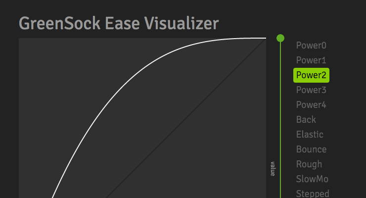 The ease-y way to find the perfect ease Easing allows us to add personality and intrigue to our animations. It's the magic behind animation, and a mastery of easing is essential for any skilled animator. Use this tool to play around and understand how various eases "feel". Some eases have special configuration options that open up a world of possibilities. If you need more specifics, head over to the docs. Notice that you can click the underlined words in the code sample at the bottom to make changes. Quick Video Tour of the Ease Visualizer Take your animations to the next level with CustomEase CustomEase frees you from the limitations of canned easing options; create literally any easing curve imaginable by simply drawing it in the Ease Visualizer or by copying/pasting an SVG path. Zero limitations. Use as many control points as you want. CustomEase is NOT in the public downloads. To get access, create a FREE GreenSock account. Once you're logged in, download the zip file from your account dashboard (or anywhere else on the site that has a download button). Club GreenSock members even get access to a private NPM repo to make installation easier in Node environments.
- 4 comments
-
- 6
-
-
- features
- steppedease
- (and 13 more)
-
So, can I deliver banner files gzipped? I have an ad that we converted with Swiffy; it looks amazing, and right there, in the Swiffy output window, it shows the file size of the banner as 88k -- but it's the gzipped file size. The raw file size of the html when I download it, is 346k. I'm pretty sure I can use gzipped files in Doubleclick, but what about other media people/publishers? Anyone have experience with this?
-
Does anyone have a preferred method for making sure that everything that's supposed to be hidden when the banner loads is actually hidden? I've had a recurring issue where sometimes, there's a quick flicker of all the hidden text/graphics before the animation kicks in. Currently, everything's fading in using .from autoAlpha:0, and it usually works, but is there something that's more bulletproof? Thanks!
(Small)(1).thumb.jpeg.15e42ae49445b8bada9d0a027e685017.jpeg)