
Search the Community
Showing results for tags 'transforms'.
Found 12 results
-
 Feature lists don't always tell the story in a way that's relevant to you as the developer/designer in the trenches, trying to get real work done for real clients. You hear about theoretical benefits of CSS animations or some fancy new library that claims to solve various challenges, but then you discover things fall apart when you actually try to use it or the API is exceedingly cumbersome. You need things to just work. .expander { cursor: pointer; font-weight: 400; position: relative; } section .card{ padding-bottom: 6px; margin-bottom: 10px; padding-left: 35px; padding-top: 6px; box-shadow: none; } .expandable-list { padding-left: 0; } .expandable-content { padding: 0; height: 0; overflow: hidden; } .expander-button { position: absolute; border-radius: 50%; background-color: #BBB; width: 15px; height: 15px; display: inline-block; vertical-align: middle; border: 1px solid #FFF; margin-top: 8px; /* vertically center with heading top: 50%; margin-top: -9px; */ left: -8px; margin-left: -18px; font-size: 0px; } .expander-plus, .expander-minus { position: absolute; background-color: #FFF; display: block; } .expander-plus { width: 1px; height: 7px; left: 6px; top: 3px; } .expander-minus { width: 7px; height: 1px; top: 6px; left: 3px; } .project-post p { font-family: "Lucida Grande", "Lucida Sans Unicode", Helvetica, Arial, Verdana, sans-serif; } .project-post h2 { padding-top: 16px; margin-bottom: 10px; } .expPoint, .project-post .expList li { font-size: 1.1em; list-style: none; line-height: normal; margin: 0px 0px 0px 8px; padding: 6px 4px 4px 20px; position:relative; border: 1px solid rgba(204,204,204,0); } .expPoint, .expContent { font-family: "Lucida Grande", "Lucida Sans Unicode", Helvetica, Arial, Verdana, sans-serif; } .expPoint:hover, .project-post .expList li:hover { background-color:white; border: 1px solid rgb(216,216,216); } .expContent { height: 0px; overflow: hidden; color: #656565; font-size: 0.9em; line-height: 150%; font-weight: normal; margin: 5px 0px 0px 0px; padding-top: 0px; } .toggle { width:6px; height:8px; position:absolute; background-image:url(/_img/toggle_arrow.gif); background-repeat: no-repeat; left: 9px; top: 12px; } .expMore { color: #71b200; text-decoration: underline; font-size:0.8em; } #featureAnimation, #featureBox { background-color:#000; border: 1px solid #333; height: 220px; overflow:hidden; line-height: normal; font-size: 80%; } #featureAnimation { position:relative; visibility:hidden; } #featureBox { position:absolute; } #featureAnimation, #featureBox, #whyGSAP, .featureTextGreen, .featureTextWhite { width: 838px; } #whyGSAP, .featureTextGreen, .featureTextWhite { text-align: center; } #whyGSAP, .featureTextGreen, .featureTextWhite { font-size:50px; position:absolute; font-family: "Lucida Grande", "Lucida Sans Unicode", Helvetica, Arial, Verdana, sans-serif; top:0; } .featureTextGreen { color:#91e600; font-weight: bold; } .featureTextWhite { color:white; font-weight:normal; } .star { position: absolute; width: 16px; height: 16px; display: none; } #browserIcons { top:64px; left: 100px; width: 92px; height: 92px; position: absolute; text-align:left; } #browserIcons img { position:absolute; } .featureTextMinor { color:#CCCCCC; font-weight:normal; font-size:20px; position:absolute; font-family: "Lucida Grande", "Lucida Sans Unicode", Helvetica, Arial, Verdana, sans-serif; visibility:hidden; } .dot { position:absolute; background-color: #91e600; } #ctrl_slider { position:absolute; width: 725px; height:10px; left:18px; top:196px; background: rgba(80,80,80,0.3); border:1px solid rgba(102,102,102,0.5); visibility:hidden; } Why GSAP? Performance Compatibility Other tools fall down in older browsers, but GSAP is remarkably compatible. Scale, rotate & move independently (impossible with CSS animations/transitions) XNJYHQLJYQEW CSS, canvas libraries, colors, beziers, etc. Total control pause(), play(), reverse(), or timeScale() any tween or sequence. GSAP The standard for HTML5 animation replay
- 1 comment
-
- 5
-

-
- workflow
- compatibility
- (and 7 more)
-
 Hi there Been using GSAP for years, love the library and use it almost daily! It's awesomecakes. This is my very first forum post I believe For a project I'm working on I'm using my own quite simple Ken Burns implementation, which works without using timeline. There's probably a much better and more efficient way to code this effect so I'm open to suggestions. I've successfully used this approach in the past (at least in a very similar fashion) and didn't experience the issues I'm having now (see here: https://mikebravo.ch/). The reason it was working then eludes me. Could be because I was doing something different (CSS maybe? unsure) or it could possibly be an issue with the latest version of GSAP – I was using TweenMax 1.19.1 then. I've experienced these issues in two different browsers, latest Firefox and Safari versions, which leads me to believe that they aren't related to a specific browser. Anyway, as for what the issues actually are, I'm having two (or maybe three) different but possibly related problems. You'll probably have to watch the animation in the Codepen for a moment to see the issues appear (usually happens within a few seconds though, max. 30 Seconds) : sometimes, usually within the first few animation cycles, the image being animated is being scaled from 0 up, even though that should never actually occur because the value being scaled from/to should always be higher than 1; the scale values I'm using reflect this fact if printed to console. sometimes the animation simlpy ends or pauses for 1 or more cycle/s. When it does end it just seems to die completely. I'm not sure whether it would resume if I waited long enough, but I don't think it ever would. sometimes the image disappears and same as before, the animation ends/hangs up and usually refuses to continue. I've tried a couple of things: using fromTo() in place of to() adding a timeout before the cycle restarts added killTweensOf($el) applied the animation to the parent Div, but the same issues occur (which excludes the image itself as the culprit, I think) tried using parseTransform: true after reading about that on these boards Any ideas what the issue might be? Am I missing something obvious? Thanks a lot for any help!
 -
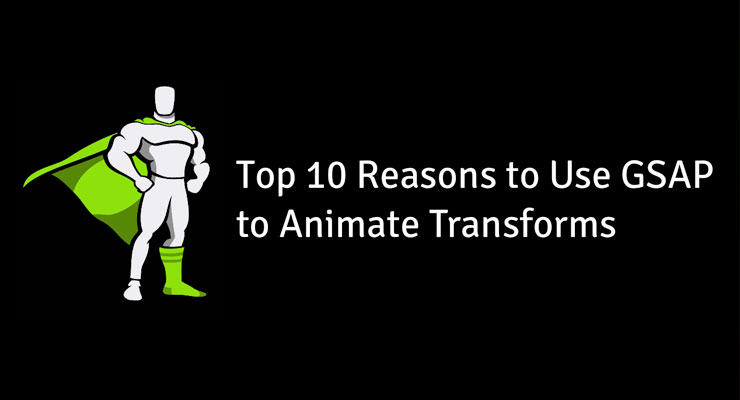 Note: This page was created for GSAP version 2. We have since released GSAP 3 with many improvements. While it is backward compatible with most GSAP 2 features, some parts may need to be updated to work properly. Please see the GSAP 3 release notes for details. You may be surprised by how much work GSAP does under the hood to make animating transforms intuitive and performant. This video explains the top 10 reasons you should be using GSAP to animate transform-related values like scale, rotation, x, y, etc. Watch the video Independent control of each component (x, y, scaleX, scaleY, rotation, etc.) Physics-based animations and dragging, plus advanced easing like Elastic and Bounce Snap to any increment or set of values Query values anytime with _gsTransform Relative values ("+=" and "-=") Directional rotation (clockwise, counter-clockwise, or shortest) Two different skew types ("compensated" and "simple") Consistency across browsers, especially with SVG Animate along a path Sequencing and on-the-fly controls All of these features are baked into CSSPlugin (which is included inside TweenMax). See the docs for more information. Happy tweening!
 -
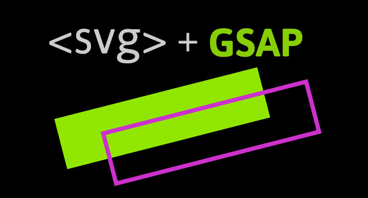 Note: This page was created for GSAP version 2. We have since released GSAP 3 with many improvements. While it is backward compatible with most GSAP 2 features, some parts may need to be updated to work properly. Please see the GSAP 3 release notes for details. We're excited to announce enhanced SVG support baked right into GSAP's CSSPlugin. Now you can animate the rotation, scale, skew, position (and even change the transform origin) of SVG elements just like normal DOM elements. The chart below illustrates a number of cross-browser bugs related to CSS transforms on SVG elements. Four modern browsers interpret the same basic animation code in drastically different ways. Browser comparison (without GSAP) See the Pen GIFS: SVG + CSS Transform Problems by GreenSock (@GreenSock) on CodePen. Be sure to test the demo above in IE, Opera, FireFox, Safari and Chrome to see equal results. Find out how it all works In order to help a wider audience understand how to get around the obstacles of working with SVG, Jack wrote an article packed with tons of info, animation demos and a video showing all the juicy details on www.css-tricks.com. We're honored that Chris Coyier allowed us to share these enhancements and time-saving techniques with the wider developer community on his highly-respected blog. Get all the juicy details in: SVG Animation and CSS Transforms: A Complicated Love Story. The techniques discussed will surely transform your SVG animation workflow
 -
Hi guys, for some reason I can't get the 3d transform perspective working on my splittext animation - see codepen... It only seems to be working in Chrome / Mac. Any ideas? Thanks!
-
Hi everyone! I am working on a project at the moment, and I am using this code snippet: TweenMax.set(convertForm, { y: -30, autoAlpha: 0, force3D: true }); *Note I have tried without the force3D too. And it is generating the following CSS: visibility: hidden; opacity: 0; transform: translate3d(0px, -30px, 0px); However the problem I am having is that the transform doesn't have any vendor prefixes, how can I change this, as I need the animation to work across multiple browsers. Many thanks in advance!
-
Hi guys, I want to make an 'endless' list that is draggable. Each list element needs to snap in the center of the screen. I got those parts working with throwprops' snaps and a proxy element. Now the whole thing also needs to be zoomable. That works too, but the snapping stops working when zoomed out. I can't figure out what parts I have to scale myself and what parts TweenMax scales for me. I set up this pen, im sure you will get where I want this to go: http://codepen.io/mbuesing/pen/XNRrog I put a green line in the center so you can easily see when an element is centered. The center of the element in the middle should always line up with the green line. In zoomed out mode that doesn't work. The calculated offsets are shifted. I suspect it has to do with the update function, in line 60 i subtract the double list width, but that isn't updated to the new zoomed out size. If I do changed it to that, the list will be in a wrong position after the zooming animation. Any ideas? Thanks Moriz
-
Hi, I just want to know if there is any difference in using say { x: "50px" } VS { css: { transform: "translateX(50px" }}, performance wise etc? Is x/y/z always better when it comes to positioning? thanks
-
Hey, I am currently working on a project that requires full page transitions. As an example pages are div elements that are approximately 1024x600 in size and contain content. Pages slide in and out from left to right (emulating the ebook feel). At the moment the page change/transition process goes like this: * Page in view has visibility 'visible' and willChange '' set * set willChange 'transform' on outgoing page *Slide outgoing page out of view * set visibility 'hidden' and willChange '' on outgoing element after animation finished * set visibility 'visible' and willChange 'transform' on incoming element. *Inserted delay (~300ms) - to allow some breathing room for browser paint times and composition(layer creation) *Slide incoming page into view * set willChange '' on incoming page once animation is finished I have put in the delay to give the browser time to paint and promote the div to a composite layer before animating for smooth animations. However the delay required on different devices obviously varies. Is this something lagSmoothing can help with or does any one have any other/better techniques for this type of situation? Jack has already suggested: Don’t alter the will-change property at all. Take the layerization hit at a time that’s less critical. Maybe at startup (not sure how many things you may have to layerize, so you may have to stagger things). You can, for example do TweenLite.set(element, {force3D:true}) and it’ll get layerized right away. That way, when you actually go to animate its transforms, it’s already layerized and ready-to-go. My understanding was that setting will-change:'transform' on the element layerized when it is set, so is there any differences between using that or TweenLite.set(element, {force3D:true}) ? The other thing is deciding when to layerize the pages. Because the pages are quite large doing all the pages ahead of time floods the GPU memory and would probably kill the device so it seems the only option is too layerize pages as they are needed. Since that can take some time depending on the device I am currently inserting the delay during the animation sequence to help but I would much rather a more dynamic approach (no need delaying on devices that dont need too or might need longer). Any input or advice would be appreciated, thanks.
-
Hello people! I was wondering if anyone has experience using Greensock to tween elements in inline SVG and getting it to work in IE (9 and up)? I'm creating a site with a lot of animations going on, and the graphics are pretty much exclusively in SVG. Most of the time, I'm wrapping inline SVG in HTML elements and then animating those, but in some instances, I really need to animate elements within the inline SVG document (e.g. moving things inside of a clip-path). Specifically (so far), I've wanted to move stuff by animating x/y. This works great in Chrome, Firefox, Safari (iOS and desktop), but fails in IE. It's really hard to debug why it's not working, so I thought I'd ask around if anyone has faced the same issues, or had ideas on why this is. No code sample at this point, but will try to provide one if needed.
-
Hello All, I am very new to GreenSock plugins. I want to implement animations in my code as shown in the video in the starting. http://www.greensock.com/css3/ In the starting of the video, how the CSS plugin and CSS Special properties animates, I want the exact same effect to my labels. I searched for the plugin and code for that animation but I couldn't find it. Could you please let me know the code for that effect? Thank you! Thanks, Bunnie
-
 Hello, I love GreenSock, it's a phenomenal product. I am a Flash Developer migrating to HTML, Canvas, CSS, and Javascript web designing. The Javascript versions are excellent. The one challenge I am having is trying to make the CSS 3D Transformations work. I looked at the demos of how powerful these transformations can be at: http://www.greensock.com/transitions/ http://www.greensock.com/css3/ and the "CssPlugin" section of your documentation at: http://api.greensock.com/js/ But, unfortunately I see a whole lot of small snippets of code (i.e. the trailer for a really awesome movie that I can't wait to see), but I would really like to see the whole html page with the css and javascript included (i.e. the whole "unrated, director's cut with alternate endings and commentary.") After searching through the GreenSock forums I found this link that the great Carl Schooff posted some downloadable examples of CSS Transformations: http://forums.greensock.com/topic/6230-how-to-tween-css3-transform-properties/ What I'm trying to say, is I would really appreciate it, if it were a little easier to figure out how to use these powerful tools to the most. Thanks, for viewing & best wishes, J


