Search the Community
Showing results for tags 'transformorigin'.
Found 47 results
-
 Trying to basically "walk" a square across the screen the way you'd tip a heavy box across a room to move it. For it to work, I need to update the transform origin (i.e. rotation point) of the box for each step but since the origin is relative to the original box position, it doesn't quite work. Any thoughts on getting this to work? Currently I'm just using a div but I'm open to SVG solution.
 -
Hi, Firstly many thanks for taking a look at my query. I am getting inconsistent behavior on rotation of my clip path. Chrome and Safari are behaving correctly, but Firefox seems to be acting very strange. I would appriciate if someone could explain why. Many thanks ?
-
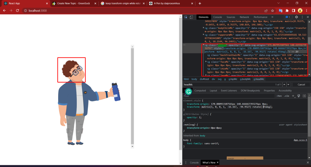
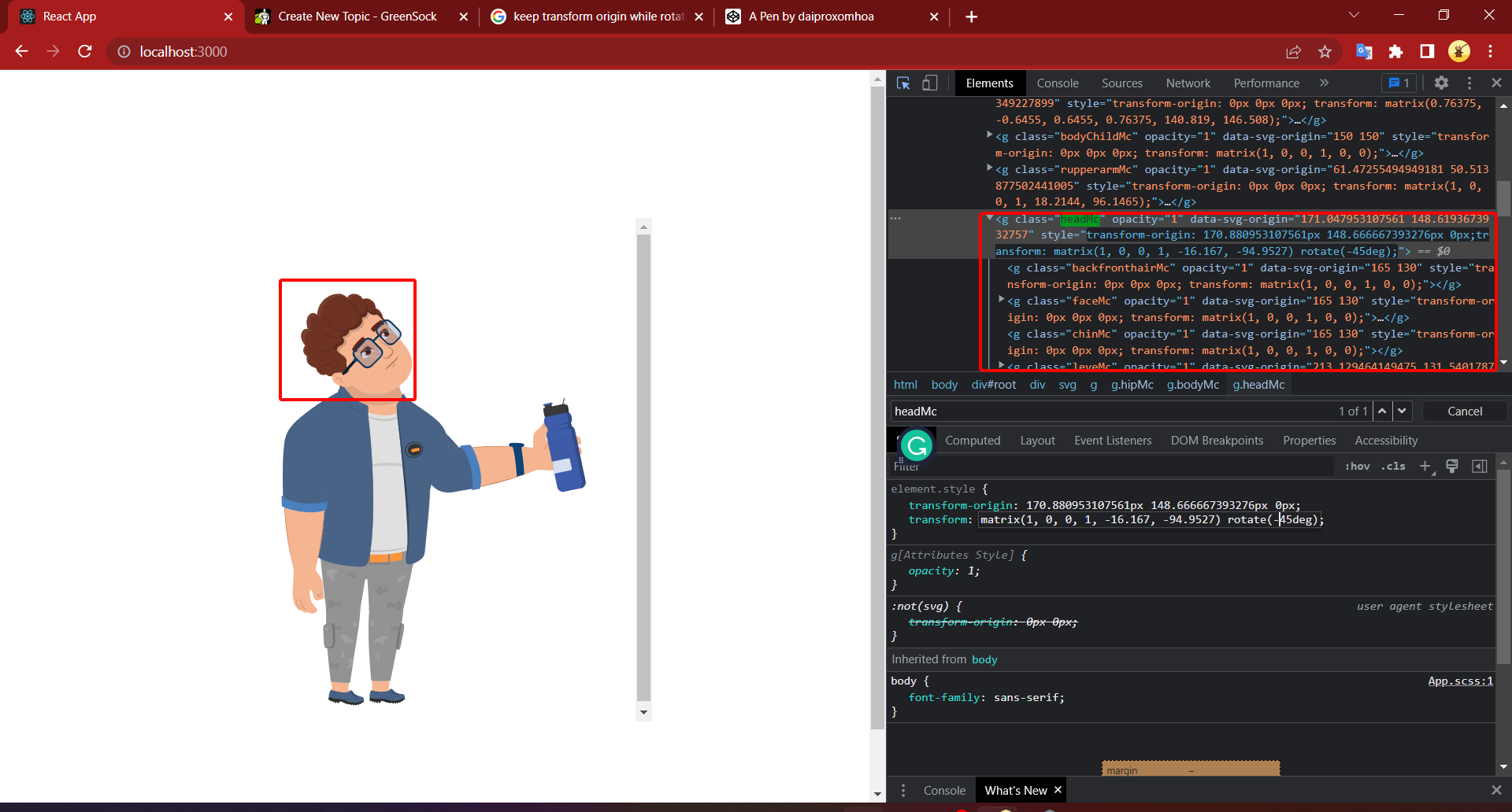
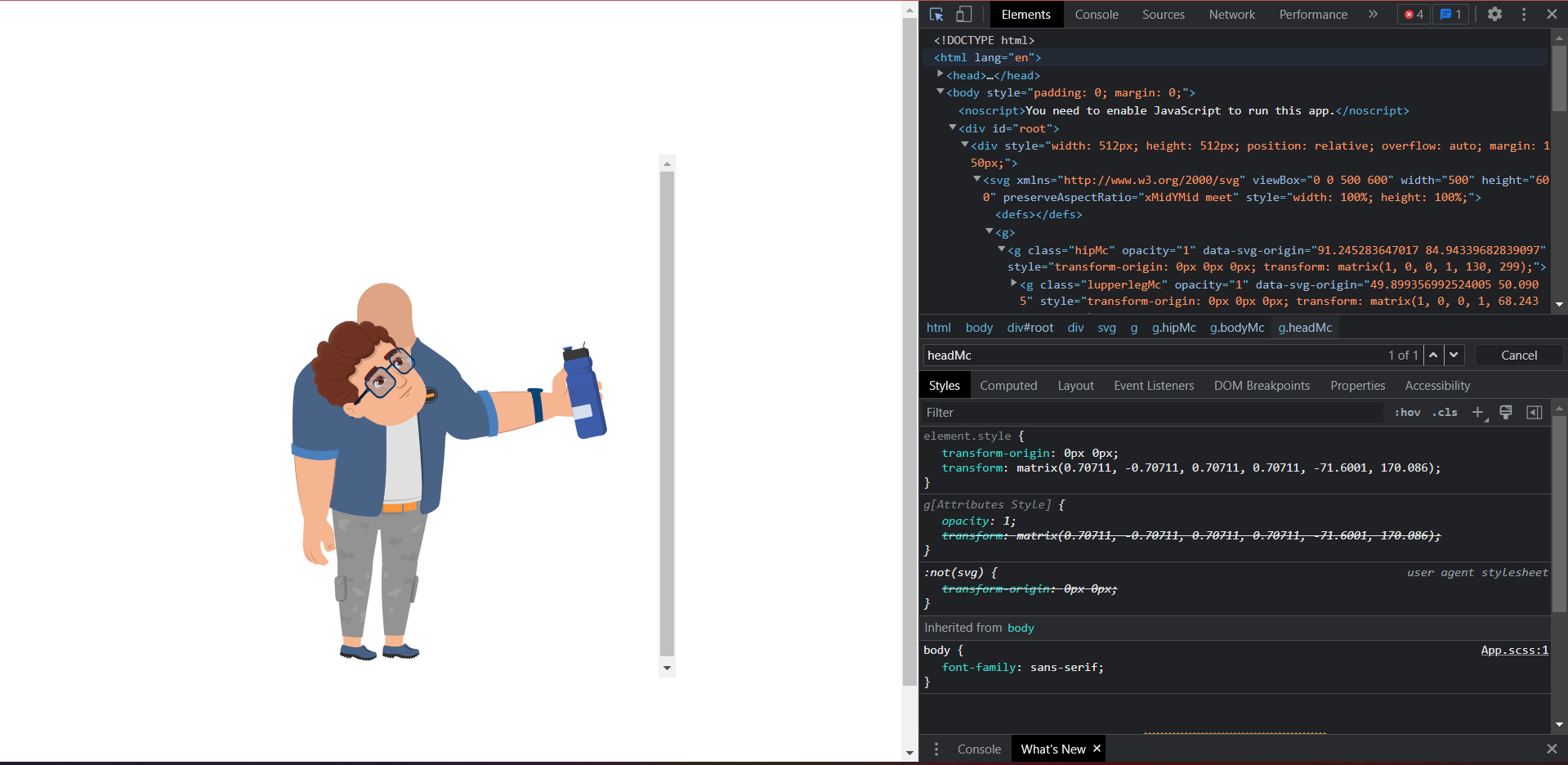
This is what i have when i rotate headMc by transform css. This is a result which I have when I use Gsap : gsap.set('.headMc', { transformOrigin: '170.880953107561px 148.666667393276px', rotation: -45 }); What I have to do to get the result when I use css like the first image; Link svg :

-
Hey folks! I'm having a problem with SVG transform properties using transform-box: fill-box Is possible to avoid the matrix calculation in the rect ? I created a Codepen example with three rects, the red use only css, the blue use a normal tween and the yellow one is crazy ? Thanks! ?
-
Hello Green Socks! I'm having a very confusing issue with an animation I'm doing, where the transform-origin seems to (sometimes) quickly flip to a value I have not defined anywhere. I recreated a super simplified version showing the issue. The codepen version for some reason does not have the issue(??) ** But it happens on my local machine and also on the server here >> https://vektor.co.uk/dev/gsap-debug/970x250--debug/ So the transform-origin should always be 50% 50%, but it quickly flips to '275px 0' before swapping back, this causes the image to jump around. I even added a 'set' to the start of the code, and also added it into the tween itself. it is also in the timeline 'defaults{}'. Can anyone shed some light on what is going on and how I can make sure the transform origin never changes? Is this a bug or does it make sense somehow? Cheers! p.s. loving V3! ??? ** EDIT: I have seen the issue happen on codepen if I open it in a window and refresh it enough times >> EDIT2: seems to be some sort of caching issue? Happens with devtools open or in new incognito window. But I don't think it's an issue of GSAP.js not loading quickly enough, as the animation starts with the image transformed, which is done via gsap code? (uses a 'from' tween which always shows up immediately). (It is going to be a google banner so assuming that most people will see it like this, on a 'first load' basis, if that makes sense)
-
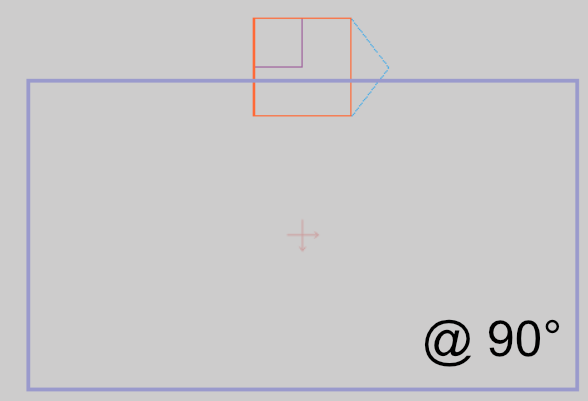
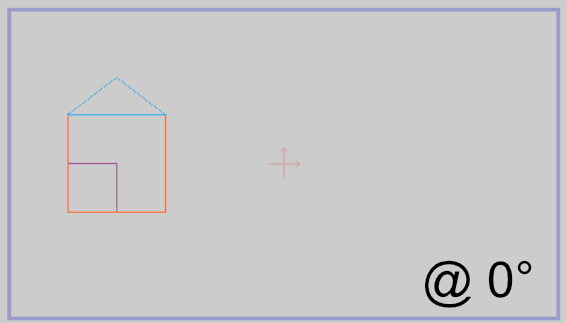
Hi. I am starting to go mad trying to resolve this, so I thought I would post a question here instead. I am try to implement a rotation such that everything on the page view box (the outermost group -- depicted by the purple outline) rotates about its pre-defined origin point (shown by the cross - located at 50% 50% of view port in this case, but could be anywhere). At present the resultant rotation is relative to the compound contents of the Group (i.e. all the House elements) -- spinning around itself , whereas I need it to be relative to the parent view box -- effectively spinning around a fixed point on the page. So... the outer Group element ('street' in my codepen example) needs to behave like a parent-filler rather than a child-wrapper, with the origin offsets relative to the parents offset and dimensions. Note: The content items can be arbitrary i.e. multiple houses, cars etc. (set by a user), and the content may also exceed the bounds of the purple view box. None of these factors should affect the pre-defined rotation origin of the 'street'. (start) (desired @ 90 deg)
-
 Hey GSAP enthusiasts, I have a problem with the following scenario: I have two image elements: .el { position: absolute; width: 100px; height: 100px; } .el1 { transform: matrix(1, 0, 0, 1, 100, 100); } .el2 { transform-origin: 0 0; transform: matrix(0, 1, -1, 0, 400, 100); } The second element "el2" has an initial rotation applied and also the transformOrigin set. Now I use gsap to animate both elements like this: gsap.to('.el', { delay: 2, repeat: -1, yoyo: true, transformOrigin: '50% 50%', scale: 2 }); When running in the browser I see the second element "el2" making a jump to the right, before the animation starts. I know that it's not the best practice to set transforms/origin in CSS instead of initialising these properties via gsap.set(...). But in my scenario the code (Markup and CSS) is being generated, so I don't have control over it. Is there anything I am missing or is this an unsupported edge case? (Not 100% sure if this comment might be related: ) Thanks in advance and keep up the amazing work. (BTW: loving the new ScrollTrigger :)
 -
 With the help of the CSSPlugin, GSAP can animate almost any CSS-related property of DOM elements including the obvious things like width, height, margin, padding, top, left, and more plus more interesting things like transforms (rotation, scaleX, scaleY, skewX, skewY, x, y, rotationX, and rotationY), colors, opacity, and lots more. Because animating DOM elements in the browser is so common, GSAP automatically checks to see if the target is a DOM element and if it is (and you haven't already defined a "css" object in the vars parameter), the engine creates that css object for you and shifts any properties that aren't reserved (like onComplete, ease, delay, etc. or plugin keywords like scrollTo, morphSVG, pixi, etc.) into that css object when the tween renders for the first time. We recommend using the more concise style that omits the css:{} object but be aware that either style is acceptable. Learn more in the CSSPlugin documentation.
 -
Ok, so here are 2 almost identical tweens. Both initially set transformOrigin of bars to bottom-center. The first one uses gsap.from() and it works weird, looks like it's some bug (or perhaps I miss something?) The second one is almost the same, but it uses gsap.to() and transformOrigin seems to work fine. What could be the reason for such behaviour?
-
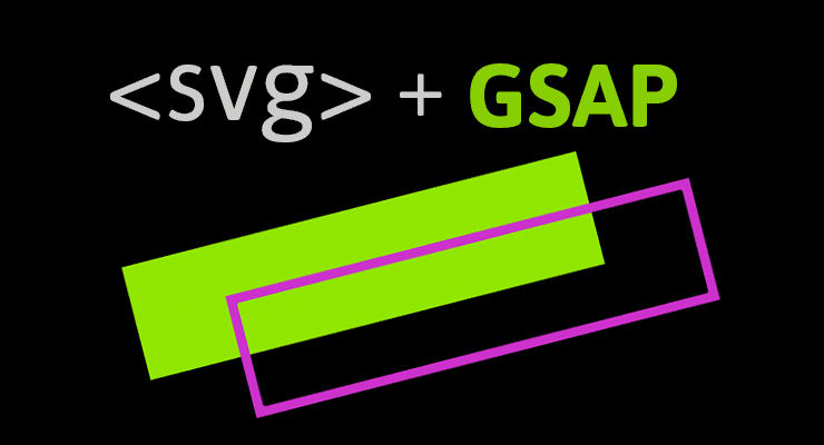
 When it comes to animation, SVG and GSAP go together like peanut butter and jelly. Chocolate and strawberries. Bacon and...anything. SVG offers the sweet taste of tiny file size plus excellent browser support and the ability to scale graphics infinitely without degradation. They're perfect for building a rich, responsive UI (which includes animation, of course). However, just because every major browser offers excellent support for displaying SVG graphics doesn't mean that animating them is easy or consistent. Each browser has its own quirks and implementations of the SVG spec, causing quite a few challenges for animators. For example, some browsers don't support CSS animations on SVG elements. Some don't recognize CSS transforms (rotation, scale, etc.), and implementation of transform-origin is a mess. Don't worry, GSAP smooths out the rough spots and harmonizes behavior across browsers for you. There are quite a few unique features that GSAP offers specifically for SVG animators. Below we cover some of the things that GSAP does for you and then we have a list of other things to watch out for. This page is intended to be a go-to resource for anyone animating SVG with GSAP. Outline Challenges that GSAP solves for you Scale, rotate, skew, and move using 2D transforms Set the transformOrigin (the point around which rotation and scaling occur) Set transformOrigin without unsightly jumps Transform SVG elements around any point in the SVG canvas Animate SVG attributes like cx, cy, radius, width, etc. Use percentage-based x/y transforms Drag SVG elements (with accurate bounds and hit-testing) Move anything (DOM, SVG) along a path including autorotation, offset, looping, and more Animate SVG strokes Morph SVG paths with differing numbers of points Tips to Avoid Common Gotchas Limitations of SVG Browser support Inspiration Awesome SVG Resources Get Started Quickly with GSAP Challenges that GSAP solves for you GSAP does the best that it can to normalize browser issues and provide useful tools to make animate SVG as easy as it can be. Here are some of the challenges that using GSAP to animate SVG solves for you: Scale, rotate, skew, and move using 2D transforms When using GSAP, 2D transforms on SVG content work exactly like they do on any other DOM element. gsap.to("#gear", {duration: 1, x: 100, y: 100, scale: 0.5, rotation: 180, skewX: 45}); Since IE and Opera don't honor CSS transforms at all, GSAP applies these values via the SVG transform attribute like: <g id="gear" transform="matrix(0.5, 0, 0, 0.5, 100, 0)">...</g> When it comes to animating or even setting 2D transforms in IE, CSS simply is not an option. #gear { /* won't work in IE */ transform: translateX(100px) scale(0.5); } Very few JavaScript libraries take this into account, but GSAP handles this for you behind the scenes so you can get amazing results in IE with no extra hassles. Set the transformOrigin (the point around which rotation and scaling occur) Another unique GSAP feature: use the same syntax you would with normal DOM elements and get the same behavior. For example, to rotate an SVG <rect> that is 100px tall by 100px wide around its center you can do any of the following: gsap.to("rect", {duration: 1, rotation: 360, transformOrigin: "50% 50%"}); //percents gsap.to("rect", {duration: 1, rotation: 360, transformOrigin: "center center"}); //keywords gsap.to("rect", {duration: 1, rotation: 360, transformOrigin: "50px 50px"}); //pixels The demo below shows complete parity between DOM and SVG when setting transformOrigin to various values. We encourage you to test it in all major browsers and devices. With MorphSVG, you can Morph <path> data even if the number (and type) of points is completely different between the start and end shapes! Most other SVG shape morphing tools require that the number of points matches. Morph a <polyline> or <polygon> to a different set of points Convert and replace non-path SVG elements (like <circle>, <rect>, <ellipse>, <polygon>, <polyline>, and <line>) into identical <path>s using MorphSVGPlugin.convertToPath(). Optionally define a "shapeIndex" that controls how the points get mapped. This affects what the in-between state looks like during animation. Simply feed in selector text or an element (instead of passing in raw path data) and the plugin will grab the data it needs from there, making workflow easier. MorphSVGPlugin is a bonus plugin for Club GreenSock members (Shockingly Green and Business Green). Tips to Avoid Common Gotchas There are some things that GSAP can't solve for you. But hopefully this part of the article can help prepare you to avoid them ahead of time! Here are some things to keep in mind when creating and animating SVGs. Vector editor/SVG creation tips: When creating an SVG in Illustrator or Inkscape, create a rectangle the same size as your artboard for when you copy elements out of your vector editor and paste them into a code editor (how-to here). How to quickly reverse the direction of a path in Illustrator (Note: If the Path Direction buttons are not visible in the attributes panel, click the upper right menu of that panel and choose 'Show All'): Open path: Select the pen tool and click on the first point of your path and it will reverse the points. Closed path: Right click the path and make it a compound path, choose menu-window-attributes and then use the Reverse Path Direction buttons. If you're morphing between elements it might be useful to add extra points yourself to simpler shapes where necessary so that MorphSVG doesn't have to guess at where to add points. You can think of masks as clip-paths that allow for alpha as well. When using masks, it's often important to specify which units to use. Use a tool like SVGOMG (or this simpler tool) to minify your SVGs before using them in your projects. Code/animation-related tips: Always set transforms of elements with GSAP (not just CSS). There are quite a few browser bugs related to getting transform values of elements which GSAP can't fix or work around so you should always set the transform of elements with GSAP if you're going to animate that element with GSAP. Always use relative values when animating an SVG element. Using something like y: "+=100" allows you to change the SVG points while keeping the same animation effect as hard coding those values. You can fix some rendering issues (especially in Chrome) by adding a very slight rotation to your tween(s) like rotation: 0.01. If you're having performance issues with your issue, usually the issue is that you have too many elements or are using filters/masks too much. For more information, see this post focused on performance with SVGs. You might like injecting SVGs into your HTML instead of keeping it there directly. You can do this by using a tool like Gulp. You can easily convert between coordinate systems by using MotionPathPlugin's helper functions like .convertCoordinates(). Technique tips/resources: You can animate the viewBox attribute (demo)! You can animate (draw) a dashed line by following the technique outlined in this post. You can animate (draw) lines with varied widths by following the technique outlined in this post. You can animate (draw) handwriting effects by following the technique outlined in this post. You can create dynamic SVG elements! You can animate (draw) a "3D" SVG path. You can fake nested SVG elements (which will be available in SVG 2) by positioning the inner SVG with GSAP and scaling it (demo). You can fake 3D transforms (which will be available in SVG 2) in some cases by either Faking the transform that you need. For example sometimes rotationYs can be replaced by a scaleX instead. Applying the transform to a container instead. If you can limit the elements within the SVG to just the ones you want to transform, this is a great approach. For example, applying a rotationY to the <svg> or <div> containing a <path> instead of applying it to the <path> itself. Limitations of SVG The current SVG spec does not account for 3D transforms. Browser support is varied. Best to test thoroughly and have fallbacks in place. Most browsers don't GPU-accelerate SVG elements. GSAP can't change that. Browser support All SVG features in this article will work in IE9+ and all other major desktop and mobile browsers unless otherwise noted. If you find any cross-browser inconsistencies please don't hesitate to let us know in our support forums. Inspiration The Chris Gannon GSAP Animation collection is great for seeing more SVG animations made with GSAP. Be sure to also check out Chris Gannon's full portfolio on CodePen and follow him on Twitter for a steady influx of inspiration. Awesome SVG Resources SVG Tutorials - MotionTricks The SVG Animation Masterclass - Cassie Evans Understanding SVG Coordinate Systems and Transformations - Sara Soueidan Improving SVG Runtime Performance - Taylor Hunt SVG tips - Louis Hoebregts A Compendium of SVG Information - Chris Coyier Making SVGs Responsive with CSS - Sara Soueidan viewBox newsletter (SVG focus) - Cassie Evans and Louis Hoebregts Get Started Quickly with GSAP Below are a few resources that will get you up and running in no time: Getting Started Guide with Video Sequence Animations like a Pro (video) GSAP Documentation
 -
 Note: This page was created for GSAP version 2. We have since released GSAP 3 with many improvements. While it is backward compatible with most GSAP 2 features, some parts may need to be updated to work properly. Please see the GSAP 3 release notes for details. We're excited to announce enhanced SVG support baked right into GSAP's CSSPlugin. Now you can animate the rotation, scale, skew, position (and even change the transform origin) of SVG elements just like normal DOM elements. The chart below illustrates a number of cross-browser bugs related to CSS transforms on SVG elements. Four modern browsers interpret the same basic animation code in drastically different ways. Browser comparison (without GSAP) See the Pen GIFS: SVG + CSS Transform Problems by GreenSock (@GreenSock) on CodePen. Be sure to test the demo above in IE, Opera, FireFox, Safari and Chrome to see equal results. Find out how it all works In order to help a wider audience understand how to get around the obstacles of working with SVG, Jack wrote an article packed with tons of info, animation demos and a video showing all the juicy details on www.css-tricks.com. We're honored that Chris Coyier allowed us to share these enhancements and time-saving techniques with the wider developer community on his highly-respected blog. Get all the juicy details in: SVG Animation and CSS Transforms: A Complicated Love Story. The techniques discussed will surely transform your SVG animation workflow
 -
Hello GreenSockers, You guys are so awesome and thank you for providing this platform. Today, I saw this beautiful accordion animation https://uimovement.com/design/beaches-app/ and I want to create the same effect using GS. Is it possible to create this effect using in GS? Thanks in advance.
-
Hi, So this is a simple rotation animation that works well on all browsers but Safari. Can't figure out why this is happening. Any ideas? (Chrome for desired results, Safari for wrong ones) Thanks!
-
 I'm at a loss. I cannot replicate this issue in a CodePen so sorry in advance. Here's what I have: var aiAnimations = (function () { function init() { TweenMax.set('.ai-hero__flare', { opacity: 1, transformOrigin:'50% 50%'}) TweenMax.from('.ai-hero__flare', .7, { scale: 0, ease: Power3.easeOut }) } return { init: init, }; })(jQuery); $(document).ready(function () { aiAnimations.init(); }); The output is: element { transform-origin: 0px center 0px; opacity: 1; transform: matrix(1, 0, 0, 1, 0, 0); } I cannot figure out what is going wrong with transformOrigin. I'm loading GSAP v: 2.0.2 via NPM and am compiling via Gulp. If I remove the line with transformOrigin nothing shows up for transform-origin inline, so it's not being overwritten elsewhere. Any ideas? I can set the transform-origin in my CSS, but I'd rather control it via GSAP. Thanks, Ryan
 -
I am unable to get the transformOrigin property to be centered within the object. It is being set to 0px 0px regardless of whether I have a 'transformOrigin' property defined or not. The codepen illustrates this issue: https://codepen.io/ron-itelman/pen/xzqMWN?editors=1010

-
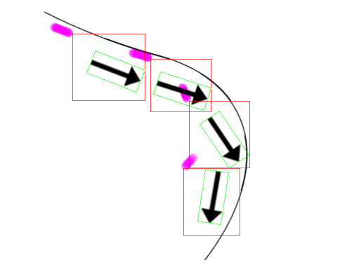
Hello great almighty GSAP forum, here I am with another question I'm having. Goal create some sort of traveling trail emitter that follows the object and being manipulated by scroll event. Also everything is responsive, relative to the SVG size.Progress/ attempts Got most parts working, however there're a few visual things I just can't figure out. I've tried manipulating x,yPercent, transformOrigin, svgOrigin on the <image> tag inside the <svg> Help needed I'd like to know how to make the image's transform origin to the tip or tail of the arrow how to properly adjust the emit position so it sync with the arrow tail.. Actual travelling route doesn't have to follow the predefined path strictly, it's more important getting the emitter right. I don't know how autoRotate works under the hood, by the look of the relationship between particle and the arrow position, seems like a "invisible bounding box" is created, and the arrow rotate inside the box, and the box takes on the bezier curve data. Question outside of this topic Why isn't <image> tag visible on Safari, let alone IE?? The emitted particle shows on Safari but seems the percentage position is way off? Seems like line 48-51 behave differently on Safari. Added on 19th of April To answer my own question for peoples reference. <image> tag needs an inline width and height attribute in browsers other than Chrome, somehow other browser can't take the CSS and apply it to <image> tag within svg; Thanks a lot!

-
Hey guys, so i am wondering how i can animate my svg? It is only the second time i am doing this only this time it wont work. If i place in the css for instance : opacity:0; this will work. When i use .from opacity or autoAlpha:0 nothing happens. I also used transform origin in the inline style, that also works. What is wrong? Also no console errors in the browser. Would like to animate them so they look like a bar graph Thanks allot in advance
-
 Hi, I'm getting more and more familiair with GSAP and JS, but I'm only diving in to it since last week. Now I was playing around with the TweenMax.ticker and mousemove event based on: But I got stuck on trying two things: 1)move SVG paths in the same way as the circle element; I did get the rect element to work by changing the cx and cy into x an y, but I don't know how to interpret this with a path position, since the ticker event does not seem to work if I give the SVG group tag an id. 2)I attached a codepen sketch based on the pen from Blake Bowen; as you can see I simply added a timeline to rotate one of the elements. Now I want this to keep on rotating around the origin value of the element, but this doesn't happen. The origin point stays on the begin value of the element (which is the top left corner) and does not move accordingly to the mouse position. Initially I want to be able to do: 1)move SVG paths based on mouse position 2)know how to apply more than the change of position accordingly Can anyone help me? Please let me know if my question is unclear. Thank you in advance!
 -
Greetings GSAP community, I'm having some trouble getting an SVG origin to center. Please see the Codepen, there is not much else to explain. Thanks in advance for any help. ~Jareth
-
Hi, I need to scale a polygon so that its "width" goes to zero. In the codepen its the pink element. It seems like the scale animation makes it rotates. I've included a blue rect who works perfectly. Is it normal behavior or did i miss something ?
-
Hi all, I use TweenMax to try a animation bouncing down a image. The problem is when I using transformOrigin attribute ( transformOrigin:"bottom" ), the image do not scale rightly. I want the image scale from top to bottom. Can you tell me the solution for this problem? Sorry for my English. //here is svg circle. It's work normally var duration = 3; var tl = new TimelineLite({delay:0.2}); CustomBounce.create("myBounce", {strength:0.01, squash:2}); tl.to("#ball", 2, {y:200, ease:"myBounce"}) .to("#ball", 2, {scaleY:0.7, scaleX:1.1, ease:"myBounce-squash", transformOrigin:"bottom"}, 0) // Problem here, when I replace circle by an image. the transformOrigin bottom no working var tl2 = new TimelineLite({delay:0.2}); CustomBounce.create("myBounce2", {strength:0.01, squash:2}); tl2.to("#burger", 2, {y:200, ease:"myBounce2"}) .to("#burger", 2, {scaleY:0.7, scaleX:1.1, ease:"myBounce2-squash", transformOrigin:"bottom"}, 0)
-
 CodePen should demonstrate the issue I am facing. Clicking on RED should ideally rotate the "+" sign into an "x" sign by applying "rotation":45. However, this rotation must be done alongside changes in inherited height, which, as you can see, totally disturbs the rotation matrix. I am expecting the scale of the icon to change with relative box-position unchanged, i.e. the center of the icon as per transformOrigin property should stay the same relative to the parent box. Any help would be appreciated!
 -
Hi guys, I am trying to use the Attribute Plugin to ensure that my SVG also animates in Firefox, but can't figure out the correct syntax for this: .fromTo("#star",1, {attr:{transform:"scale(0.2)"}},{attr:{transform:"scale(1)",transform:"rotate(360)"}}) The issue: This above code ignores the fromTo scale tween completely and just rotates the SVG and this gives me a syntax error: .fromTo("#star",1, {attr:{transform:"scale(0.2)"}},{attr:{transform:"scale(1)","rotate(360)"}}) All I want to do is scale up and rotate the star at the same time from transformOrigin:"50% 50%". I tried that as well as transform-origin:"center center" inside the Attr plugin with no luck. Thanks!
-
Sunday night, I could be doing so many things other than breaking Jack's toys couldn't I? Well, I am that boring sometimes. Sorry Jack. So, the combo that caused the weirdness is CustomBounce + percentage base movement + transformOrigin in a shape element of an SVG. As you will see in the pen (at least in Chrome), the element gets moved to the 0,0 position according to the transformOrigin you define. Not something desirable if you're trying to squash an element.
-
Can anyone give me a clue as to why IE9 is rotating my SVG files differently than all other browsers? TransformOrigin doesnt seem to work the same (I have tried, %, pixels, and top), and it is going in different directions. The CodePen link should show the 3 lettter "A"s pointing to the left. But in IE9, they get squished and point down after a TweenMax.set call. Any thoughts? Thanks very much. Also posted here in case CodePen doesnt allow IE9 viewing: http://brendyn.com/test2/


