Search the Community
Showing results for tags 'transform'.
Found 98 results
-
Hello, I'm trying to create an effect that several boxes that overlap are rotated and then each one expands from the other in a 3D way. The only way I found that does that is by modifying the transformOrigin property. But unfortunately that property does not animate and simply goes into position. Is there a better way to achieve this? (the codepen sample should illustrate the animation that I'm describing) Thanks. Here's the codepen again: http://codepen.io/netgfx/pen/EaKPdP
-
 I have got this snippet of gsap code working pretty well to adapt my 1280x768 webgame to almost any mobile viewport size. It's not perfect, but I think it's pretty close. I'm looking for any constructive advice or ways to improve this method as adapting viewport sizes is kind of a pain. // disable all mobile dragging of webpage $("html").on("touchmove", function(e){ // only disable dragging of html element if(e.target===this){ e.preventDefault(); } }); // make html page scaling originate from top-left corner TweenMax.set("html", { transformOrigin:"0 0" }); function resizeWindow(){ var w=window.innerWidth; var h=window.innerHeight; // width less than 1280? if(w<1280){ TweenMax.set("html",{scaleX:w/1280}); }else{ TweenMax.set("html",{scaleX:1}); } // height less than 768? if(h<768){ TweenMax.set("html",{scaleY:h/768}); }else{ TweenMax.set("html",{scaleY:1}); } } $(window).on("resize", function(){ // only do this for mobile devices if(isMobile===true){ // do not resize if focusing on an input or the keyboard will squish the whole webpage if(inputFocus===false){ resizeWindow(); } } });
 -
Hi all, I'm having this problem with SVG rotation. Basically it always reset its position once the animation is finished. Codepen: http://codepen.io/anon/pen/QwwEYX During testing, it works fine on Chrome, but not of Firefox and mobile Safari. I'm using Firefox 33.1.1. Anyone's having the same issue? Any pointer is greatly appreciated. Cheers! UPDATE: Apparently the problem is exclusive to FF for mac and Safari mac.
-
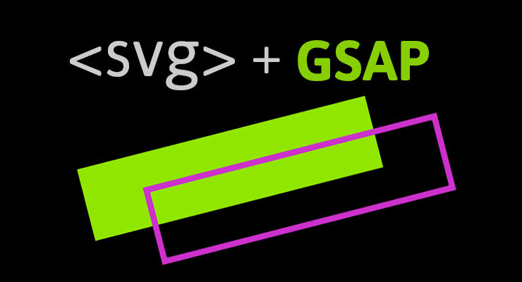 Note: This page was created for GSAP version 2. We have since released GSAP 3 with many improvements. While it is backward compatible with most GSAP 2 features, some parts may need to be updated to work properly. Please see the GSAP 3 release notes for details. We're excited to announce enhanced SVG support baked right into GSAP's CSSPlugin. Now you can animate the rotation, scale, skew, position (and even change the transform origin) of SVG elements just like normal DOM elements. The chart below illustrates a number of cross-browser bugs related to CSS transforms on SVG elements. Four modern browsers interpret the same basic animation code in drastically different ways. Browser comparison (without GSAP) See the Pen GIFS: SVG + CSS Transform Problems by GreenSock (@GreenSock) on CodePen. Be sure to test the demo above in IE, Opera, FireFox, Safari and Chrome to see equal results. Find out how it all works In order to help a wider audience understand how to get around the obstacles of working with SVG, Jack wrote an article packed with tons of info, animation demos and a video showing all the juicy details on www.css-tricks.com. We're honored that Chris Coyier allowed us to share these enhancements and time-saving techniques with the wider developer community on his highly-respected blog. Get all the juicy details in: SVG Animation and CSS Transforms: A Complicated Love Story. The techniques discussed will surely transform your SVG animation workflow
 -
I'm using a scale transform, when accelerated using the force3D property the elements are not repainted correct at the end of the animation. I believe this is a chrome/blink bug but I wanted to see if anyone had anything to share on the matter here. The issue can be see here: http://jsbin.com/qehuna Using a non-accelerated tween is fine: http://jsbin.com/sureza Accelerated CSS transitions are fine: http://jsbin.com/fomuno As a workaround I've discovered that adding a small non-accelerated transform after the main tween removes the elements from a composite layer and triggers a repaint: http://jsbin.com/vezaxa This issue is not present in Firefox
- 4 replies
-
- 1
-

-
- chrome
- accelerated
- (and 1 more)
-
I've noticed that GSAP applies transform properties to SVG elements via the inline style attribute instead of the native SVG transform attribute: https://developer.mozilla.org/en-US/docs/Web/SVG/Attribute/transform. This tends to be a browser compatibility issue, especially with IE. I cross referenced Velocity JS, and it looks like there's some feature detection built in that deals with this issue. Am I missing something? Or does GSAP have a method of accomplishing this easily? I should note that I already have some functional code, but it's a lot more verbose than I'd like it to be; onUpdate functions running after every tween. To be sure I'm clear, I want: transform="translate(40, 60)" or transform="matrix(1,2,3,4,5,6)" instead of style="transform: matrix(1, 0, 0, 1, -45, 75)" (ignore number values) Thanks for the help
-
Hi all! I need help with this, I have tested in Chrome, Safari, Firefox, and IE9+ and works magically. But when I tested in IE8 specifically, the animation breaks. I have tried everything I could came up with but I'm stocked. Demo Link: http://theoremcreations.com/undertone/16002/ss/demo/ CodePen Link: http://codepen.io/anon/pen/lnIHg Animation_Demo.zip
-
Hi, I’ve spent the last day building a working rubix cube demo using TweenMax to position and animate the objects accordingly. Draggable is being used to rotate the cube X/Y and throwProps is used too. Firefox is displaying some very odd, back-face type display issues that I can't seem to resolve, can anybody suggest a work-around or fix to correct this problem? IE10 is simply flattening the whole object onto a 2D plane and not allowing any z-depth. The demo will auto rotate 20 times before allowing user interaction by "swiping" a side to rotate it, or dragging the background to rotate in the cube in 3D space. Any help would be gratefully appreciated. View the demo here: http://www.rogueinteractive.net/rogueiOS/rubix.html Pete
-
Hey all, Browser : Chrome, OS : Windows 7 x64 codePen : http://codepen.io/Stefdv/pen/eybkF The problem(s); When i switch between sliders, the sliders don't always correspond to the current tranform of the box. There is als a 'jump' when i switch between slider adjustments. another issue: i can't seem to make a rotationZ for 180deg...at least it's not rotating right then ? Any help would be appreciated ( a lot )
-
Hi, The new Chrome has a matrix3D bug and the solution would be to set -webkit-transform: perspective(xxxx). I tried to use the TweenLite.set(element, {transformPerspective:500}); but isnt working. Also if i add manually the gsap removes it when the animation starts. If you check this: http://demo.minic.ro/modules/isntauro in chrome you can see the bug. The solution is to add the transform perspective to the ".back" element. Any help would be great! Thanks!
-
I want to make some spans in a paragraph scale up the same way the parent div would scale up. Here is a demo showing the naive implementation -- notice all of the enlarged words jumble together: http://jsbin.com/yamatuke/1 Before I dive into the css to accomplish this, I thought that perhaps greensock's libraries already handle this?
-
Hi, About me: This is the first day I am trying JSAP. I know using jquery and doing animation. But not expert. I am trying to rotate an element 180 degree, it works perfect using css3 rotation, but using jsap-jquery plugin, it behaves weired. It works for 179 degree and 181 degree. Problem is in 360 degree rotation too - it stays there. The code I used $('.link2').click(function(){ $('.div2').animate({'transform':'rotate(-180deg)'},3000) }) I tried the tweenmax way too $('.link3').click(function(){ var sur = $('.div3'); TweenMax.to(sur, 1.5, {transform:'rotate(180deg)'}) }) again, it works when using other values is there any way to force the direction, so it rotates the way i want?
-
I'm no real programmer but I created this: http://fizion.maakt.nu/gstest/ Not sure why but there's something wrong with the 3D transform. If you look (in Chrome) at the developer tools you see that it will be something like this after one (or a few) clicks -webkit-transform: matrix3d(0.99992, 0, -0.01243, 0, 0, 1, 0, 0, 0.01243, 0, 0.99992, 0, 0, 0, 0, 1); I removed the perspective from the wrapper but still the same. I tried to do something with roundProps but no luck so far. As far as I could see the first click is always working like it's supposed to be working. Since I rotate with 90 degrees I'm not sure why it behaves like this. If you click more often the difference will get bigger and bigger which is not really my intention. Hope someone can help me out.
-
Hi, Is possible this css3 animation with gsap? http://jsfiddle.net/nGsk3/1/ Regards.
-
Hello.. i am trying to clear properties on a tween and/or timeline. But no matter what or where i use it, it wont clear the properties off the element (image). sample code below: var tl = new TimelineMax({ paused:true, autoRemoveChildren:true, onComplete: function(){ //TweenMax($("img"),{clearProps:"all"}); TweenMax($("img"),{clearProps:"transformOrigin,transform,scale"}); } }); tl.add( TweenMax.to($("img"), 4, { css:{ transformOrigin:"left top", scale:1.5 }, clearProps: "transformOrigin,transform,scale", //clearProps: "all", ease: Linear.easeOut, onComplete: function(){ //TweenMax($("img"),{clearProps:"all"}); TweenMax($("img"),{clearProps:"transformOrigin,transform,scale"}); } }) ); tl.play(); and here is my codepen example: http://codepen.io/jonathan/pen/rwFva as you can see using your browser code inspector/console.. you can see how after the animation completes the transform properties do not get cleared. You can see how i tried 3 ways that are commented out: the clearProps that is called in the onComplete callback of the Timeline using the set method the clearProps that is called in the onComplete callback of the added Tween using the set method and the clearProps property on the added tween. No matter which way i try to clear properties, i cant seem to have the element clear the properties GSAP has added. If you check my code pen example commenting out each way you can see how its not clearing the style attribute css properties: transform matrix3d, transform origin or any css that GSAP adds to the element (image). Any help will be highly appreciated!
- 15 replies
-
- 1
-
-
- css
- clearprops
- (and 3 more)
-
Hello, Im trying to find away to infinitely scale an image. The only way i can think of is using a recursive function. I tried to use 'repeat: -1, but it just restarts the tween from the beginning value of the css property. start(); function start(){ TweenMax.to($(img), 4, { css:{ scale:'+=0.5' }, ease: Power0.easeInOut, onComplete: function(){ start(); } }); } I was wondering if there is a better way using TweenMax or TimelineMax to infinitely scale an image? Either using (transform) scale or width and height (css or dom). Basically I want to keep animating the value up, infinitely. By incrementing up, infinitely. Any help will be highly appreciated! Thank You!
-
Hello, I was wondering how could we translate CSS 3D animations & transformations to equivalent GSAP code. I have the following CSS: @-webkit-keyframes pathRotate { from { -webkit-transform: rotateZ(0deg);} to { -webkit-transform: rotateZ(360deg); } } And want to translate this into GSAP code. I have also set up a codepen here: http://codepen.io/netgfx/pen/pBgbo What I'm trying to do is rotate in an "orbital" path some objects but without them rotating around themselves. Is there a plugin for GSAP or some specific code that can do that? Thanks in advance!
-
Hello, I'm working on my new Portfolio at the moment, and i ran into a problem. The whole page will be based on a cube that spins around. At first I used CSS-Transitions for the animations, but I decided to switch to GSAP JS. It worked great but I got a "little" problem. It rotates the cude diffrently then it did before. This it what it does: http://vps.deesr.com/cube/ This it what it should do: http://vps.deesr.com/cube/cssversion/ *You can rotate the cube with the arrow keys | (WEBKIT only for now)* JS I use to rotate: //GSAP Version TweenLite.to(cube, 1, {rotationY: yAngle,rotationX: xAngle, ease:Quad.easeInOut}); //CSS Version document.getElementById('cube').style.webkitTransform = "rotateX("+xAngle+"deg) rotateY("+yAngle+"deg)"; Because of this "Bug" (its more like Property) the transparents get messed up in the GSAP version. It seems like the GSAP Version rotates the Axis NOT the cube itself. I hope someone is able to help me. Thanks - Deesr
-
I know I am missing something here, can I have an onComplete call in a Trasform Matrix tween? Here is what I have import com.greensock.*; import com.greensock.easing.*; import com.greensock.plugins.TweenPlugin; import com.greensock.plugins.TransformMatrixPlugin; TweenPlugin.activate([TransformMatrixPlugin]); TweenMax.to(mc, 2, {transformMatrix:{rotation:-15, ease:Quad.easeInOut, onComplete:myFunction}}); The tween works nicely but just dead ends on the end never calling myFunction
-
I have something that's been kinda bugging me for a bit when tweening an element's css scale property with js gsap. so i figured i would ask about it since i haven't been able to find anything bout this topic on the forum here. let's say i tween something that changes the transform matrix of an element like: TweenLite.to( elem, 0.5, { ease: Back.easeIn, css: { scale: 0 }}); and then say when i tween the element back in with: TweenLite.to( elem, 0.5, { ease: Back.easeOut, css: { scale: 1 }}); the transform css property will stay on the element ( transform: matrix(0, 0, 0, 0, 0, 0); ) even if the scale was set back to 1.0. is there an alternative solution for scaling elements that will remove the transform automatically afterwards? or is the only solution going to be using the onComplete callback to remove the transform myself after it's done? thanks!
-
 Hi! I'm having a problem with a webpage. It contains 6 elements that are animated via css for :hover behaviours: .mySel{ -xx-transform: scale(0.8); } .mySel:hover{ -xx-transform: scale(1); } On intro, I need to tween these elements' y position individually, so I use TweenLite: TweenLite.to(this,1,{css:{y:50}}); Problem is, when my tween finishes, the tweened elements have inline styles overriding my :hover behaviour: -webkit-transform: matrix(0.8, 0, 0, 0.8, 0, 0); I see why jack did this but I'm open to manually resetting inline styles onComplete, but I have no way of using TweenLite to do so. I'll have to deal with vendor prefixes manually. I was wishing for TweenLite.to(this,0,{css:{scale:"" or scale:"none" or scale:"auto"}}) to reset the property but no dice... Can someone help me in any way?
 -
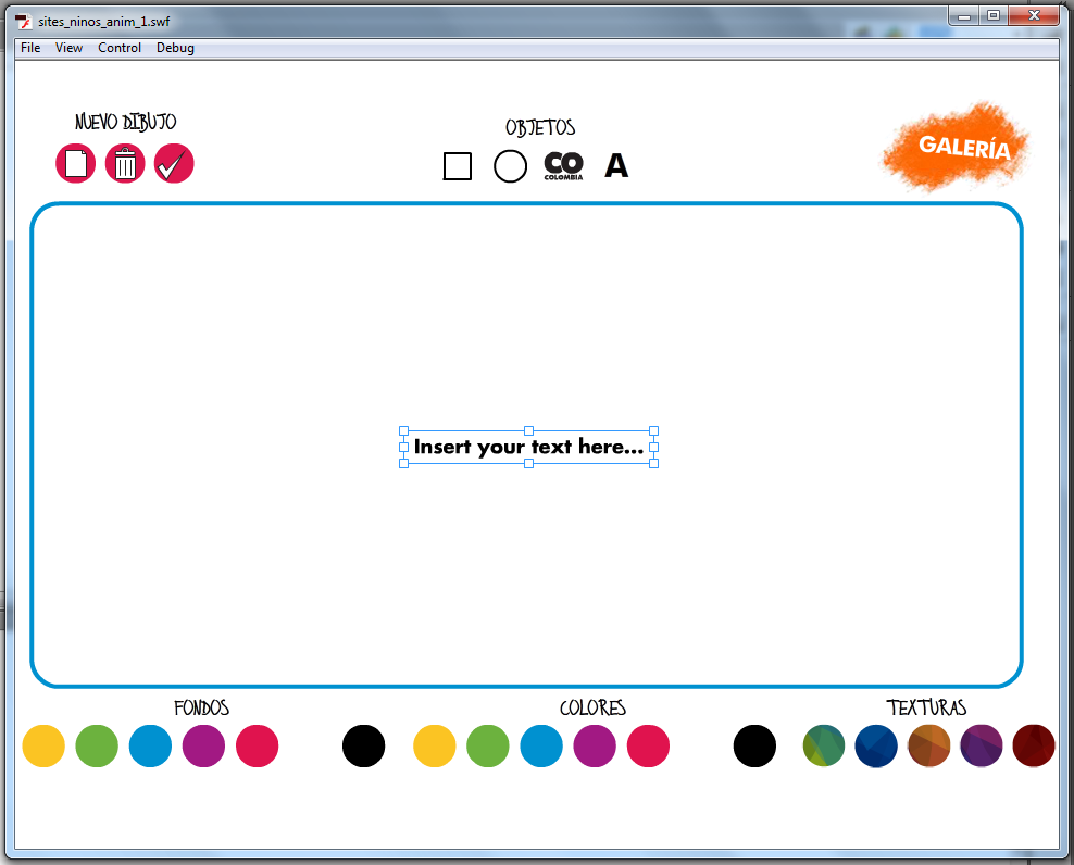
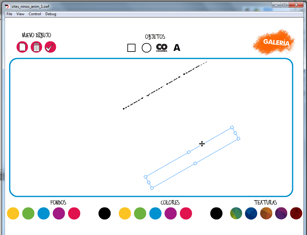
Hello, I'm trying to transform a text input field that should resize the text font size when scaling the transform item, and that should resize itself when the user writes text in it. To resize the text field i set the "autoSize" property to true, and to increase the font size i wrapped the text field with a movieclip and then add that to the TransformManager. Here is my code: //create the font format var font: Font = new FuturaStdBold(); _textFormat = new TextFormat(); _textFormat.size = 18; _textFormat.align = "center"; _textFormat.font = font.fontName; //Create the text field _textField = new TextField(); _textField.width = 200; _textField.height = 40; _textField.x = 100; _textField.y = 100; _textField.type = "input"; _textField.multiline = true; _textField.embedFonts = true; _textField.autoSize = TextFieldAutoSize.CENTER; _textField.defaultTextFormat = _textFormat; _textField.text = "Ingresa tu texto aquí..."; _textField.addEventListener(Event.CHANGE, keyStroked, false, 0, true);[/font] [font=arial, helvetica, sans-serif]//[/font][font=arial, helvetica, sans-serif]_mcConte is the wrapper for the text field[/font] [font=arial, helvetica, sans-serif]_mcConte.addChild(_textField); //add the item to the stage _container.addChild(_mcConte); //add the item to the transformManager _transItem = _transManager.addItem(_mcConte); _transItem.hasSelectableText = true;[/font] The resize of the text field works fine, however the scaling does not. When i try to scale the item and it has some rotation, the text field gets out of the transformManager Box, but if i set "hasSelectableText" to false, then the scaling works but i cant input text. Any help would be greatly appreciated. I attached some screenshots of the problem.

-
I'm scaleing a huge div with absolutely positioned content inside. The problem is, that Matrix transforms seem to work on every browser (FireFox, Chrome, Safari, Opera, IE7, IE9), but not on IE8. I looked at the source code, and it was generating this code for the filter on IE8: filter: progid:DXImageTransform.Microsoft.Matrix(M11=0.4091666666666667, M12=0, M21=0, M22=0.4091666666666667, Dx=0, Dy=0) ; I remember reading, that IE8 filters must be prefixed with the -ms- prefix. Maybe that is the case, transforms seem not to be working.

