Search the Community
Showing results for tags 'javascript'.
-
So I want to resize my WebGL canvas to be bigger than window.innerHeight but more like document.body.scrollHeight. I also don't want to lose the ration, so I would resize the width by the way (with ratio). I already achieve some sort of resizing, but either the ratio wasn't good or the effect was not on the cursor anymore, like it was some hundreds pixels away from the cursor place.
-
Hello, I want to create this distortion effect when scrolling: video of the animation I'm a complete beginner to GSAP like I don't have any basics, but I can learn quickly with the appropriate code, and I'm sure it's possible to do it with GSAP. I already looked at some topics on this website, with the property skew, but it doesn't skew from the center of the image. Furthermore, I want this animation to be vertical, not horizontal like in the video. If anyone can help me with an easy-to-understand solution, that would be awesome.
-
 I've reached my witts end here, I have been trying to solve this issue for the past hour or so but with no avail. I created an animation with GSAP that creates an illusion that you are zooming into a planet, then the planet will disappear and a random image of a lake with large rocks will appear and two text boxes appear, one of them with a button. Once you click on the button, the image of the lake and the two text boxes will disappear and another image of the night sky will take its place. Everything works well up to this point, however, when I resize the viewport, the image of the night sky disappears and the image of the large rocks appears again when it shouldn't. I've included the CODEPEN for this but I can't recreate the bug/error. gsap.timeline({ scrollTrigger: { trigger: ".earth_container", start: "-20% 0%", markers: false } }) .to(".earth_planet", { width: "+=2500", height:"+=2500", duration: 3 }) .set(".earth_container", { backgroundImage: "url('https://i.postimg.cc/Dy9ryPpB/earth-forest.jpg')", backgroundSize: "cover" }) .to(".earth_planet", { opacity: 0 }) .from(".text_info_box_earth_one", { opacity: 0 }) .from(".text_info_box_earth_two", { opacity: 0 }); the timeline above executes automatically and the code below is only executed when the user clicks on the button "Night Time". As i stated before, everything works fine to this point, but once i resize the window AFTER i click on the "Night Time" button, however, the backgroundImage of the ".earth_container" reverts back to the image of the lake, when it shouldn't... why do you think this is happening? function change_to_night_earth() { let newHTML = "The night sky is just as beautiful " + "as the the day time sky. Millions of stars in every " + "corner of the sky. There may be less light, but there isn't " + "less beauty at this time of the planet"; let new_HTML = "Click the button below if you want to return to " + "the day time of earth..." + "<br><br>" + "<button type='button' class='btn'> Day Time </button>"; gsap.timeline() .to(".text_info_box_earth_one", { opacity: 0 }) .to(".text_info_box_earth_two", { opacity: 0 }) .to(".earth_container", { opacity: 0 }) .set(".text_info_box_earth_one", { innerHTML: newHTML, attr: {class: "text_containers_white text_info_box_earth_one transitioning_fast"} }) .set(".text_info_box_earth_two", { innerHTML: new_HTML, attr: {class: "text_containers_white text_info_box_earth_two transitioning_fast"} }) //-----this is propbably where the error happens---------------------------------------------- .set(".earth_container", { backgroundImage: "url('https://i.postimg.cc/x8km9XKw/earth-night.jpg')", }) //---------------------------------------------------------------------------------------------- .to(".earth_container", { opacity: 1 }) .to(".text_info_box_earth_one", { opacity: 1 }) .to(".text_info_box_earth_two", { opacity: 1 }) }
 -
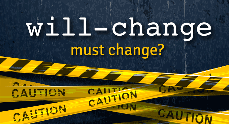 Note: This page was created for GSAP version 2. We have since released GSAP 3 with many improvements. While it is backward compatible with most GSAP 2 features, some parts may need to be updated to work properly. Please see the GSAP 3 release notes for details. Chrome 53 debuted a new "feature" to improve animation performance and graphics fidelity, but it had some nasty side effects that caused quite a few animators to get unpleasant phone calls from angry clients whose ads and web sites suddenly looked blurry and/or stuttery. Every other browser (including previous versions of Chrome) render the same animation beautifully. Chrome's new behavior may also result in WORSE animation performance. A lengthy discussion with the Chrome team revealed some disturbing tradeoffs that animators need to know about, and that could spell trouble with other browsers too unless we band together as a community and make our voices heard. At the heart of the controversy is the will-change CSS property. What is "will-change"? It gives developers a way to say "hey, browser, I'm gonna animate this property, so please do whatever you can to prepare and make it happen smoothly" which often means creating a compositor layer to get GPU-acceleration of transforms and opacity. Think of a compositor layer like a screen-shot of the element that the browser can store on the GPU to move/scale/rotate cheaply instead of re-computing all the pixels on each screen refresh. Read Sara Soueidan's excellent in-depth article here for details. Problem: blurry, stuttering animations What is Chrome 53 doing differently? Chrome is basically saying "In the past, I intelligently managed when and how to rasterize elements, but now that will-change property exists, I'll just make that serve as a blind toggle switch for rasterization instead. If things look blurry, it's not my problem - the developer will need to jump through some hoops (described below) to make things look sharp again." It all boils down to how and when "rasterization" of an element occurs (changing it into pixels stored on the GPU). If rasterization happens when the element is very small, it will be lower resolution. When scaled up, it'll look blurry/pixelated. On the other hand, if you rasterize while it's at its native scale (1) or above, you'll get a much higher-quality image with more pixels. Another key factor is how it is rasterized. Apparently Chrome uses a completely different algorithm for rasterizing an <img> than a <div> with a background-image even though both use identical source files and are sized the same! Here's an example of how they look in Chrome 53: Update: The Chrome team says they've fixed the bug that caused background-image to render differently than <img> (issue 649046) and it should be in the 9/29 release of Chrome Canary. Both factors (the when and the how) are at play in Chrome 53's new behavior (which apparently was a purposeful engineering choice based on will-change). According to this document, all content now gets re-rasterized when its scale changes (which happens up to 60 times per second during animation of scale/scaleX/scaleY properties). That's supposed to keep things sharp, but in this case Chrome's background-image algorithm applies some sort of pixel-snapping which causes that odd vibration during animation. (Update: should be fixed soon). This re-rasterization comes at a cost performance-wise too. Previously, Chrome applied some heuristics to sense when it was appropriate to re-rasterize to avoid blurriness, thus it only kicked in when necessary. But now, you must opt-in to get the layerizing benefits by setting will-change: transform. The Chrome team says this is an "improvement" because it puts the control into the hands of developers, but clearly this shift in behavior comes at quite a price. Overnight, the rug got pulled out from under many animations around the web, hurting performance (due to the constant re-rasterizing by default) and also introducing those visual vibrations when scaling background-image graphics (quite common for sprite sheets). To be clear, this primarily affected scaling animations, not ALL animations on the web. And of course anything where a background-image was used and the element was layerized (making it blurry in Chrome 53). Partial solution: set will-change: transform Complaints rolled in quickly, and the Chrome team suggested that developers go back and edit all their affected animations by adding will-change: transform which would layerize/rasterize those elements (skipping re-rasterizing on every refresh). It's a bit of a nightmare to go back and find all the affected animations and make the necessary edits, but hey, it's just adding one property to the CSS so it shouldn't be too bad, right? Oops, that breaks it in other ways Chrome chose to implement will-change such that it will trigger rasterization at whatever the current scale happens to be, so if you've got an element that starts at scale(0.1) and animates up to scale(1), rasterization happens at scale(0.1), thus it will look terrible (blurry/pixelated) at the end of the animation. Here's an example showing the SAME image animating to identical scales, but flip-flopped starting/ending values: (View the codepen here) Partial solution: toggle will-change back and forth Hold your nose...here comes the hack. In order to trigger re-rasterization of the element to keep it clear, the Chrome team suggested toggling will-change back to auto during the animation, then waiting until a requestAnimationFrame elapses before setting it back to transform...and then doing it again, and again, at whatever frequency the developer wants in order to keep things acceptably sharp. So will-change: auto is being pressed into service to explicitly tell the browser "rasterize me on the next requestAnimationFrame." Yes, you read that correctly: animators must turn **off** the very property whose entire purpose is to be **on** for animation, signaling change. Then toggle it back-and-forth many times during the animation. So we're essentially telling the browser "I'm gonna change this...no I'm not...yes I am...nope..." all while in the process of animating. This doesn't exactly sound consistent with the intent of will-change, nor does it seem performant (Google's document says "Be aware, however, that there is often a large one-time performance cost to adding or removing will-change: transform.") Gotcha: never de-layerize Even if you're willing to follow the advice to set will-change: transform and toggle back-and-forth during the animation to maintain a reasonable level of clarity, there's one last gotcha - if you set it back to will-change: auto at the end of the animation and give it a non-3d transform (to de-layerize it), you'll see a jarring shift in pixels and clarity for anything with a background-image! The Chrome team advises in that case that you make sure it always has a 3d transform thereafter to prevent it from de-layerizing. Following that advice puts you at risk of running out of memory (or hitting performance problems), plus the background-image will always be slightly blurry. Here's what it looks like to toggle between the two modes at the end of the animation: Update: The Chrome team clarified that this was a temporary fix, not a long-term solution. The background-image rendering bug should be resolved soon, and this "never de-layerize" suggestion will no longer apply at that point. The bigger issue, beyond Chrome... The will-change spec doesn't really specify implementation details which means that Chrome's new behavior may be completely unique; Firefox might do something different, and then there's Edge, Safari, Opera, Android, etc. Perhaps Chrome requires that developers toggle back-and-forth to maintain clarity, but what if Firefox interprets that differently, or imposes a big performance penalty when doing the same thing? What if developers must resort to various [potentially conflicting] hacks for each browser, bloating their code and causing all sorts of headaches. We may have to resort to user agent sniffing again (did you just throw up a little in your mouth?). This will-change property that was intended to SOLVE problems for animators may end up doing the opposite. It seems wise for the browsers to step back and let the spec authors fill in the implementation details and gain consensus before moving forward. Another problem: stacking contexts As mentioned in this article, will-change can also affect the stacking context of elements, leading to unintended changes in how things render/stack on your page. So your content may stack differently in browsers that do support will-change than those that don't. More sniffing, yay! To summarize: Before Chrome 53 Just animate stuff. No need to jump through any hoops as a developer to get decent clarity (though the Chrome team points out that there was still some blurriness in certain edge cases that they've heard complaints about). After Chrome 53 Make sure to set will-change: transform if you're animating transforms and want to opt-in to performance optimizations and avoid jittery background-image scaling. But be careful about how it might affect stacking contexts, and keep checking when other browsers decide to implement will-change, as it could change how your content looks. If you're scaling up, make sure you toggle will-change back-and-forth to/from auto during the animation to maintain clarity (but sacrifice performance). Make sure there's a 3D transform applied throughout to prevent de-layerization (which would cause a big performance hit). Don't switch back to a 2D transform at the end (at least for elements with a background-image), or you'll see a jarring pixel shift. (Update: should be fixed soon in Chrome, so this step won't be necessary at some point.) Don't forget to go back and find/fix existing animations that are affected by the new Chrome behavior. Is Chrome going to fix this? As of today, the Chrome team says they've thought a lot about this and feel pretty strongly that the new behavior is an improvement, so there's no plan to change it (that we know of at least). Here are the solutions we proposed (with the answers we got): Instead of putting the burden on developers to manually toggle will-change back-and-forth between transform and auto during the animation, just have the browser natively sense when re-rasterization is prudent and do that automatically which would be much faster than JS anyway. It seems rather trivial for the browser to sense when an element has been scaled greater than a certain delta (like 0.2) and trigger a rasterization. Chrome team's answer (summary): "that's too hard (complex). The browser might get it wrong sometimes, so it's better to have developers do it at the JS level. And JS isn't that much slower than native. It's just a small amount of extra work for animators (or library developers)." The browser could always perform rasterization at native size (scale of 1) or the current scale, whichever is bigger. That way, nobody would run into those nasty blurred images when scaling up from a small value to 1 (pretty common) and there's no need to keep re-rasterizing. Chrome team's answer: "rastering at native size and then scaling that down with bilinear filters in the compositor to something less than 0.5 or so will start to loop noticeably bad." If the goal is to put control into developers' hands, why not expose an API for defining what scale rasterization should occur at, like element.cacheTransform = "scale(1)"? Chrome team's answer: "it may not be so easy to get it right in terms of expressiveness, and requires new APIs...and also to define what raster scale means, which seems quite tricky in general, especially while not over-fitting to current implementation strategies. That might happen later on." The browser should use the same algorithm to rasterize (and scale) anything. The one being used by Chrome for <img> looks great so please use that for background-image too Chrome team's answer (summary): "Acknowledged. We're working on a fix." Instead of turning will-change into a convoluted way to control rasterization in the browser and risk opening a can of worms with other browsers doing things completely differently due to vague specs, roll back the behavior and work with the spec authors to define implementation details and re-approach later when consensus is reached. Chrome team's answer: "the intention of will-change is to give a hint to the browser that the referenced property is going to be animated, and for the browser to take steps to optimize performance for that use case. This is why will-change: transform creates a composited layer: because animating transform afterward will therefore not later have the startup cost and per-frame of creating the composited layer and rasterizing it. Following this logic, further extending the meaning of will-change: transform to not re-raster on scale change is similar, because it will make it faster." Can GSAP fix it for me? Yes and no. We've already experimented with the suggestions that the Chrome team made, but there are a few tricky challenges. First, we're hyper-focused on performance so it's quite painful to have this new Chrome behavior force us to add extra logic that must run on every tick of every tween of any transform-related animation. It probably wouldn't be noticeable unless you're animating hundreds or thousands of elements simultaneously, but we built GSAP to handle crazy amounts of stress because sometimes that's what a project requires, so we're pretty frustrated by Chrome's decision to impose this burden on animators and libraries like GSAP. But yes, we could do the toggling under the hood automatically and accept the performance tradeoff. But another major problem that's totally in the hands of browsers is rendering - we can't fix that jarring pixel shift at the end of the animations of background-image. We can force the 3D transform to remain, but as described above, that leaves things blurry and unnecessarily eats up memory. We work very hard to implement workarounds for browser inconsistencies and bugs like this, but we can't work miracles. We really need Chrome to step up and provide some better solutions. Conclusion There's no doubt that the Chrome team is working hard to move the web forward and deliver the best experience for their users. At GreenSock, Chrome is our primary browser that we use every day, so we're big fans. This article isn't intended to criticize anyone, but rather to bring attention to something that could spell big trouble for animators in the days ahead, beyond the headaches Chrome 53 caused with its new behavior. Hopefully Chrome will roll back the changes and/or implement some of the suggestions above. We'd encourage folks to make their voices heard (on the Chrome thread, below in the comments, with the spec authors, etc.). Perhaps we got something wrong - feel free to correct us or make other suggestions. Ultimately we want to help move animation forward on the web, so please join us.
 -
 Features Touch enabled - works great on tablets, phones, and desktop browsers. Incredibly smooth - GPU-accelerated and requestAnimationFrame-driven for ultimate performance. Compared to other options out there, Draggable just feels far more natural and fluid, particularly when imposing bounds and momentum. Momentum-based animation - if you have InertiaPlugin loaded, you can simply set inertia: true in the config object and it'll automatically apply natural, momentum-based movement after the mouse/touch is released, causing the object to glide gracefully to a stop. You can even control the amount of resistance, maximum or minimum duration, etc. Complex snapping made easy - snap to points within a certain radius (see example), or feed in an array of values and it'll select the closest one, or implement your own custom logic in a function. Ultimate flexibility. You can have things live-snap (while dragging) or only on release (even with momentum applied, thanks to InertiaPlugin)! Impose bounds - tell a draggable element to stay within the bounds of another DOM element (a container) as in bounds:"#container" or define bounds as coordinates like bounds:{top:100, left:0, width:1000, height:800} or specific maximum/minimum values like bounds:{minRotation:0, maxRotation:270}. Sense overlaps with hitTest() - see if one element is overlapping another and even set a tolerance threshold (like at least 20 pixels or 25% of either element's total surface area) using the super-flexible Draggable.hitTest() method. Feed it a mouse event and it'll tell you if the mouse is over the element. See http://codepen.io/GreenSock/pen/GFBvn for a simple example. Define a trigger element - maybe you want only a certain area to trigger the dragging (like the top bar of a window) - it's as simple as trigger:"#topBar", for example. Drag position, rotation, or scroll - lots of drag types to choose from: "x,y" | "top,left" | "rotation" | "scroll" | "x" | "y" | "top" | "left" | "scrollTop" | "scrollLeft" Lock movement along a certain axis - set lockAxis:true and Draggable will watch the direction the user starts to drag and then restrict it to that axis. Or if you only want to allow vertical or horizontal movement, that's easy too using the type ("top", "y" or "scrollTop" only allow vertical movement; "x", "left", or "scrollLeft" only allow horizontal movement). Rotation honors transform origin - by default, spinnable elements will rotate around their center, but you can set transformOrigin to something else to make the pivot point be elsewhere. For example, if you call gsap.set(yourElement, {transformOrigin:"top left"}) before dragging, it will rotate around its top left corner. Or use % or px. Whatever is set in the element's css will be honored. Rich callback system and event dispatching - you can use any of the following callbacks: onPress, onDragStart, onDrag, onDragEnd, onRelease,, onLockAxis, and onClick. Inside the callbacks, "this" refers to the Draggable instance itself, so you can easily access its "target" or bounds, etc. If you prefer event listeners instead, Draggable dispatches events too so you can do things likeyourDraggable.addEventListener("dragend", yourFunc); Works great with SVG Even works in transformed containers! Got a Draggable inside a rotated/scaled container? No problem. No other tool handles this properly that we've seen. Auto-scrolling, even in multiple containers - set autoScroll:1 for normal-speed auto scrolling, or autoScroll:2 would scroll twice as fast, etc. The closer you move toward the edge, the faster scrolling gets. See a demo here (added in version 0.12.0) Sense clicks when the element moves less than 3 pixels - a common challenge is figuring out when a user is trying to click/tap an object rather than drag it, so if the mouse/touch moves less than 3 pixels from its starting position, it will be interpreted as a "click" and the onClick callback will be called (and a "click" event dispatched) without actually moving the element. You can define a different threshold using minimumMovement config property, like minimumMovement:6 for 6 pixels. All major browsers are supported including IE9+. IE8 lacks hitTest() support. Demos Draggable Showcase Draggable How-To Demos See full documentation here. To get InertiaPlugin (for the momentum-based features), join Club GreenSock today. You'll be glad you did. If not, we'll gladly issue a full refund. To learn how to include Draggable and InertiaPlugin into your project, see the GSAP install docs.
- 10 comments
-
- 3
-

-

-
- drag
- javascript
- (and 10 more)
-
 Hi we are looking for a full time vanilla javascript software engineer for cast.app, a silicon valley company There is $1000 referral if we hire the candidate. Job description is below but here are the highlights - Experienced vanilla Javascript, - 2+ years paid experience - Startup experience is a plus - equity + market salary, remote, 4K monitor + M1 MacBook Pro - DOM manipulation, javascript worker threads, fast synchronized animation of SVG and DOM experience is great to have https://cast.app/javascript-engineer Send resume to dickey at cast.app
 -
Hello! I'm wondering how to replicate this effect on https://monopo.london/ where the mouseover interacts with the colours. I thought it would be something like this https://tympanus.net/Development/FlowmapDeformation/index.html, but it does not seem like it as in this case, it's a still image. In Monopo London, the mouse was interacting with the colours. Really am dying to find out: 1) What this effect is called. Is it repulsion effect? 2) How do I make this? (e.g., use Pixi.JS or WebGL... or?) 3) Are there any tutorials to watch/learn about this mouseover effect together with the glowy background? Any help would be greatly appreciated!
-
Hello! I am trying to accomplish this effect https://greensock.com/docs/v2/Plugins/DirectionalRotationPlugin on a 3d scene. So basically i want the camera to transition to the point selected and not jump to it as it is right now. How can i do that?
-
Hello everyone, I would like to develop this kind of animation for my background. Anybody suggest me about this how can I develop this? Also how can I add liquid hover effect on images. https://s.muz.li/NzNjY2YzNGRi Thanks
-
 Download CustomEase Get CustomEase by creating a FREE GreenSock account which gets you access to our community forums plus you’ll receive our exclusive “GreenSock Insider” email series (you can unsubscribe anytime). Make sure you're logged in, then you’ll get immediately gain access to the download zip containing CustomEase. Note: CustomEase is not in the GitHub repository or CDN; it's only available for download at GreenSock.com. data:image/svg+xml,%3Csvg%20xmlns='http%3A//www.w3.org/2000/svg'%20viewBox='0%200%2084.25%2084.25'%3E%3Cdefs%3E%3Cstyle%3E.cls-1%7Bfill%3A%23FFF;%7D%3C/style%3E%3C/defs%3E%3Cpath%20class='cls-1'%20d='M42.12,0A42.13,42.13,0,1,0,84.25,42.12,42.17,42.17,0,0,0,42.12,0Zm0,77.25A35.13,35.13,0,1,1,77.25,42.12,35.17,35.17,0,0,1,42.12,77.25Z'/%3E%3Cpath%20class='cls-1'%20d='M53.38,41.25l-7.63,8V26.66a3.5,3.5,0,1,0-7,0V49.53l-7.69-7.69a3.5,3.5,0,1,0-4.95,4.95L39.78,60.46h0a5.17,5.17,0,0,0,.51.42l.2.11c.13.07.26.15.4.21l.26.08c.13,0,.26.09.4.12a3.17,3.17,0,0,0,.69.07h0c.12,0,.24,0,.36,0a1.65,1.65,0,0,0,.32,0,2.33,2.33,0,0,0,.25-.07,2.83,2.83,0,0,0,.41-.14l.21-.11a2.16,2.16,0,0,0,.39-.22l.2-.16c.11-.09.22-.18.32-.28l0,0L58.44,46.08a3.5,3.5,0,1,0-5.06-4.83Z'/%3E%3C/svg%3E Download GSAP (ZIP) Demos CustomEase Demos
- 4 comments
-
- 4
-
-

-
- easing
- featured-homepage
- (and 5 more)
-
Is there a way to tween the values of an array when in a for loop? I saw that there was an endArray plugin for the AS version of greensock which is close to what i'm looking for, but it doesn't appear to exits in js. Trying to do something like this: var array=[0,1,2,3,4,5]; for(var i=0; i<array.length; i++) { TweenLite.to(array, 0.5, {i:0}); }
-
Does anyone knows how to make a website like this?? - https://www.erikasenftmiller.com/ What plugins should I use? and if you have codepen link please share it with me Thanks
-
Hi all- I'm brand new to the GSAP space. I have an existing React project and want to implement a GSAP animation. The person that made it for me sent it in an HTML file. How would I go about implementing this into my React site? I know there's a react-gsap NPM package but figured there might be an easy way to just plug the HTML doc in and get it working that way? I've attached the file to this post; if you click when it loads, it should play the animation. Thanks! index-v3-3 (1).html
-
I have a problem, I have written many lines of code that are similar and with the same structure, will there be a way to automate the code? I need help
-
 As the author of GSAP I'm sometimes asked if the Web Animations API (WAAPI) will be used under the hood eventually. My responses have gotten pretty long so I thought I'd share my findings with everyone here. Hopefully this sheds light on the challenges we face and perhaps it can lead to some changes to WAAPI in the future. WAAPI is a native browser technology that's similar to CSS animations, but for JavaScript. It's much more flexible than CSS animations and it taps into the same mechanisms under the hood so that the browser can maximize performance. Overall support is has gotten pretty good but there are multiple levels to the spec, so some browsers may support only "level 1", for example. The hope is that eventually all major browsers will support WAAPI fully. Progress in that direction has been very, very slow. You could think of WAAPI almost like a browser-level GSAP with a bunch of features stripped out. This has led some to suggest that perhaps GSAP should be built on TOP of WAAPI to reduce file size and maximize performance. Ideally, people could tap into the rich GSAP API with all of its extra features while benefiting from the browser's native underpinnings wherever possible. Sounds great, right? Unfortunately, WAAPI has some critical weak spots that make it virtually impossible for GSAP to leverage it under the hood (at least in any practical manner). I don't mean that as a criticism of WAAPI. In fact, I really wanted to find a way to leverage it inside GSAP, but I'll list a few of the top reasons why it doesn't seem feasible below. To be clear, this is NOT a feature comparison or a bunch of reasons why GSAP is "better" - these are things that make it architecturally impossible (or very cumbersome) to build GSAP on WAAPI. Custom easing WAAPI only supports cubic-bezier() for custom easing, meaning it's limited to one segment with two control points. It can't support eases like Bounce, Elastic, Rough, SlowMo, wiggle, ExpoScaleEase, etc. GSAP must support all of those eases plus any ease imaginable (unlimited segments and control points - see the CustomEase page). This alone is a deal-breaker. Expressive animation hinges on rich easing options. Independent transform components The most commonly animated values are translation (x/y position), rotation, and scale (all transform-related) but you cannot control them independently with CSS or WAAPI. For example, try moving (translate) something and then halfway through start rotating it and stagger a scale toward the end: |-------- translateX() ------------| |------ rotate() ------| |---------- translateY() -----------| |-------------- scale(x,y) --------------| Animators NEED to be able to independently control these values in their animations. Additive animations (composite:"add") probably aren't an adequate solution either. It's unrealistic to expect developers to track all the values manually or assume that stacking them on top of each other will deliver expected results - they should be able to just affect the rotation (or whatever) at any time, even if there was a translate() or scale() applied previously. GSAP could track everything for them, of course, but continuously stacking transforms on top of each other seems very inefficient and I imagine it'd hurt performance (every transform is another matrix concatenation under the hood). There is a new spec being proposed for translate, scale, and rotate CSS properties which would certainly help, but it's not a full solution because you still can't control the x/y components independently, or all of the 3D values like rotationX, rotationY, z, etc. This is an essential feature of GSAP that helped it become so popular. Example See the Pen Independent Transforms Demo by GreenSock (@GreenSock) on CodePen. Custom logic on each tick Certain types of animations require custom logic on each tick (like physics or custom rounding/snapping or morphing). Most GSAP plugins rely on this sort of thing (ModifiersPlugin, for example). I'm pretty sure that's impossible with WAAPI, especially with transforms being spun off to a different thread (any dependencies on JS-based logic would bind it to the main thread). Non-DOM targets As far as I know, WAAPI doesn't let you animate arbitrary properties of generic objects, like {myProperty:0}. This is another fundamental feature of GSAP - people can use it to animate any sort of objects including canvas library objects, generic objects, WebGL values, whatever. Global timing controls I don't think WAAPI lets you set a custom frame rate. Also, GSAP's lag smoothing feature requires the ability to tweak the global time (not timeScale - I mean literally the current time so that all the animations are pushed forward or backward). As far as I know, it's impossible with WAAPI. Synchronization (transforms and non-transforms) As demonstrated in this video, one of the hidden pitfalls of spinning transforms off to another thread is that they can lose synchronization with other main-thread-based animations. As far as I know, that hasn't been solved in all browsers. We can't afford to have things getting out-of-sync. Some have proposed that GSAP could just fall back to using a regular requestAnimationFrame loop to handle things that aren't adequately supported by WAAPI but that puts things at risk of falling out of sync. For example, if transforms are running on a separate thread they might keep moving while other parts of the animation (custom properties that get applied somehow in an onUpdate) slow down or jank. Compatibility GSAP has earned a reputation for "just working" across every browser. In order to deliver on that, we'd have to put extra conditional logic throughout GSAP, providing fallbacks when WAAPI isn't available or doesn't support a feature. That would balloon the file size substantially and slow things down. That's a tough pill to swallow. WAAPI still isn't implemented in several major browsers today. And then there are the browser inconsistencies (like the infamous SVG origin quirks) that will likely pop up over time and then we'd have to unplug those parts from WAAPI and maintain the legacy raw-JS mechanisms internally. Historically, there are plenty of cross-browser bugs in natively-implemented technologies, making it feel risky to build on top of. Performance WAAPI has a performance advantage because it can leverage a separate thread whereas JavaScript always runs on the main thread, right? Well, sort of. The only time a separate thread can be used is if transforms and/or opacity are the only things animating on a particular element (or else you run into synchronization issues). Plus there's overhead involved in managing that thread which can also get bogged down. There are tradeoffs either way. Having access to a different thread is fantastic even if it only applies in certain situations. That's probably the biggest reason I wanted to leverage WAAPI originally, but the limitations and tradeoffs are pretty significant, at least as it pertains to our goals with GSAP. Surprisingly, according to my tests GSAP was often faster than WAAPI. For example, in this speed test WAAPI didn't perform as well as GSAP on most devices I tried. Maybe performance will improve over time, but for now be sure to test to ensure that WAAPI is performing well for your animations. File Size To ensure compatibility, GSAP would need all of its current (non-WAAPI) code in place for fallbacks (most browsers won't fully support WAAPI for years) and then we'd need to layer in all the WAAPI-specific code on top of that like conditional logic checking for compatible eases, sensing when the user is attempting something WAAPI can't support, tracking/stacking additive animations, etc. That means file size would actually be far worse if GSAP were built on WAAPI. Some have suggested creating a different adapter/renderer for each tech, like a WebAnimationsAdapter. That way, we could segregate the logic and folks could just load it if they needed it which is clever but it doesn't really solve the problem. For example, some plugins may affect particular CSS properties or attributes, and at some point conditional logic would have to run to say "oh, if they're using the WebAnimationsAdapter, this part won't work so handle it differently". That conditional logic generally makes the most sense to have in the plugin itself (otherwise the adapter file would fill up with extra logic for every possible plugin, bloating file size unnecessarily and separating plugin logic from the plugin itself). So then if anyone uses that plugin, they'd pay a price for that extra logic that's along for the ride. Weighing the Pros & Cons At the end of the day, the list of "pros" must outweigh the "cons" for this to work, and currently that list is quite lopsided. I'd love to find a way to leverage any of the strengths of WAAPI inside GSAP for sure, but it just doesn't seem feasible or beneficial overall. The main benefit I see in using WAAPI inside GSAP is to get the off-the-main-thread-transforms juice but even that only seems useful in relatively uncommon scenarios, and it comes at a very high price. I'm struggling to find another compelling reason to build on WAAPI; GSAP already does everything WAAPI does plus a lot more. I'm hopeful that some of the WAAPI benefits will someday be possible directly in JS so that GSAP wouldn't have to create a dependency on WAAPI to get those. For example, browsers could expose an API that'd let developers tap into that off-the-main-thread transform performance. Ideally, browsers would also fix that hacky matrix()/matrix3d() string-based API and provide a way to set the numeric matrix values directly - that'd probably deliver a nice speed boost. Please chime in if I'm missing something, though. (Contact us or post in the forums) Why use GSAP even if/when WAAPI gets full browser support? Browser bugs/inconsistencies Lots of extra features like morphing, physics, Bezier tweening, text tweening, etc. Infinite easing options (Bounce, Elastic, Rough, SlowMo, ExpoScaleEase, Wiggle, Custom) Independent transform components (position, scale, rotation, etc.) Animate literally any property of any object (not just DOM) Timeline nesting (workflow) GSDevTools Relative values and overwrite management from() tweens are much easier - you don't need to get the current values yourself Familiar API Why WAAPI might be worth a try If you don’t need broad browser support today or any of GSAP’s unique features, you could save some kb by using WAAPI Solid performance, especially for transforms and opacity Always free Again, the goal of this article is NOT to criticize WAAPI at all. I think it's a great step forward for browsers. I just wanted to explain some of the challenges that prevent us from using it under the hood in GSAP, at least as it stands today. EDIT: Brian Birtles, one of the primary authors of the WAAPI spec, reached out and offered to work through the issues and try to find solutions (some of which may involve editing the spec itself) which is great. Rachel Nabors has also worked to connect people and find solutions. Although it may take years before it's realistic to consider building on WAAPI, it's reassuring to have so much support from leaders in the industry who are working hard to move animation forward on the web. 2020 EDIT: Now Brian Birtles is the only one working on WAAPI and he does so on a volunteer basis, so further development of WAAPI has understandably slowed down in recent times.
 -
Hi, Id like to know if there is a GSAP function that can create the effect of a mouse following the cursor
-
 Your animation workflow is about to get a major boost. GSDevTools gives you a visual UI for interacting with and debugging GSAP animations, complete with advanced playback controls, keyboard shortcuts, global synchronization and more. Jump to specific scenes, set in/out points, play in slow motion to reveal intricate details, and even switch to a "minimal" mode on small screens. GSDevTools makes building and reviewing GSAP animations simply delightful. Get Started Load the JavaScript file //be sure to use a path that works in your dev environment <script src="./js/GSDevTools.min.js"></script> Instantiate GSDevTools GSDevTools.create(); That's it! The demo below shows GSDevTools running with its default settings. It automatically gives you control over every animation on the global timeline. Select an animation by id Any GSAP animation (tween or timeline) can be assigned an id (a string) which causes it to show up in the animation menu. That makes it easy to jump to any scene. Notice how the timeline and each tween below have an id assigned: //give the timeline and child tweens their own id. var tl = gsap.timeline({id: "timeline"}) tl.to(".orange", {duration: 1, x: 700, id: "orange"}) .to(".green", {duration: 2, x: 700, ease: "bounce", id: "green"}); //give this tween an id gsap.to(".grey", {duration: 1, x: 700, rotation: 360, delay: 3, id: "grey"}) //instantiate GSDevTools with default settings GSDevTools.create(); Now each id shows up in the animations menu (lower left). Persistence between refreshes For added convenience, when you manually set the in/out points, animation, timeScale, or looping state in the UI, they persist between refreshes! This means you can drag the in/out points to isolate a particular section and then tweak the code, hit refresh, and see the changes immediately within that cropped area. Any values set in the GSDevTools.create({...}) method will override manual selections. Set persist: false to disable persistence. If you encounter persistence contamination (e.g. setting timeScale in one affects another), simply assign a unique id to the GSDevTools instance (the recorded values are segregated by id, session, and domain). Configuration options GSDevTools can be configured extensively. Optionally define any of these properties in the config object: animation [string | animation] - If you define an animation, like animation: myTimeline, animation: myTween or animation: "id", that animation will be initially selected. By default, the global timeline is selected. container [string | element] - Specify the container element for GSDevTools, like: "#devTools" or document.getElementById ("devTools"). css [object | string] - The CSS you want on the outer div, like {width:"50%", bottom:"30px"} or a string of css like "width: 50%; bottom: 30px". It is safe to use GSAP-specific shortcuts like x, yPercent, etc. in the object syntax because it just gets passed to a gsap.set() internally. globalSync [boolean] - By default, animations are kept in context and synchronized with the root timeline (scrubbing one scrubs them all), but you can set globalSync: false to unhook it from the global timeline. Note: only one GSDevTools instance can be globally synchronized on a page (otherwise scrubbing them both to different times would break the time-space continuum). hideGlobalTimeline [boolean] - If true, the Global Timeline will be removed from the animation menu. id [string] - A unique string to identify the GSDevTools instance. The persistent values between refreshes are mapped to this id, so if you ever run into a case where there's cross-contamination of the persistent values (like if you embed multiple codepens on one page and don't want timeScale changes in one to affect the others on refresh), just make sure you give each one a unique id. inTime [number | string] - Position of the in marker (time, in seconds, or label or animation id). You can even use relative values like "myAnimation-=2" to start 2 seconds before the animation with the id of "myAnimation". If you use just a negative relative value like "-=5" , it will be measured from the end of the timeline, making it easy to just watch the final 5 seconds. keyboard [boolean] - If true (the default), keyboard shortcuts will work. Note: only one GSDevTools instance can listen for keyboard shortcuts. paused [boolean] - Initial paused state. loop [boolean] - Initial loop state. minimal [boolean] - If true, the UI will only show minimal controls (scrubber, play/pause, and timeScale). Note: when the screen is less than 600px it automatically switches to minimal mode anyway. outTime [time | label] - Position of the out marker (time, in seconds, or label, or animation id). You can even use relative values like "myAnimation+=2" to end 2 seconds after the animation with the id of "myAnimation" ends. If you use just a positive relative value like "+=5", it will be measured from wherever the inTime is. persist [boolean] - By default, GSDevTools remembers the in/out points, selected animation, timeScale, and looping state between refreshes in the same domain session, but you can disable that behavior by setting persist: false. timeScale [number] - Initial timeScale. visibility [string] - "auto" causes the controls to automatically hide when you roll off of them for about 1 second, and return when you move your mouse over the area again. Default is "visible", or you can set it to "hidden" to hide the controls initially (useful if you don't want the controls to obscure any part of the screen - you can still use the keyboard shortcuts to control playback or tap the "H" key to toggle visibility). Keyboard Controls SPACEBAR: Play/pause UP/DOWN ARROWS: Increase/decrease timeScale LEFT ARROW: Rewind RIGHT ARROW: Jump to end L: Toggle loop I: Set the in point to current position of playhead O: Set the out point to current position of playhead H: Hide/show toggle Tips and tricks Clicking the GreenSock logo (bottom right) gets you right to the GreenSock docs! Double-click on the in/out marker(s) to reset them both immediately. If the playback UI is obscuring part of your animation, just tap the "H" key to hide it (and again to bring it back) - you can still use all the keyboard shortcuts even when it's invisible. Advanced demos We purposefully chose very basic animations for the demos above, but here are a few that illustrate how easy GSDevTools makes it to control and debug even super-complex animation sequences. How do I get it? GSDevTools is available to Club GreenSock members ("Shockingly Green" and above). Just download GSAP with the bonus files zip from your Dashboard. Try GSDevTools for free on CodePen. To learn how to include GSDevTools into your project, see the GSAP install docs. FAQ Why is my global timeline 1000 seconds long? That means you've probably got an infinitely repeating animation somewhere. GSDevTools caps its duration at 1000 seconds. Scrubbing to Infinity is awkward. Does loading GSDevTools impact runtime performance? Since it must monitor and record the root timeline, yes, there is a slight performance hit but probably not noticeable. Keep in mind that usually you'll only load GSDevTools while you're developing/reviewing your animations and then remove it when you're ready to launch, so ultimately it shouldn't be much of a factor anyway. Why isn't GSDevTools in the CDN or GitHub repo? Because it's a membership benefit of Club GreenSock. It's a way for us to give back to those who support our ongoing development efforts. That's why we've been able to continue innovating for over a decade. See https://greensock.com/why-license for details about our philosophy. Does GSDevTools work with other animation libraries? Nope, it depends on some unique capabilities baked into the GSAP architecture. What will I do with all the time this tool saves me? Take up a new hobby, ponder deep philosophical questions, make cookies - it's up to you.
-
- 5
-
-
- javascript
- animation
- (and 8 more)
-
 Note: TweenMax has been deprecated in GSAP 3 in favor of the streamlined gsap object. It has 50+ new features and is almost <strong>half the size!</strong> GSAP 3 is backward compatible with the vast majority of GSAP 2 features including TweenMax. Please see the Migration Guide for details. TweenMax lets you animate literally any property of any object that JavaScript can touch (CSS, SVG, React, Vue, Three.js, canvas, motion paths, generic objects, etc.). Before the release of GSAP 3, TweenMax was the most feature-packed (and popular) animation tool in the GSAP arsenal. However in GSAP 3, you no longer even need to reference TweenMax in your code (although you can because GSAP 3 honors the vast majority of legacy code). We strongly recommend migrating to GSAP 3's streamlined syntax. Quick links Getting started What's so special about GSAP? Documentation: Version 2 | Version 3 Showcase (examples) For convenience and loading efficiency, TweenMax version 2 and earlier included TweenLite, TimelineLite, TimelineMax, CSSPlugin, AttrPlugin, RoundPropsPlugin, BezierPlugin, and EasePack (all in one file). Every bit of that functionality (plus a lot more) is in the GSAP 3 core which is almost half the size. Staggered animations GSAP makes it easy to create staggered animations on multiple objects. The animations can overlap, run in direct sequence or have gaps between their start times. The old TweenMax stagger methods (from version 1 and 2): TweenMax.staggerTo(), TweenMax.staggerFrom() and TweenMax.staggerFromTo() aren't even necessary in GSAP 3 because a "stagger" special property can be added to ANY tween, like in the demo below: Additional Methods (only relevant for version 1 and 2) TweenMax inherits methods from TweenLite and it also has quite a few of its own. ul.chart {width:300px; float:left; margin-right:80px; } ul.chart li:nth-child(1){ font-weight:bold; list-style:none; margin-left:-20px; font-size:20px; margin-bottom:20px; } TweenLite and TweenMax Methods delay() delayedCall() duration() eventCallback from() fromTo() getTweensOf() invalidate() isActive() kill() killDelayedCallsTo() killTweensOf() pause() paused() play() progress() restart() resume() reverse() reversed() seek() set() startTime() time() timeScale() to() totalDuration() totalProgress() totalTime() Methods exclusive to TweenMax getAllTweens() isTweening() killAll() killChildTweensOf() pauseAll() repeat() repeatDelay() resumeAll() staggerFrom() staggerFromTo() staggerTo() updateTo() yoyo() Learn more in the TweenMax version 2 documentation.
 -
Good day everyone. I have just completed my personal portfolio site which makes use of GSAP. However, it seems the animations are not playing and so the page remains blank. Everything works fine on my local server but when I uploaded my website to the dreamhost servers, the animations no longer work. There are no errors whatsoever on the console. I contacted the customer service and was told that in my error.log file it says the folder where all my GSAP.js files are located cannot be found. But looking at my panel, all files were uploaded successfully. Ok, in order to be sure it was not just the dreamhost servers, I decided to try uploading the site to github servers and still the same thing. The site and all files uploaded successfuly but the javascript files are not running or located. I don't know exactly. And after looking at the console and the network in the google developer tools, there is no single error, it shows all files were uploaded successfully as there is no error. What may be causing this issue? I'm lost.
-
I am using BarbaJS for creating my Portfolio by using a <ul> for creating a Page-Transition. I have set up GSAP Animations and Many More such as AutotypeJS but they aren't getting fired neither are the CSS is getting applied after the Page transition is done. Once I refresh the page, The Animations gets fired. What could be the possible reason? gsap.from('.btn-blue', { opacity: 0, duration: 0.5, delay: 21, y: 50 }); gsap.from('.anim1', { opacity: 0, y: -100, duration: 0.5, stagger: 0.5 })
-
 Feature lists don't always tell the story in a way that's relevant to you as the developer/designer in the trenches, trying to get real work done for real clients. You hear about theoretical benefits of CSS animations or some fancy new library that claims to solve various challenges, but then you discover things fall apart when you actually try to use it or the API is exceedingly cumbersome. You need things to just work. .expander { cursor: pointer; font-weight: 400; position: relative; } section .card{ padding-bottom: 6px; margin-bottom: 10px; padding-left: 35px; padding-top: 6px; box-shadow: none; } .expandable-list { padding-left: 0; } .expandable-content { padding: 0; height: 0; overflow: hidden; } .expander-button { position: absolute; border-radius: 50%; background-color: #BBB; width: 15px; height: 15px; display: inline-block; vertical-align: middle; border: 1px solid #FFF; margin-top: 8px; /* vertically center with heading top: 50%; margin-top: -9px; */ left: -8px; margin-left: -18px; font-size: 0px; } .expander-plus, .expander-minus { position: absolute; background-color: #FFF; display: block; } .expander-plus { width: 1px; height: 7px; left: 6px; top: 3px; } .expander-minus { width: 7px; height: 1px; top: 6px; left: 3px; } .project-post p { font-family: "Lucida Grande", "Lucida Sans Unicode", Helvetica, Arial, Verdana, sans-serif; } .project-post h2 { padding-top: 16px; margin-bottom: 10px; } .expPoint, .project-post .expList li { font-size: 1.1em; list-style: none; line-height: normal; margin: 0px 0px 0px 8px; padding: 6px 4px 4px 20px; position:relative; border: 1px solid rgba(204,204,204,0); } .expPoint, .expContent { font-family: "Lucida Grande", "Lucida Sans Unicode", Helvetica, Arial, Verdana, sans-serif; } .expPoint:hover, .project-post .expList li:hover { background-color:white; border: 1px solid rgb(216,216,216); } .expContent { height: 0px; overflow: hidden; color: #656565; font-size: 0.9em; line-height: 150%; font-weight: normal; margin: 5px 0px 0px 0px; padding-top: 0px; } .toggle { width:6px; height:8px; position:absolute; background-image:url(/_img/toggle_arrow.gif); background-repeat: no-repeat; left: 9px; top: 12px; } .expMore { color: #71b200; text-decoration: underline; font-size:0.8em; } #featureAnimation, #featureBox { background-color:#000; border: 1px solid #333; height: 220px; overflow:hidden; line-height: normal; font-size: 80%; } #featureAnimation { position:relative; visibility:hidden; } #featureBox { position:absolute; } #featureAnimation, #featureBox, #whyGSAP, .featureTextGreen, .featureTextWhite { width: 838px; } #whyGSAP, .featureTextGreen, .featureTextWhite { text-align: center; } #whyGSAP, .featureTextGreen, .featureTextWhite { font-size:50px; position:absolute; font-family: "Lucida Grande", "Lucida Sans Unicode", Helvetica, Arial, Verdana, sans-serif; top:0; } .featureTextGreen { color:#91e600; font-weight: bold; } .featureTextWhite { color:white; font-weight:normal; } .star { position: absolute; width: 16px; height: 16px; display: none; } #browserIcons { top:64px; left: 100px; width: 92px; height: 92px; position: absolute; text-align:left; } #browserIcons img { position:absolute; } .featureTextMinor { color:#CCCCCC; font-weight:normal; font-size:20px; position:absolute; font-family: "Lucida Grande", "Lucida Sans Unicode", Helvetica, Arial, Verdana, sans-serif; visibility:hidden; } .dot { position:absolute; background-color: #91e600; } #ctrl_slider { position:absolute; width: 725px; height:10px; left:18px; top:196px; background: rgba(80,80,80,0.3); border:1px solid rgba(102,102,102,0.5); visibility:hidden; } Why GSAP? Performance Compatibility Other tools fall down in older browsers, but GSAP is remarkably compatible. Scale, rotate & move independently (impossible with CSS animations/transitions) XNJYHQLJYQEW CSS, canvas libraries, colors, beziers, etc. Total control pause(), play(), reverse(), or timeScale() any tween or sequence. GSAP The standard for HTML5 animation replay
- 1 comment
-
- 5
-
-
- workflow
- compatibility
- (and 7 more)
-
Hi there! I'm newbie with GSAP but really enjoy using it!!! I'm currently trying to build a hover for my site company that play a video on background when hovered. As you can see on the code pen exemple, it works great. My problem is: I would like to pause the video after the the timeline reverse completely. I can find how to delay the pause fonction or using onReverseComplete in the timeline properties but nothing work... Another solution would be to just pause the video and not going back to 0 but the fix img (.img) doesn't come back. But I can't find how to exclude the img animation when the timeline is reversed. Thanks for your help
- 2 replies
-
- 1
-
-
- gsap
- javascript
- (and 3 more)
-
 Note: This plugin was replaced with MotionPathPlugin in GSAP 3. Please see the GSAP 3 release notes for details. Animate virtually any property (or properties) along a curved Bezier path which you define as an array of points/values that can be interpreted 4 different ways (described as the Bezier's "type", like type:"soft"? "thru" (the default) - the plugin figures out how to draw the Bezier naturally through the supplied values using a proprietary algorithm. The values you provide in the array are essentially treated as anchors on the Bezier and the plugin calculates the control points. The target's current/starting values are used as the initial anchor. You can define a curviness special property that allows you to adjust the tension on the Bezier where 0 has no curviness (straight lines), 1 is normal curviness, 2 is twice the normal curviness, etc. Since "thru" is the default Bezier type, you don't need to define a type at all if this is the one you want. "soft" - the values that you provide in the array act almost like magnets that attract the curve towards them, but the Bezier doesn't typically travel through them. They are treated as control points on a Quadratic Bezier and the plugin creates the necessary intermediate anchors. The target's current/starting values are used as the initial anchor. "quadratic" - allows you to define standard Quadratic Bezier data (Quadratic Beziers have 1 control point between each anchor). The array should start with the first anchor, then control point, then anchor, control point, etc. for as many iterations as you want, but obviously make sure that it starts and ends with anchors. "cubic" - allows you to define standard Cubic Bezier data (Cubic Beziers have 2 control points between each anchor). The array should start with the first anchor, then 2 control points, then anchor, 2 control points, anchor, etc. for as many iterations as you want, but obviously make sure that it starts and ends with anchors. For full details please consult the BezierPlugin documentation.
 -
I have created a product list page where every thumb image will have a zoom effect. the zoom effect code is working fine in the pure javascript. but my project is in vuejs and I wanna achieve same effect in my vue component. I already made my component and put some code in vuejs way. but it's not working right way. when I clicked it jumps to top left and then zooming. Here is my sandbox link in vuejs. Maybe I am missing something or there is have a better way to write this pure javascript code to vuejs way. it would be appreciated if any expert takes a look and give me the solution. The zoom effect goal is this. I believe i am very close to this effect. just can't figure out the problem. Thanks in advance.
-
<!doctype html> <html lang="en"> <head> <meta charset="UTF-8"> <meta name="viewport" content="width=device-width, user-scalable=no, initial-scale=1.0, maximum-scale=1.0, minimum-scale=1.0"> <meta http-equiv="X-UA-Compatible" content="ie=edge"> <title>Document</title> </head> <style> .loading{ background: orangered; position: absolute; top: 0; bottom: 0; right: 0; height: 100%; width: 100%; z-index: -99; } button{ padding: 10px 30px; background:#323232; color: white; outline: none; border: none; position: absolute; z-index: 9; top: 45%; left: 45%; cursor: pointer; } </style> <body> <div class="loading"> </div> <div class="btn"> <button>CLick</button> </div> <script src="https://cdnjs.cloudflare.com/ajax/libs/jquery/3.4.1/jquery.min.js "></script> <script src="https://cdnjs.cloudflare.com/ajax/libs/gsap/3.2.6/gsap.min.js "></script> <script> const ld_gray = gsap.timeline({paused: true}); ld_gray.from('.loading', {duration: 1, delay: 0.5, scaleX: 0, transformOrigin: 'left', ease: "expo.out",}); ld_gray.to('.loading', {duration: 1, delay: 1, scaleX: 0, transformOrigin: 'right', ease: "expo.in",} ); $('button').click(function () { ld_gray.restart(); }); </script> </body> </html>
